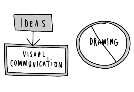
The story of how Southwest Airlines was founded is one of my favorite stories to share about the power of a sketch. If you are not familiar, take a moment to hop over to Dan Roam‘s blog post Southwest Airlines keeps up the napkin spirit…I’ll wait because I trust you’ll return. Back….good. Dan Roam refers to this story as a great example of problem solving, and that’s just what sketching is. Sketching is a standard part of my design process, and it’s an activity that happens at various stages of any Perficient XD project. Something I hear from others when I ask them if they can sketch out an idea, or ask to see their sketches, is “I can’t sketch…” This commonly happens when people equate sketching with drawing, or illustration. The ability to illustrate is very different from being able to sketch out an idea.

Getting Comfortable With Sketching
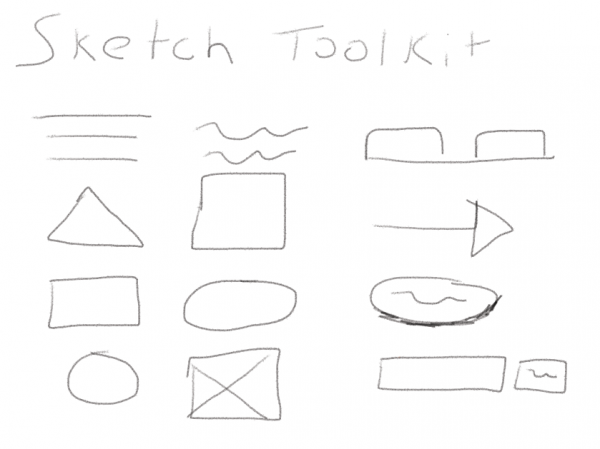
The first thing I show people that show a hesitation towards sketching is the sketchers toolkit. This is a series of simple shapes that can can be used in a sketch to visually express the an idea, like a user interface. Dan Roam, in his book Back of the Napkin, going into more detail about the type of shapes you can use and the purpose of those sketches to express a variety of ideas. For the purposes of this post, I’ll be focusing on sketching out a user interface though. Using the shapes shown below, you can quickly sketch out a layout and various features that you think may belong on a given interface.
- Line – Line of text or if combined with a triangle an arrow
- Circle – Icon place holder or button
- Square – Content area, call to action, or even an image placeholder
- Rectangle – Tab, content area, or image placeholder
- Weighted Line – Heading or line of separation
Using Sketches To Drive Design Concepts
There are a number of design activities that can be performed in a group setting that will both encourage other smart people to share their ideas for a solution but also bring up great conversation about design direction, desired functionality, and content requirements. One that is used often at the beginning of our projects is a design studio. During a design studio, a group of stakeholders from different departments are asked to sketch out a series of design concepts to meet a defined scenario that typical users would find themselves in. Once these sketches have been produced, members of the design studio present their ideas and collect critique from their peers. This critique is used to refine the design ideas and spurn conversation around the possibilities and constraints of the solution.
Sketching Before Wireframing
Another area sketching shines is prior to the production of wireframes, or interactive prototypes. I firmly believe that once you sit down with any kind of design tool, you begin to limit your thinking to the design patterns that are present within the design tool. Sketching prior to using a design tool frees you and your mind up explore ideas that may not be supported by the widget library available to you. You don’t fall into the trap of filtering out ideas in your head rather than on paper and with your peers. An idea that may not sound all great in your head might be what another designer or peer needs to produce their own concept that will push the solution to the next level.
There are a variety of paper template or sketch pads that facilitate the sketching phase of a design
- UI Stencils – Offers a variety of platforms and stencils
- UX Pin – Note pads for desktop and web UIs
- Smashing Magazine Sketching Resources
- InspireUX Sketching Resources
If you haven’t incorporated sketching into your design process yet, give it a try. Don’t be discouraged if your first couple of attempts aren’t the greatest. Also, don’t try to make a piece of art. The goal of sketching is to communicate an idea, if you are able to do that (regardless if the idea was good or not) than you have created a successful sketch. Good luck sketching!


Kudos Brad, remarkable how our brains work differently with pencil in hand, mouse in hand, stylus in hand … keep the wisdom coming!