We’ve all been there: A new technology emerges (cough Responsive Web Design cough), all shiny and spiffy. We get excited about it – tweet and blog our way around it for months – until our excitement and the sheer saturation from the community spills out into the wider business community. And at a certain point, it’s like everyone knows about it. The secret is out, and your grandmother is asking how she can make her cat’s Facebook page responsive. Bless. Then a little while later, all the business blogs are viciously biting at the ankles of the once-darling new technology. What happened?
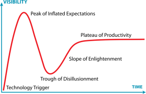
In 1995, Gartner Research published a fantastic graph that illustrates this concept perfectly – The Hype Cycle. It:
provide(s) a graphic representation of the maturity and adoption of technologies and applications, and how they are potentially relevant to solving real business problems and exploiting new opportunities.
Gartner Research
With regards to Responsive Web Design, it’s been amazing how closely this pattern has been followed! In 2010 we had the Technology Trigger – Ethan Marcotte wrote his seminal article for A List Apart , and the combination of techniques that form Responsive Web Design was officially born. The web design community were immediately engaged.
The Peak of Inflated Expectations is the period where a technology is viewed as the solution to every problem. It’s pushed to its (still burgeoning) limits, and there are a few notable successes in its implementation that lead to huge amounts of attention, grabbing the interest of people from outside the technology’s particular community. In the case of Responsive Web Design that probably occurred when the Boston Globe launched their responsive site in 2011. It was the first large brand to use this new technology, and its impact was felt everywhere.
The Trough of Disillusionment is where reality sets in for a lot of people. This new technology isn’t the panacea, it won’t solve world hunger, and it probably won’t call you in the morning. The cad. So did Responsive Web Design fall into this chasm? Certainly. It became very difficult towards the end of 2011 to read any articles on mobile development without an opinion piece on how responsive design wasn’t the way forward, that discrete mobile solutions was the way to go, and that <insert provider’s platform of choice> was really the only platform worth worrying about anyway, honest guv’nor…
Some of those attitudes are still prevalent, unfortunately. However, at the start of 2013 we seem to be pretty much at the top of the Slope of Enlightenment (which sounds like a fantastic vacation destination – just remember to pack your hiking boots). Risks and benefits are clear, and there are a lot of large sites and applications in the wild that are using Responsive Web Design. Users understand it, stakeholders see the benefits in it, and the design community understands that it’s another tool in the arsenal, not the be-all-end-all.
2013 is the year where Responsive Web Design hits its Plateau of Productivity. Optimistic minds (like mine) would argue that we’re already there. But what do you think?

