
In this blog, we’ll explore Power Apps, the concept of components, and how they enhance app efficiency and scalability.
What is Power Apps?
Microsoft Power Apps is a low-code/no-code platform that allows users and businesses to create custom applications with minimal coding. It enables app development for web browsers, mobile devices, and tablets. It seamlessly integrates with Microsoft services like SharePoint, Office 365, Teams, and third-party data sources such as Salesforce and SQL databases.
Now that we have a brief introduction to Power Apps,, let’s explore its key aspect: Components. These powerful building blocks can take your Power Apps development to the next level!
What Are Components, and How Do They Strengthen Power Apps?
Power Apps components are reusable elements that help create consistent, efficient app designs. They encapsulate functionality, styling, and logic into a single unit, making them easy to use across multiple screens and apps.
Why Should We Use Components in Power Apps?
1) Reusability: Reduce duplication and maintain consistency across different apps.
2) Efficiency: Speed up development by streamlining app creation and updates.
3) Maintainability: Simplify updates with centralized component management.
4) Customization: Tailor components to specific business needs while ensuring uniformity.
5) Collaboration: Enable multiple developers to work on different components simultaneously.
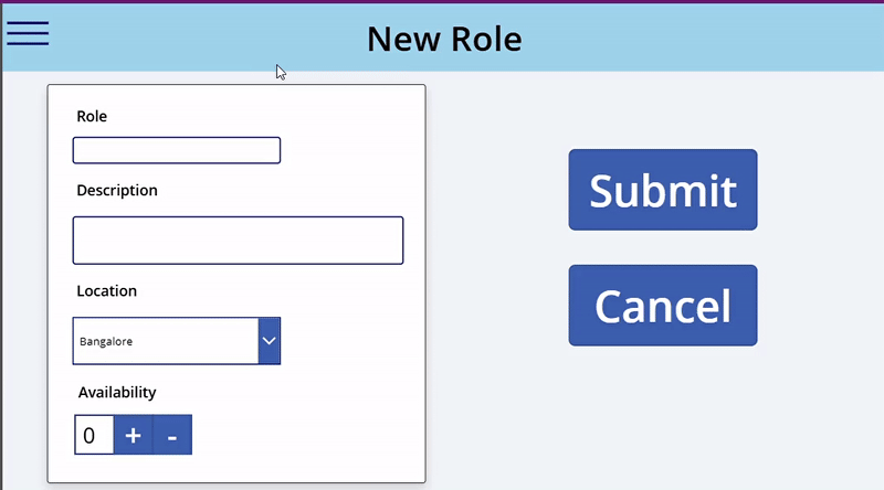
Building a Menu Component in Power Apps
Now that we understand the components of Power Apps, let’s build one from scratch. In this blog, we will create a Menu component, not just any regular menu bar. This menu bar is easy to customize, allows adding new items using collections, and leverages the custom properties of components (which will be explained later in the blog).
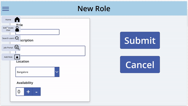
For this component, we will use Collections—like data arrays—along with the component’s custom properties to seamlessly pass data from the screen to the element. This allows users to easily add new menu items by simply updating the collection, and the changes will automatically be reflected in the component. Users only need to adjust the height and width as required.
Step 1: Setting Up the Initial Component and Menu Data
Before we get into the actual logic of the component, let’s add the Menu component and the data for the menu items.
1. Menu Items Data
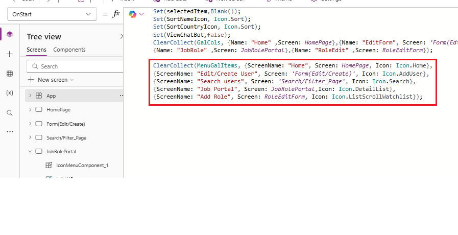
Below is a preview of how the collection should be initialized in the app’s OnStart property. This serves as a demo of the expected data structure, but you can customize it with any menu items based on your needs.
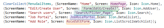
In this collection shown above, we have:
- MenuGalItems: The collection name that can be referenced throughout the app.
- ScreenName: The page name to navigate to
- Screen: The actual screen you want to navigate to
- Icon: This is the Icon you wish to display to the user in the menu
2. Menu Component
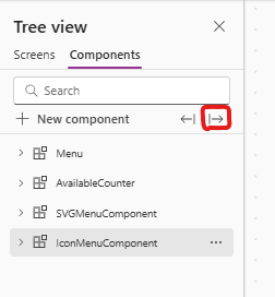
To add the component, navigate to the component tab in the Power Apps tree view. You should have an option called new component; click it, and a new component will be created.
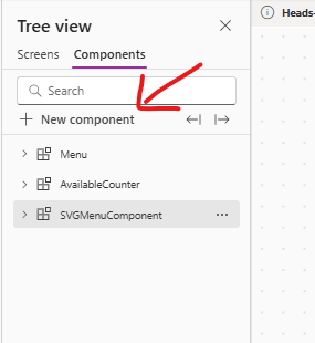
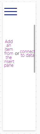
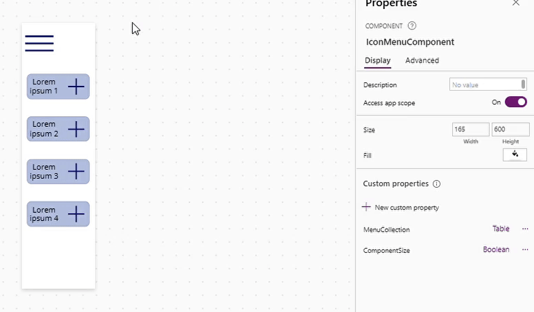
Once clicked, you will see the screen below with your newly created component.
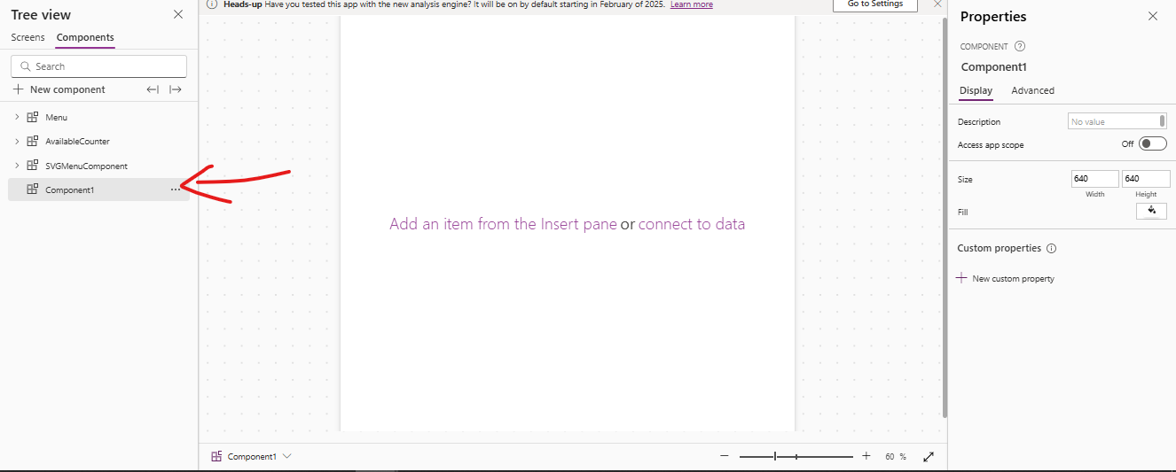
The above image shows that it looks similar to the screen tab, with a properties pane, a tree view, and the ability to add controls to the component just like you would on a screen. The only difference is that you cannot test the component directly; you need to add it to a screen to test it.
If you notice in the properties tab, there is a section called Custom Properties at the bottom. These properties are game changers for components as they function as input and output variables—input allows data to flow from the screen to the component, and output allows data to pass from the component back to the screen.
In this case, we only need Input properties since we do not need to pass any data back to the screen; we just need the menu items to be displayed.
When creating a custom property, you will see a new tab where you can add a name, choose the property type (Input or Output), and select the data type (such as Number, Date, Table, Boolean, and so on…).
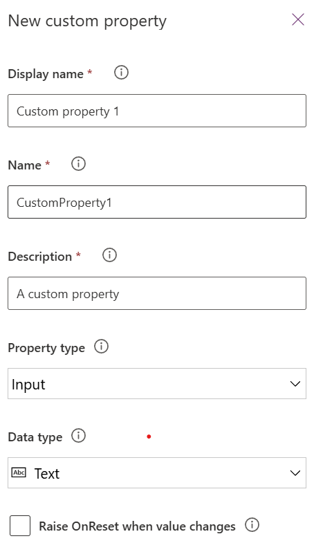
The picture (above) shows the properties you can add when creating a custom property. You also have the option to Raise the OnReset when the property’s value changes.
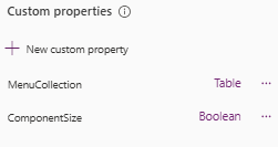
So, we would be creating two input properties:
- ComponentSize (Boolean): To have opening and closing of the menu
- MenuCollection (Table): A table that is used to display the menu items created previously
This is the basic setup you need before starting to create the component.
Step 2: Adding the Necessary Controls to the Component
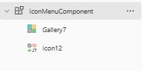
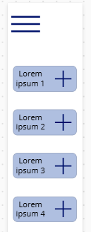
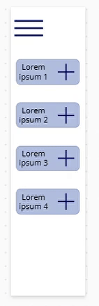
First, let’s add the menu icon that will be used to expand and collapse the menu control when it is clicked and also the gallery where we will be displaying the menu items:
In this case, I am using a Hamburger icon as my menu icon, but you can choose any icon. The icon and gallery should look like the image below once you’ve added the icon and gallery.
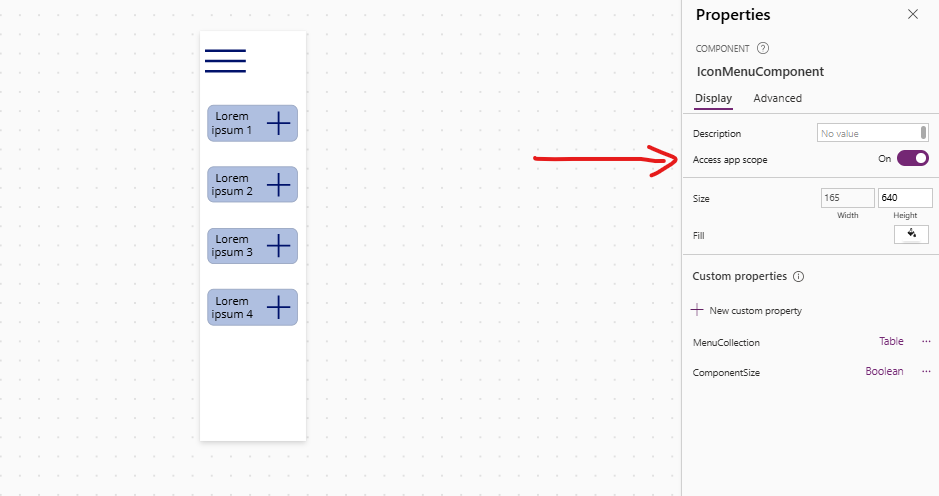
In this case, I have adjusted the width and height of my component to fit my needs (Width: 165, Height: 640), but you can set them to whatever works best for you.
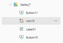
To display the menu items, we will add the following controls within the gallery:
- Icon control to show the icon defined in the menu items collection.
- Label to display the menu item name.
- Button for styling (to create a rounded box design).
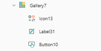
The component should now look like this:
You can see that the component is starting to take shape. Now that we have added the required controls let’s build the logic that brings the component to life.
Step 3: Adding Logic to the Component

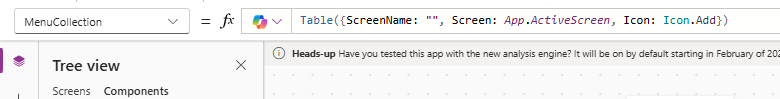
First, let’s set up the custom property of the Menu Items. Navigate to the Components property tab (highlighted in red in the image), select the MenuCollection custom property, and check what it displays.
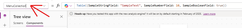
If you look at the table above, it isn’t in the same format as the data we defined earlier, so let’s fix that. Update the property names and their corresponding values to match the correct format. These are just base values to help the component understand what to expect. The final table should look something like this:
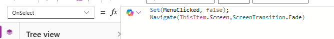
Let’s set up a variable that will control the gallery’s visibility. On the Hamburger icon’s OnSelect property, create a variable called MenuClicked and set it as shown below:
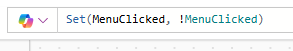
Add this variable to the Gallery’s Visible property. This will allow the gallery to toggle open and close when you click the Hamburger icon (as shown in the demo below):
If you notice, when the gallery closes, the white component space remains visible. To fix this, we can use another Component Property to dynamically adjust the width and height of the component. This ensures it doesn’t interfere with other controls on the screen.
Before proceeding to the next part, enable the Access App scope (shown below). This setting is essential because it allows you to use the variables created on the component side within the component itself. This setting is in the principal component’s property tab on the right.
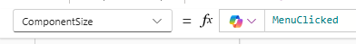
Just like we did for the MenuCollection property, go to the component’s property dropdown and set the value of the ComponentSize property to the Boolean variable (MenuClicked) we created, as shown below:
Now, we can use this property to adjust the width and height of the component when it is clicked.
Width

Height

This means that when you click the menu to open it, the component size will change, and the same will happen when you close the menu.
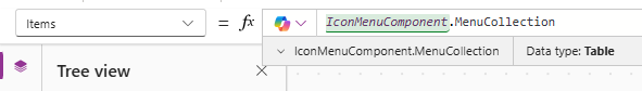
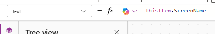
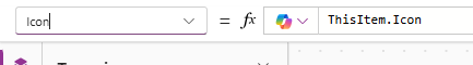
Now, all that’s left is to add the MenuCollection property to the gallery as the items and map the values to the gallery controls.
Gallery Items
Label Text
Icon value
I have added an extra button that sits on top of all the controls in the gallery, I have done this so that I can get a pointer when I hover over the menu item, as well as also added the navigate function to that button to navigate to the particular screen.
Make sure the overlapping button colors are transparent so that it does not show up when you hover over them.
Overlapping Button OnSelect logic
The component is ready! You might wonder where all the menu items we declared before are. We still need to add that part, but it comes from the screen level. For now, we’re done with the component level.
Integrating the Component into Our Application
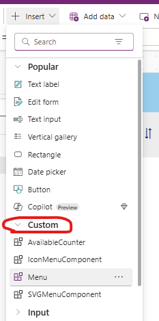
To insert the component into the screen, you should see a new dropdown in the Insert tab called Custom. This will contain all the elements you’ve created. Once you find the component you made, simply drag and drop it into place, just like you would with a regular control.
Once that’s done, you’ll see the component on the screen. You might still wonder why the menu items you created aren’t showing up. Remember the MenuCollection custom property we made as an input property. The collection we set up in the app’s OnStart property will be passed to this input property. This will, in turn, send the data to the component side, displaying the created menu items.
App OnStart
The red highlight is the menu collection we created
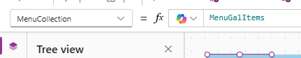
MenuCollection (Custom component property)
Just follow the previous steps to add the menu component to other screens so you can navigate back and forth, and you’ll be all set!
Deploying the Menu Component in Another Application
Another helpful feature of Power Apps is the ability to export and import components across different apps, eliminating the need to recreate them from scratch. Let’s explore how to export and use this menu component in a new app.
1. Go back to the Components screen. Next to the ‘Add New Component’ option, you’ll see two buttons. The one highlighted in the red box is the export button, while the other is the import button. Click the export button.
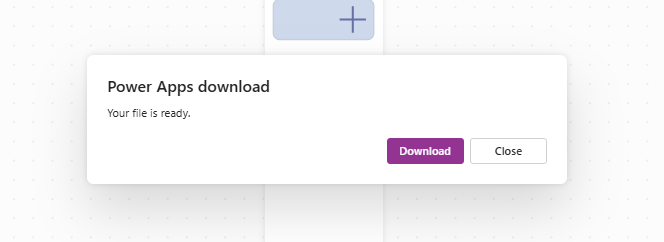
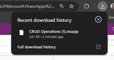
After clicking the button, a popup will appear, confirming that the file is ready for download. Simply click the download button to save the components as a .msapp package, which can be used in another application.
2. Once the file is downloaded, open the new application where you want to add your component. Then, navigate to the components screen and click the Import
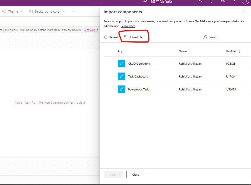
After clicking the Import button, a new tab will appear, allowing you to either upload a file or select a component from other Power Apps applications. In our case, we will upload the file downloaded in the previous step.
- Click the Upload button, locate the downloaded file, and upload it. Once uploaded, all the components from the original application will be automatically added to the new application.
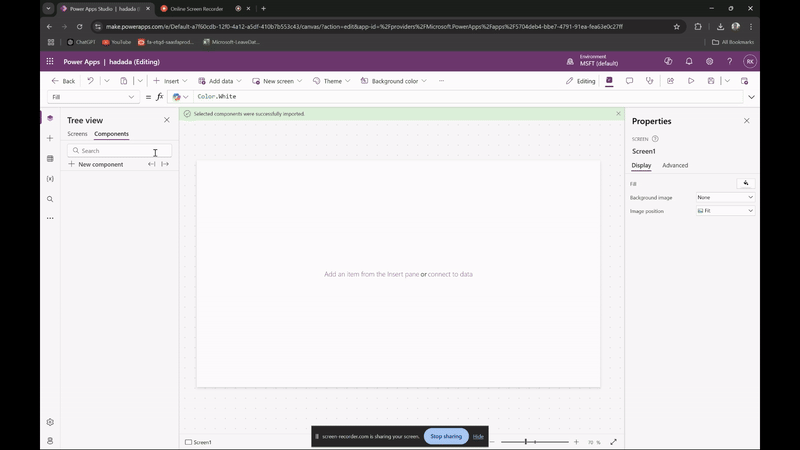
As shown in the video above, once you upload the file, the components and their settings are automatically added to the new application. The only limitation is that all elements from the original app will be imported, so you may need to delete any that are not required.
Pros and Cons of Components in Power Apps
Having explored how components function in Power Apps and created one, let’s now go over the pros and cons:
Pros:
- Components can be reused across multiple screens and apps, minimizing redundant work.
- Save development time by building once and reusing components wherever needed.
- Updating a single component automatically applies changes across all instances (especially effective when using a component library).
- Enables multiple developers to work on different components simultaneously, boosting team productivity.
Cons:
- Learning how to effectively create and manage components may take time for beginners.
- Unlike regular screens, components cannot be tested in the component screen; they must first be added to a screen.
- Managing dependencies can become complex if a component relies on external data sources or variables.
Conclusion
In this guide, we explored Power Apps’ components and how they can be used to create reusable building blocks for your app. We then walked through creating a simple, customizable menu component that can be used across multiple screens in your app. This approach helps maintain consistency in design, saves time, and makes updates easier. By using this menu component, you can ensure a smooth and uniform user experience throughout your app while keeping the development process efficient and flexible.
This approach is particularly valuable for developers aiming to maintain a cohesive and professional app interface while optimizing their workflow. Overall, it’s a practical and insightful resource for anyone looking to leverage Power Apps’ capabilities effectively.
Thank you for sharing good information.
Loved the walkthrough! The custom properties part was especially helpful.
This is super useful. Exporting and reusing components across apps is a game-changer.”
Really appreciate the practical example with the menu it makes the theory much easier to understand.