
In this blog post, we’ll develop a Custom Select Picker using Vue.js, TypeScript, and jQuery.
This article will teach you how to use Vue.js to create a custom select-picker component. Select-pickers are adaptable user interface elements that let users select from a list of alternatives in numerous ways. We’ll improve this component by adding more features like “Apply” and “Cancel” buttons to provide users with more control over their choices.
Prerequisites for Creating a Vue.js Custom Select-Picker
Step 1: Setting Up the Custom Select Picker Component in Vue
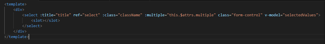
We’ll start by defining our Vue component using the template, script, and style; sections.
- The
templatesection will contain the HTML structure. - The
scriptsection will contain the business logic. - The
stylesection will be used for custom styles.
Step 2: Initializing the component
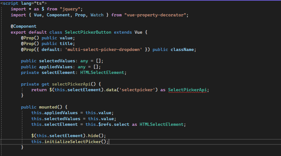
In the script section, we import the necessary modules and define the component class.

We will use the VueJs decorators below:
1) @Component: This defines a Vue component using a TypeScript class, enabling a cleaner, more structured, and object-oriented approach through class-based syntax.2) @Prop: In class-based components, this defines props, allowing a parent component to pass custom attributes to a child component.
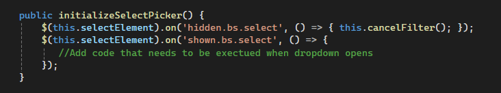
Step 3: Handling Events
We manage different events to improve the component’s functionality, including displaying and hiding the dropdown and applying and canceling selections.
Step 4: Adding Apply and Cancel buttons
We’ll dynamically create and insert the “Apply” and “Cancel” buttons into the dropdown using jQuery.
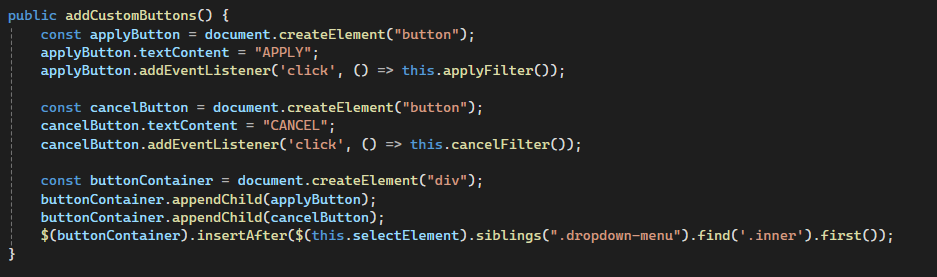
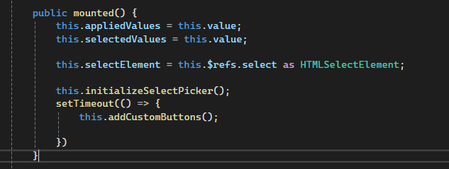
Update the mounted method to add these buttons to the UI.
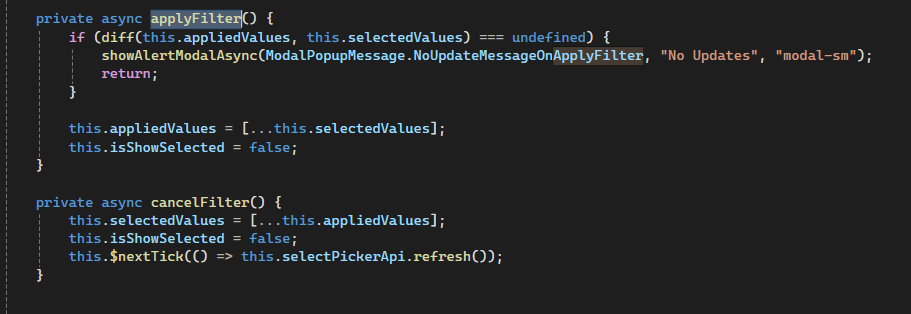
Step 5: Adding Apply and Cancel buttons functionality
Now, write code for the Apply and Cancel buttons functionality inserted into the custom select picker component dropdown.
Conclusion
By following this tutorial, you will successfully build a custom select-picker component with Vue.js that enhances user control and interaction. Whether you’re working on a complex form or a simple selection tool, this component can be adapted to meet your project’s needs. For further insights into improving your Vue.js components, explore the Vue.js official documentation. Testing the component thoroughly will ensure it performs optimally across different scenarios.