
About Ask Data
Ask Data lets you type a question in the same language and instantly get a response in Tableau. In Ask Data, answers come in the form of automatic data visualizations, with no need to manually drag-and-drop fields. Ask Data lets you ask Logical questions naturally, with support for analytical concepts like time series and spatial analysis, and an understanding of conversational phrases like Last year.
Before Starting the Process, we have to be very sure that our Data-source and workbook are published on the Tableau Server to perform the Visualization.
Steps to Use Ask Data: –
1. On the All-Lenses page at the top level of your Tableau Online or Tableau Server site
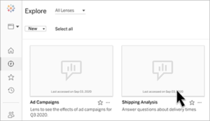
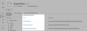
2. On the Ask Data tab for a data source for which lenses have been created
3. In an Ask Data object on a dashboard
Ask for Data from a lens page or dashboard object.
1. Navigate to a lens through the All-Lenses page in your Tableau site and the Ask Data tab for a data source or data object on the dashboard.
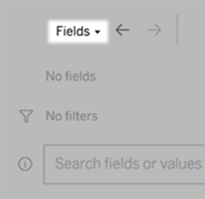
2. In the Data pane at the left, briefly hover over each field to learn more about the data it contains.
3. The Data pane is hidden in a narrow dashboard object, but you can see the same information by clicking the Fields drop-down menu.
Manually Build Visualization
How to Build queries visually

1. Click Add Field or Add Filter.
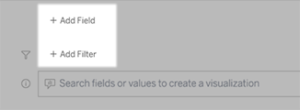
2. Click the desired field.
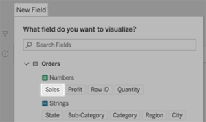
3. Set sub-options, such as aggregation type for a numeric field or grouping for string and date fields.
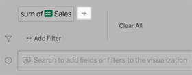
4. To add more fields or filters, click the plus sign.
How to Build queries by entering text
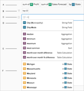
1. Type in the box “Search fields or values to create a visualization”
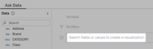
2. As you type, Ask Data searches data fields, functions, and string values and displays results in a drop-down list. Click items in the list to add them to your current entry, shown above the search box.
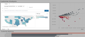
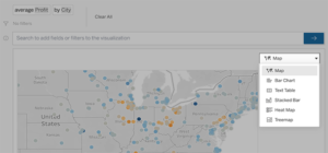
How to Change the viz type
We can change the visualization type according to data and for the betterment of the organization. It helps in making some good Visualization.
Click the menu in the upper right, and choose from these supported viz types, that’s how it is supported:
Bar Chart
Gantt Bar
Heat Map
Histogram
Line Chart
Map
Pie Chart
Scatter
Stacked Bar Chart
Text Table
Treemap
Change fields, filters, and displayed values
1. There are several ways to ask for data to fine-tune our data and show the values in the Visualization.
To switch the fields used for the vertical and horizontal axes, click the Swap Axes button to the left of the viz selection menu:
![]()
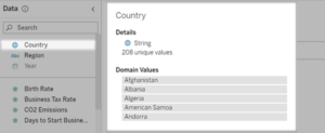
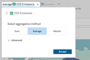
2. To change a field, click it in your query entry, and then click the field name below.
To change a field’s aggregation or grouping type (for example, we can see how to change the value from average to sum).
Click the field name in the text box and choose a different aggregation or grouping.
To Conclude
In this blog, we learned how to use Ask Data, which helps make easy and understandable Visualizations. It helps in reducing the time and builds various visuals.