Imagine your client explaining the following to you:
“I need help designing my data product. I want an interface that is smart, sophisticated, and knows me. I want it to learn about my habits and offer me suggestions for things I don’t know I want or need. I need to be able to find information from these six backend systems in an integrated interface that is quick to learn and easy to use. I don’t know what I want to find until I do, and until then I want to be able to visually see all of my options. And I want a beautiful, immersive experience.”As the designer, you simply reply with:
“So, you want a video game for data visualization.”
As a reader, you might be wondering – wait, what? How?
Well, that’s multi-dimensionality for you. Let me explain what I mean.
Multi-dimensionality, also known as the four-dimensional user experience (4D-UX), is an inclusive discipline that blends information architecture, visual design, usability, and human factors into an interactive experience. It transforms the 2D world into an immersive, exploratory landscape that allows the user to become lost in storytelling while simultaneously keeping them focused on a task. Cool, right?
It often includes Augmented Reality (AR)/Virtual Reality (VR), three-dimensional (3D) visualization and segmented storytelling. 4D-UX is enhanced by coupling business intelligence machine learning applications with the design.
It Exists due to the Challenges in Today’s Market
When designing for an ever-evolving digital age, we continue to push the boundaries of how to design an interface that is beautiful, engaging, and structurally sound. We are challenged to think outside the box of the established patterns and adapt interfaces to rapidly developing technology. This means looking at patterns that are not traditionally used in site design, like a game design for data visualization.
As a design pattern, multi-dimensionality can be very overwhelming because the sky’s the limit – but it is also very freeing. As designers, we can create space and time interactions that are not boxed into “this is the way it’s always been done.” We have the freedom to move into “what are the possibilities?” Let’s start by looking at the happy path – the backbone of standard design storytelling.
The Happy Path
It starts with a question, “what do we want the user to do?” or “where do we want the user to go?” From there, we build the foundation, create content, and layer in the visual designs, until a site or product has been created. Design elements don’t vary much from traditional places. Company branding, navigation, and user-centered actions go to the top of the page. Privacy links, cookie policies, and company links all belong at the bottom of the page, while the center is reserved for visual storytelling and content. In this 2D design metaphor, everything has a place and is generally exposed to the user.
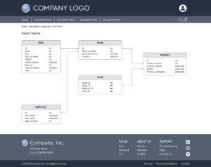
But the happy path isn’t straightforward and may not exist at all in 4D-UX. There are tasks we want the user to perform, but how they get there, how they interact with content, and how they leave, will vary from user to user.
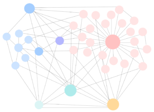
This means the traditional way of designing interfaces must change to accommodate this new narrative in storytelling. The end interface becomes a combination of sequential storylines and a decluttered front end to encourage the user to explore and discover. Think of it as a “choose your own adventure” story. Who doesn’t want something that’s created personally just for them?

This type of experience requires UX designers to think outside the standard patterns for site design. In the 4D design metaphor, everything still has a place, but the physical space is utilized very differently.
Considerations for Implementing This Trend
Believe it or not, these are all lessons learned from the gaming industry.
There is a relationship between a player, space, and point-of-view (POV) that takes into account how much of a screen a user will see at a given time before they need to move to a new location. This field of view (FOV) is roughly 90-100 degrees from where the user is looking at the screen. This is where the user is the most comfortable viewing information. A smaller FOV can lead to disorientation, dizziness, or nausea, while a wider FOV can lead to information overload. This physical FOV helps us design 3D spaced in a physical two-dimensional (2D) world.
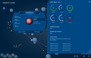
Design-wise, menu bars are no longer pinned to the top or sides of the page. Links to content no longer occupy the bottom of the screen. Copyrights, cookie content, and terms of use are removed from view. The focus of the interface is front and center, and content that is not relevant to the experience is removed or put into drawers in other areas of the screen. A mini-map gives the user context of where they are in the visualization in relation to the universe.
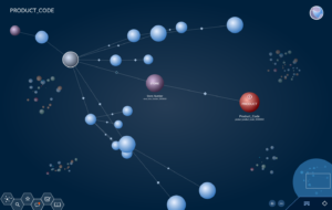
Drawers are contextually based upon where a user is and what they are doing. Interactions are focused on small tasks and are layered into the user view space.
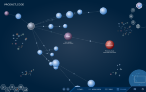
Contextual content appears when the user interacts with it and often has a larger amount of content than a traditional onHover tooltip.
So, Why Not Level up Your Web Design?
Multi-dimensionality can take your web design from traditional to inspirationally out-of-the-box. Yes, it can be done – just ask our experience design experts. For more information on other popular web design styles, read our web design styles series today.

