Since the beginning of 2021, Y2k trends have taken over pop culture and fashion. In fashion, we saw butterfly hair clips, bucket hats, and low-rise jeans. In technology, cord headphones became cool again, and Samsung released a new-age flip phone. Design trends moved with pop culture. We started seeing grunge aesthetics, colorful gradients, holographic patterns, space-inspired themes, neo-brutalism, and even some literal early web graphics.
Some in the design community embraced the trends with delight, while others left their heads scratching as to why on earth would you start using these messy, almost hard-to-use designs? The truth is, pop culture and design trends are cyclical. They rotate going back every 20-25 years or so. Y2k trends reflect early 80s trends, 80s trends were inspired by some late 50s trends. This is just enough time for the population to almost forget about the old trend and reemerge as something that feels new and fresh.
This trend-reemerge feels different though. Perhaps it reminds us of a time in the early web design when technology felt opportunistic rather than an overwhelming clutch.
The Y2k has a distinct style that is very divergent from the clean, simple, or minimal design trends that have dominated the space for the past ten years. To be truly educated in the new wave of design, we need to understand where it originally came from. Remember when we mentioned designs are cyclical? We will go all the way back to where Y2k came from. We’ll go back to the 50s, from a niche design trend of its time called Brutalist design.
So What about Brutalism?
Brutalism references the brutalist architecture movement which emphasized the raw materials of design. The digital style trend is defined by exposed grids, strong typography, layering, limited color palettes, and an almost unstyled HTML look. Turn of the century-inspired web graphics with bare HTML or a glitchy, grunge feel. In fact, it is very “anti-design.”
Some either love it or hate it but no one can deny it – it’s somehow provocative. The industrial, raw look in web designs gives the impression that it has “nothing to hide.” It feels bold, honest, stands its ground, and empowering. It’s care-free. If these fit any of your brand identities, then you might consider the brutalist design.
Brutalism seems to intentionally break the rules of clean, safe, and easy-to-use patterns are the standard for today’s web design. In many ways, this is still the best approach to great a user experience (UX), except that everything started to look the same and became a bit boring. Brutalism is the rebellion against the stale “sameness” and purposely breaks the rules. There is a certain vibe to it. Brutalist design says “I’m different, I’m cool,” and it reminds you of the “bad boy” from the breakfast club.
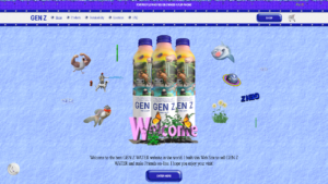
For example, take a look at Gen-Z Water, a sustainable water bottle company, chooses an entirely turn-of-the-century-inspired site design.

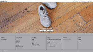
Even Balenciaga uses brutalism grids throughout their shopping experience to make their web design look more industrial and off-the-wall.

When to incorporate the trend and its benefits
Brutalism creates interest and grabs attention in a time where everyone is competing for short attention spans. It stands out from mainstream website patterns and feels like its cutting edge comparably.
It’s very fresh and almost a sigh of relief (with excitement) when everything else is cookie-cutter.
There is something alluring about the way it unlocks a hidden desire everyone must break free from the rules and normal demands of society. This design trend is great for brands who a product that is meant to entertain or try to stand out in the consumer goods space. It is also great for an audience that takes interest in art, design and fashion because of the “shout outs” to past design trends within that community.
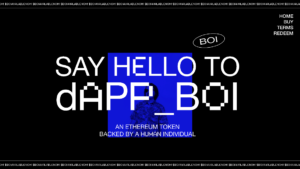
Dappboi.com, a digital coin, chooses to use brutalism to stand out against the other coin options.

Considerations when implementing the trend
Brutalism design is a great design choice for everything we mentioned above. However, to implement the trend correctly, it’s important to find a design team that understands UX and sophisticated user interface (UI).
If done incorrectly, hierarchy can be a problem, and a design too chaotic can cause anxiety for the end-user. Due to its unconventional nature, it can cause some trouble wayfinding for those who might not be as tech savvy. The call-to-actions and navigation are not always in obvious places, so it might not be the best choice for industries like healthcare, where time is of the essence and fast wayfinding could mean saving someone’s life in a few minutes.
For the right product, Brutalist design is delightful and creates a unique and interesting brand identity. But you can’t go halfway in for incorporating Brutalism elements, you need to invest in it fully, or risk people wondering, “Was this an accident? Did something break in development?” To be successful, it needs to be obvious, intentional, and make a statement while still giving clear direction to the end-user.
One Last Thing to Consider
Even if you create an award-winning brutalist site, not everyone will “get” it. Some will criticize the design just as some people criticize modern or abstract art. This trend can make your brand identity very successful – but it favors the daring, innovative, and confident. For more information, check out our web design styles series, and contact our experience design experts today.


Amazing read! I am going to share the link with other people also to help them out.