SharePoint’s modern user interface (UI) provides web parts and a user-friendly experience. My favorite feature is the quick link web part, which is very easy to learn and adapt to.
In this blog, I will demonstrate how you can design your SharePoint page using a quick links web part with two different methods. We can use a quick link web part for documents, videos, pages, images, and to navigate to a particular section of the page.
Adding Quick Links to a Web Part
Follow the steps below to add quick links to a web part:
- Edit your page from the right top of the page
- Hover your cursor above or below an existing web part
- You will see a line with circled + as shown in the below screen
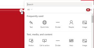
- Either search or scroll for “quick links.” Select it once you find it.
- Add your own heading for the quick link.
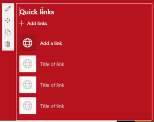
- Click “edit web part” to see more options:
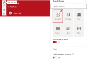
You’ll now see different layouts you can utilize in SharePoint:
Compact
The compact layout is the default layout selection. It’s generally used to show small images on the left side of the page or without any icon or image.

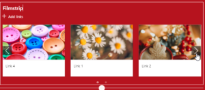
Filmstrip
A filmstrip layout is like a carousel slider as you can see below:
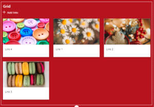
Grid
You can add any number of items in a grid layout. You can also use stock images in a grid layout.
Button
A button layout has multiple options, such as:
- Show descriptions
- Icons:
- Icon on top
- Icon on left
- No icon
- Button appearance:
- Outline
- Fill color (the color is connected to your SharePoint Theme)
- No outline
- Alignment
- Left
- Center
- Title text
- One-line
- Two lines
The screenshot below is an example of one-line text, button appearance outline, and left facing icon.
I personally use button web parts, as the look and feel are seamless.

List
In the list layout, you can hide the icon and show a description.

Tiles
We can decide on icon size in the tile layout, which also provides you the “show only icon or image” option.

Links You Can Utilize to Jump to Any Section on the Page
Add your content to the text web part as shown in the screenshot below. Click on the red link to get your URL.
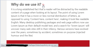
Note: To call a div link, we need to use heading 1, heading 2, and heading 3. The link will not generate for another font style.
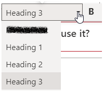
The link will display something similar to the below image:
![]()
Copy the link below, paste it in the box below, and press insert:
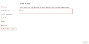
When you click on the link provided in your quick link, it will take you to the “Why Do We Use It?” section.
You can use “navigate within the same page” for “back to top” as well. Use the button web part, put copied the link, and change the alignment of the button web part to left or right.

Easy Quick Link Knowledge
A quick links web part is a good tool provided by SharePoint online, which gives a responsive look and feel to a page. For more information on quick links and web parts in SharePoint, contact our experts today.

