Create Power BI reports to effectively translate your business data
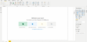
Microsoft’s Power BI is a versatile platform that allows users to connect to and transform data to make meaningful and interactive visualizations. With a familiar and intuitive interface, Power BI Desktop makes connecting to a data source and creating useful reports easy. Upon completion of your report, you can publish it from within Power BI Desktop to the Power BI Service where it can be shared and viewed in a web browser by the intended parties. All reports must be published in a workspace. Reports can be standalone or added to a dashboard and grouped with other relevant reports.
Power BI allows you to pull data from numerous sources ranging from basic Excel files to online services like Microsoft Dataverse. Because Dynamics 365 and Power Apps also use Dataverse to manage data, using it as your Power BI data source is the obvious answer if you intend to integrate your reports with Power Apps. Another benefit of using Dataverse with Power BI is the ability to alter data using Power Query, a feature accessible in Power BI Desktop. Using Dataverse as a data source also eases security concerns. The data is stored securely in the cloud and is only accessible to specified users via role-based security. Connecting to Dataverse from Power BI Desktop is a cinch. All you need is maker permissions to your Dataverse environment and the Instance URL.

While the ability to create custom low-code business applications in Power Apps is impressive, using Power Apps and Power BI in tandem can take business applications and insights to the next level. Say you have a Power Apps application that allows employees to submit expenses for manager approval. Each individual expense may seem trivial unless it is displayed in a meaningful way. Creating a Power BI report with graphs measuring frequency and overall cost of each expense category could help the manager visualize and draw conclusions about the most effective way to preserve company funds. Integrating Power BI with Power Apps would transform the way managers view expense data and in turn allow them to make more cost-effective decisions. Coupling the capabilities of Power Apps and Power BI gives you a head start when it comes to developing business applications that are functional, multi-faceted and tailored to your needs.
Link out to Power BI reports or display them directly in Power Apps
So, you’ve created your Power BI reports and your Power Apps canvas application. How do you intertwine the two? Once a report is created and published in a workspace in the Power BI Service, a shareable link to the report is created. Within your Power App, you can add a clickable label or button that will redirect users to the report in a new Power BI tab.
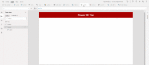
Depending on the context of your app, it may not make sense to take users to a new tab. In this case, you can surface a Power BI report directly on an application screen. Simply insert a Power BI tile then select the workspace, dashboard and report that you want to appear. When the app is published and shared, users can interact with the Power BI report from the app without having to navigate to a new browser tab.

There are some prerequisites to showing a Power BI tile in an application. First, the app and the report must be created in the same environment. If your app and report are using the same data stored in Dataverse, this should already be handled. You will not be able to add a report to an app if they are not in the same environment. Another condition that may not be as obvious is that the report must be shared with anyone who needs to view it from within the app. If a user has permissions to view the app but not the report, the Power BI tile will appear empty for that user.
Make the most of interactive, responsive visuals
Power BI offers many visualization options. Customizable tables, charts, graphs and maps (to name a few) bring your data to life. Once a visualization has been added to the report, you can select the fields you want displayed. You can also set a color theme and font selection to make sure your reports adhere to branding standards.
Although only report designers can determine which fields and graphics are displayed, report consumers can interact with visualizations by sorting and filtering the data displayed to meet their needs. Adding Power BI slicers to your reports allows end users to drill down the data shown in visualizations. This built-in functionality makes Power BI reports versatile and valuable for all business users.
References:
https://docs.microsoft.com/en-us/power-bi/fundamentals/power-bi-overview
https://docs.microsoft.com/en-us/powerapps/maker/data-platform/data-platform-intro
https://docs.microsoft.com/en-us/powerapps/maker/data-platform/data-platform-powerbi-connector
https://docs.microsoft.com/en-us/power-platform/admin/wp-security-cds
https://docs.microsoft.com/en-us/power-bi/visuals/power-bi-report-visualizations
Thanks to Chris Barber for direction and edits.


I enjoyed reading about Making Meaningful Data Reports with Microsoft Power BI. This article was really beneficial. Thank you and keep sharing posts.
Very nice blog. Truly helpful.
I have also written something relevant. Please check here- https://blog.integrativesystems.com/power-bi-benefits-features/
Thanks.