“I feel the need — the need for speed!”
Lieutenant Peter “Maverick” Mitchell
U.S. Naval Aviator
We’ve already shared why we think 2019 is going to be the year of page speed. Google’s been signaling its goal of faster web experiences for years, but in 2019, measuring and improving your site’s speed will become increasingly essential for successful healthcare marketers.
Overlook needed speed improvements and you’ll frustrate both Google and, more importantly, your hospital’s website visitors. The damage to your organic search visibility, campaign conversion rates, and overall user engagement could slow your 2019 plans before you even get started.
In this 2-part article, we first looked at the tools Google offers marketers to assess how they’re doing and where improvements might exist. We’ll now look at some leading health systems and see how ready they are for 2019. Most are poised for success but a few appear to have some work ahead of them.
There are many tools available to analyze the speed of your site and its key pages. We usually start with Google’s popular PageSpeed Insights tool. because it’s free and easy to use.
Recall, Google thinks of the page-loading experience the same way that your website visitors do:
- Is it happening? Did the navigation start successfully? Has the server responded?
- Is it useful? Has enough content rendered that users can engage with it?
- Is it usable? Can users interact with the page, or is it still busy loading?
- Is it delightful? Are the interactions smooth and natural, free of lag, and jank?
We tested the home pages of Mayo Clinic, Cleveland Clinic, Johns Hopkins Medicine, Massachusetts General Hospital, and Michigan Medicine. It’s an arbitrary list but, according to U.S. News & World Report, they’re currently the top 5 hospitals in America. If anyone has the skills and resources to optimize their web experiences, we figured it’d be them.
Take our findings with a grain of salt. We only looked at these systems’ homepages, overlooking key internal ones like physician profiles and service line pages. We also only ran the test once. Performance metrics and even Google’s recommendations can fluctuate and should ideally be watched over time.
And, of course, speed is in the eye of the beholder. If your users skew significantly to older devices or slower networks, Google’s field metrics can be less helpful.
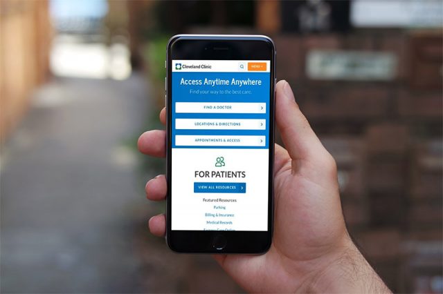
With those caveats, congratulations to Cleveland Clinic! Our data suggests they’ve successfully optimized their site—or at least their homepage—for speedy user experience on both mobile and desktop. There’s room for improvement but Google views them as in front of their 4 peers.
On mobile, Cleveland Clinic scored a solid 85 out of 100 on Google’s performance scale. This leads the 4 other systems that we tested by a healthy margin and almost makes them officially “fast” in Google’s eyes. A score between 90 and 100 is required to join that elite group of high performers.
Cleveland Clinic scored a more impressive 100 out of 100 on Google’s desktop performance scale. Google noted the site’s remarkable ability to render a meaningful amount of content and become interactive to a user in less than a second.
Where might Cleveland Clinic eke out additional speed gains? Google has a few recommendations that could potentially speed up mobile and desktop performance.
First of all, some of the page’s CSS styling and formatting rules are apparently unused and could in theory be removed, reducing the amount of data downloaded.
Similarly, modern image formats like JPEG 2000 and WebP use better compression algorithms than JPEG or PNG and could potentially shrink many downloaded files.
Also, the page’s initial rendering is seemingly being slowed by a number of non-essential Javascript and CSS downloads. Loading them later could help.
Lastly, Google suggests revisiting when the page’s offscreen images are downloaded. It may make sense to download them only “as needed”.
Consider recommendations like these carefully before personally acting on them. Not all of Google’s ideas are easily implemented, especially on a large and complex site. Some could affect your publishing workflows and require training. Others may only improve performance marginally and not be worth the effort. Perficient can help advise you on where to focus your efforts for maximum impact.
How’d the other 4 health systems fare in our testing? Without getting into specifics, Google’s assessment scores varied quite widely.
Mobile performance showed the most variability — from a disappointing low of 20 through a modest 70. No 2 systems had the same set of recommendations from Google, but optimizing images was a common theme. This makes sense; all these pages are rich with visuals that require precious bandwidth to download.
Desktop performance amongst the other 4 systems was much more consistent. Three of the 4 equaled Cleveland Clinic with a perfect 100 score and one lagged close behind at 88.
So, take heart if you’re just starting your journey to faster loading web pages. While Cleveland Clinic may have most of this figured out, they bring to the table certain resource and skill advantages not available to everyone.
Across Cleveland Clinic’s elite peers, it’s eye-opening to realize that even these leaders can do better — often with relatively straightforward improvements. With planning and effort, you too can join them as we all make the web a better, faster experience.


