
Implementation of PDF Connector in Tableau:
Step 1: Connect to your data.
Open the Tableau tool, and go to the ‘Start Page.’ In the Connect pane you can find all the connectors to connect to the various sources. Start page and Connect pane as below:

Because you are going to use source as PDF and Excel files, I have highlighted those in the above screenshot. Under the Connect pane:
- If Source data is File, you can connect to the data using ‘To a File’ option to connect to different files Such as Excel, PDF, Access, JSON file etc.,
- If Source data is database, you can connect to the data using ‘To a Server’ option to connect to different databases such as MySQL, Oracle, Teradata etc., and for cloud databases such as Amazon Redshift, IBM BigInsights, Spark SQL, etc.,
Source PDF file:
Using PDF file option in Connect pane, you can fetch the data from the PDF file
- Click on PDF file, you will get a pop-up for browsing path of the file from the system
- Then, you will get a pop-up ‘Scan PDF file’. In this by default the page range is ‘All’ but if you want you can specify the page range as well as like below:

- Specify the range and then give the ‘OK.’
- It will direct to the next window as shown below:

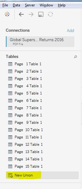
- Once you import the PDF file, it converts all the page’s data into tables like ‘page 1 Table 1, Page 2 Table 1’ and so on as shown in the left pane in the above screenshot
- For combining all the pages into one table, you should use ‘New Union’ option to do union and merge all pages into one table
NOTE: For Union operation, every page in the PDF should have same header. If the headers are different then it will consider the next row as new column in the same table.
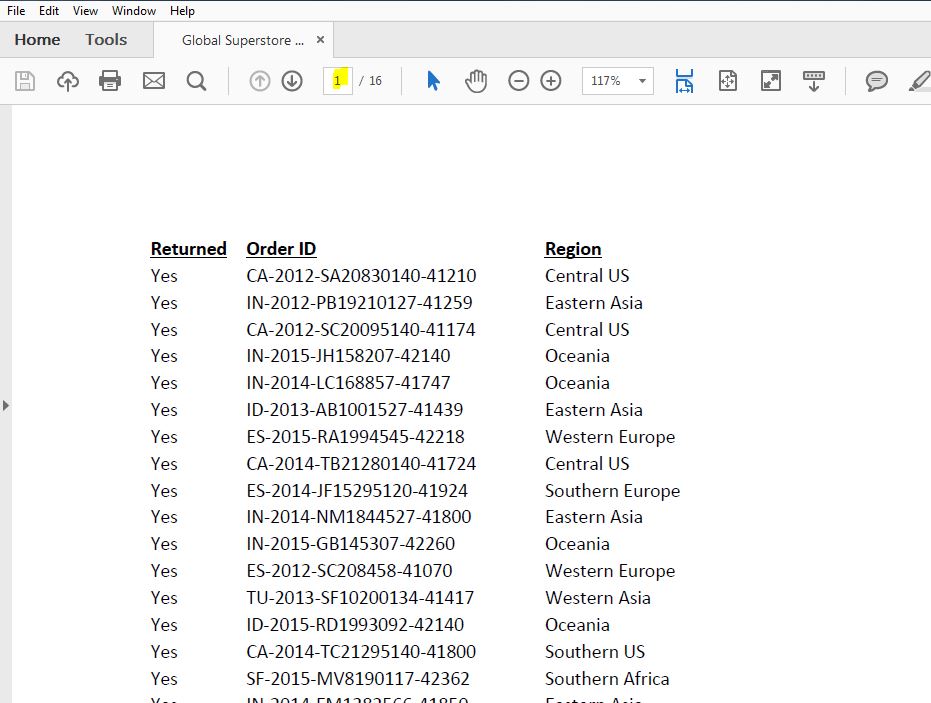
The source data in PDF file as below,
Page 1:
Page 2:

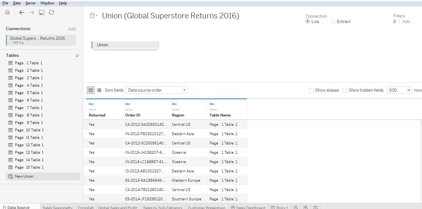
- The headers are same, so by using ‘New Union’ option you can do union all the pages into one table as the screenshot below,
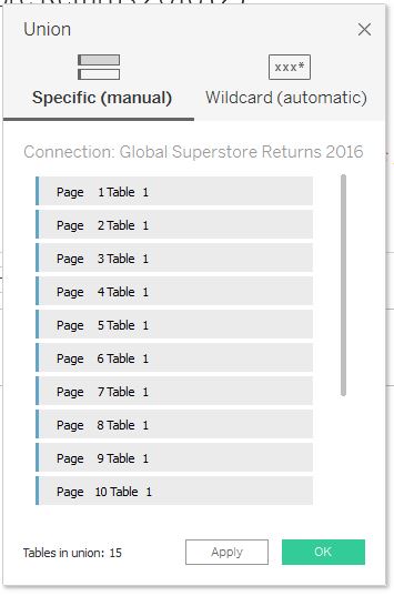
Once you click on ‘New Union’ you will get one more pop-up ‘Union’.
- In that you have two options to specify manually or Wildcard (automatic)
- When specifying automatic, it will take the whole PDF or you can specify any blank pages to be removed and then it will load the data
- When specifying manually, you should drag and drop all the pages into that table and then it will load the data as like below,

The data will be loaded as like below screenshot:
Source Excel file:
Excel data as like below:

- We can import different source data by using option ‘Add’ in the left pane in the screen below, like the PDF file we loaded:

- In the above screenshot, the total sheets present in Excel will be extracted in the left pane under ‘Sheets’
- You can drag and drop the sheet that is needed for the analysis. So, by default it will perform ‘Inner Join’ on the data
- If you want to change the Join you can click on the circles and it shows the joins, you can select the join that is required as below,
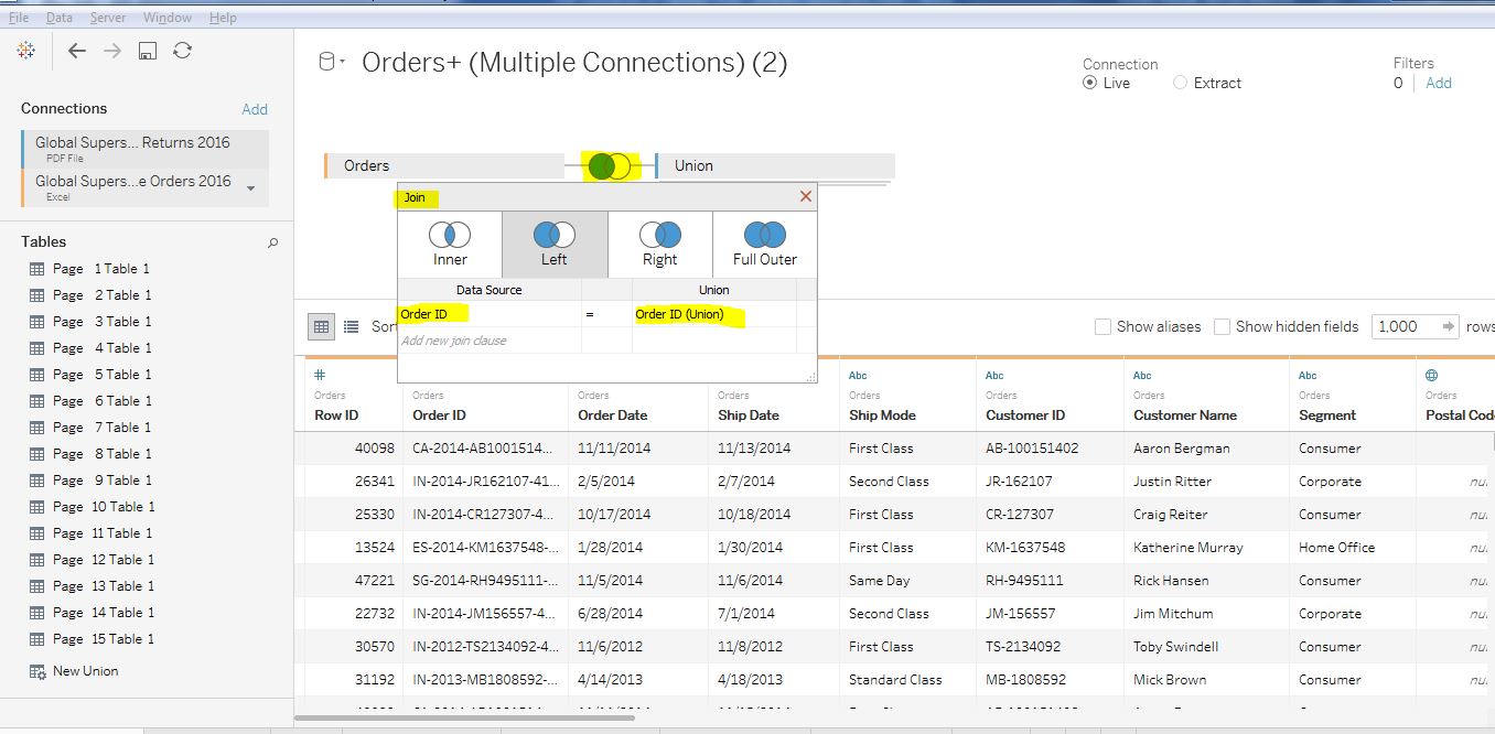
- In the above screenshot, we are giving OrderID as key from both the sources we have extracted and if we want, we can change the key id as well
- Here, I have performed Left Outer Join for this scenario as seen in the screen above
Step 2: In the New Worksheet as ‘Global Sales and Profit’
scenario: To get the overall sales and profitability for the company and identify key areas for improvement.
- First, you need to take the sales profit and loss globally
- If you know which columns to take from the data but don’t know to use which graph suits best for the data, tableau suggests the graphs through the option ‘Show me’ on the right pane in the screen, so that we can select which suits best for our analysis
- As we are taking the global wide sales, I felt map is best as in the below screenshot, I have highlighted the option ‘Show me’ and the columns that used for analyzing the data
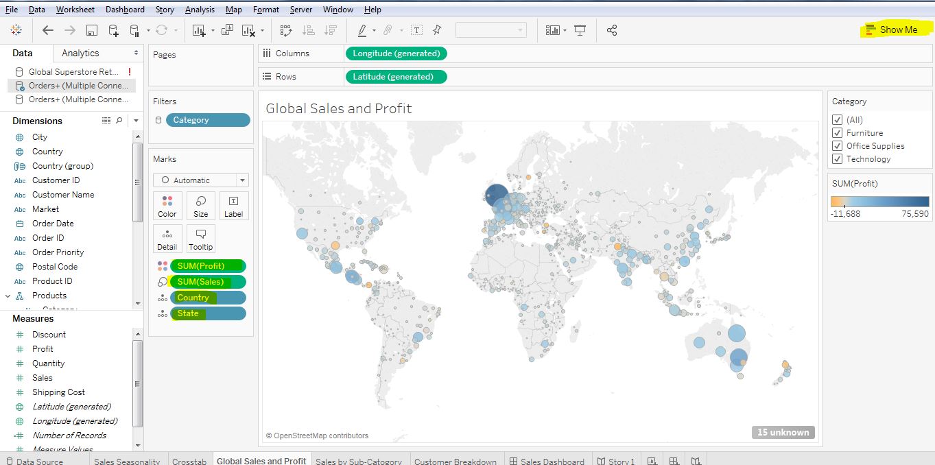
- Drag and drop category of the product into the filters. So, in the right pane we will get the option to perform filter on the data easily

- In the ‘Marks’ pane on the left, Drag and drop the field Profit on the Color so that the profit looks in different colors everywhere and Sales filed on Size to show the sales in different size, Country column and State column on Detail so when we point particular circle it will show the details of particular state
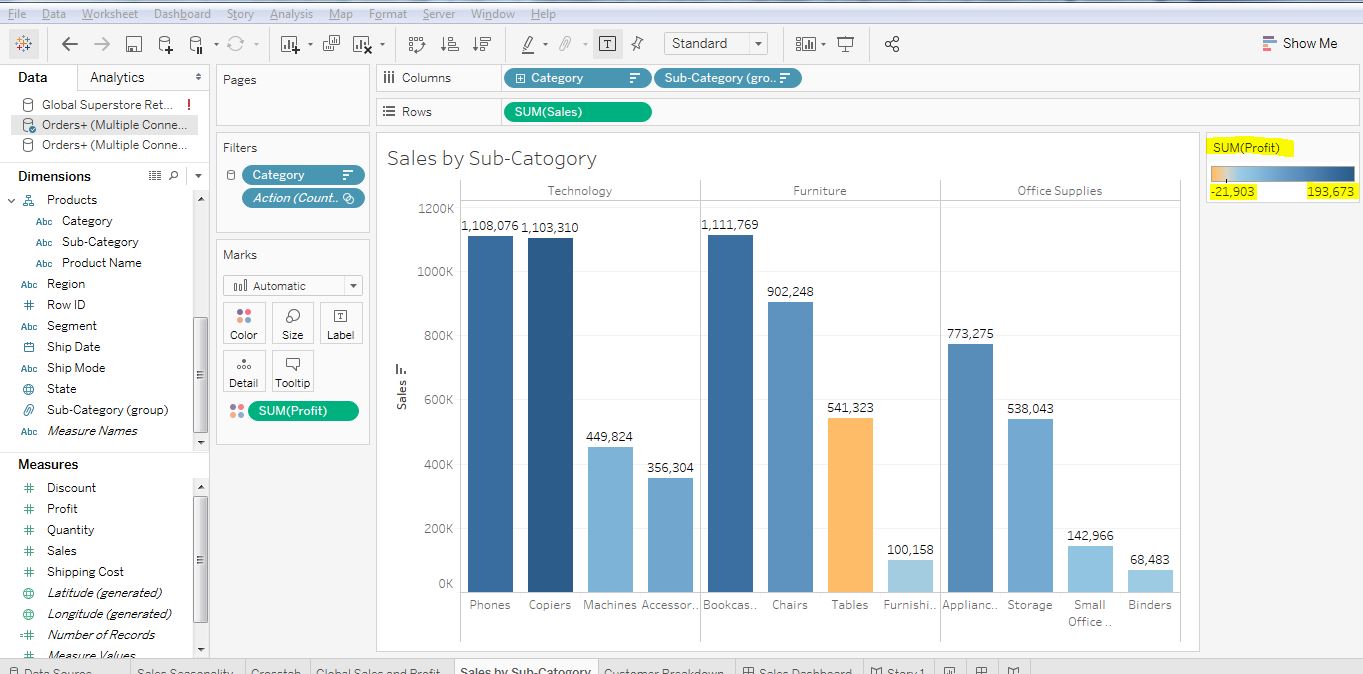
Step 3: In the New Worksheet, we are doing analysis on ‘Sales by Sub-Category’
- In the below screenshot, we are going to analyze based on the sales by sub-category which contains about all in detail
- In this we have three categories (Technology, Furniture, Office Supplies) and every category has sub-categories. So, analyzing on the sub-category will give in detail about all the products under it shows the loss and profit.
- On the right pane, I have highlighted the sum(profit) so by the colored bars we can come to know the loss and profit
Step 4: In the New Worksheet, we are analyzing on the ‘Customer Breakdown’
- To know whether the profitability issues may be because of shipping cost
- In the below screenshot, to know the profitability we drag and drop field shipping cost to columns and field profit to rows
- Drag and drop the category field on to the ‘Shape’ in the left pane under the ‘Marks’
- Drag and drop the Customer ID field on to the ’Detail’ in the left pane under the ‘Marks’
- In the below screenshot, on the right highlighted pane the shapes are given to which category it belongs

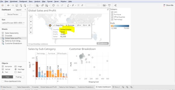
Step 5: The Dashboard creation having all the required worksheets on one sheet using ‘New Dashboard’,
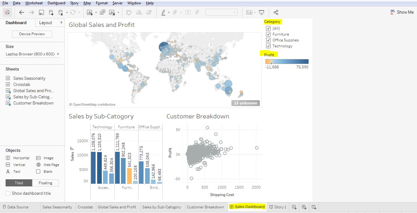
- Once you have everything required on one dashboard, our analysis becomes easy because I can select the state in the map. So, that the details related to that state will be appeared
- For eg: I am taking Texas state down in the screen shot below
- In the same way you can filter the data in the right pane under ‘Category’ and the profit of particular sub-categories are specified based on the colored bars
Step 6: You have an option to write the story points as well once we analyze where you are losing the profits using ‘New Story’,
- The story points are highlighted in the screenshot below, like that we can take a note of the important points analyzed

Tableau Glossary:
Dashboard:
A Dashboard is used to gather all the required information and various worksheets data at one place so you a user can easily compare and perform the analysis. Whenever you update the worksheet it gets effected in the dashboard as well and vice versa
Story:
A Story is points you gather together to deliver information and the points can be taken down from the analysis done so that it will be easy to narrate, demonstrate about the decisions of the outcomes
NOTE: Sample files are taken from tableau website only.