
As featured in MediaPost
- Study of 855K search results published in February 2015 (study data is from December 2014)
- Study of 1.4M search results published in October 2015 (study data is from July 2015)
- NEW! Featured Snippets: New Insights, New Opportunities: Published May 2016 with latest data on growth of Rich Answers and new revelations about Featured Snippets.
In the study publishing today, I’ll focus on the 855K queries we’ve been tracking since December 2014.
TL;DR
As seen in Entrepreneur.com
The major new finding that I’m publishing today shows that Google’s featured snippets (see definitions in the next section) are going through a rapid rate of churn. More than 55% of the queries that show featured snippets in our January 2016 data (which is what I’m publishing today) either didn’t show a featured snippet in July 2015, OR, shows a different URL for the featured snippet than it did in July 2015.
[Tweet “55% of Google Featured Snippets are new or have a new URL since 2015. See study at”]
This seems to indicate that Google is using an automated process (but it’s NOT machine learning) to optimize their use of featured snippets. They test different featured snippets on a rapid basis in order to find the best possible result for their SERPs. You can read more about this in the section called “Massive Churn in Featured Snippets” shown below.
In addition, it should come as no surprise that the volume of rich answers shown by Google has continued to grow. Looking at our 855K test queries, you can see the growth in this chart in one quick nutshell:

[Tweet “Google’s Rich Answers (aka Direct Answers) have almost doubled in SERPs since 2015. More at”]
Note that this data doesn’t include Knowledge Panels (see definitions in the next section), but rich answers including these also show a similar level of growth.
Definitions
Confused about which term means what? You’re not alone, as there are many different facets and features to all the types of rich answers that Google shows. This section will help you with some definitions.
- Knowledge Graph: This was initially launched by Google in May 2012. Knowledge Graph refers to the program where Google is building a massive database of information. There are many components of this, but most of the information today consists of a massive database of public domain information, such as how to convert from gallons to liters, or the capital of Egypt.
Another key part of the Knowledge Graph is that Google has learned a lot about “entities”, and the relationships between them. For example, they know that the Empire State Building is a building, and that it has attributes, such as when it was built, an address, nearby restaurants, and much more.
Lastly, the term Knowledge Graph refers to the database of information itself, and isn’t a label for how this type of information might be displayed in the SERPs.
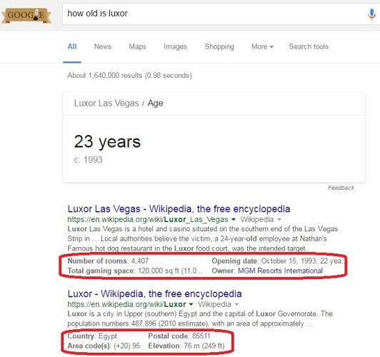
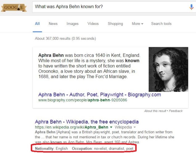
- Knowledge Panel: There are many queries where information from the Knowledge Graph may be displayed in the search results. Sometimes this information is shown over on the right sidebar of the SERPs. While I don’t believe that Google has a label for this display format, Danny Sullivan coined the term “Knowledge Panel” for it. Here is an example of one (red highlighting is mine):

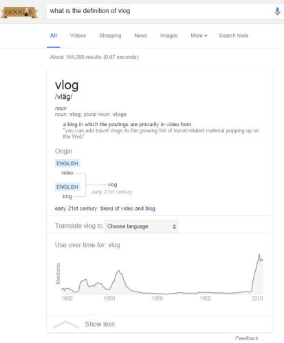
- Knowledge Box: Sometimes data from the Knowledge Graph is shown above the search results instead of over on the right sidebar. This can come in many forms, and here is an example of one with a form:

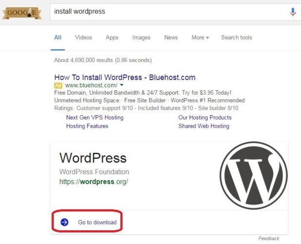
- Featured Snippets: Featured Snippets are an answer pulled from a third party website (and not the Knowledge Graph). Unlike the other terms, this one is a term officially shared by Google. Featured snippets also come in many forms, but here is an example of one that is displayed as a step by step procedure:

- Enhanced Snippets: This is another one without a specific term that we know about from Google. In this case, Google adds rich information snippets to a regular search result. I’m going to refer to these as Enhanced Snippets, and here is an example of one of these:

6. Rich Answers or Direct Answers: There is no official label from Google for all of these formats collectively either. At Perficient Digital, we refer to these as Rich Answers. Others, such as Danny Sullivan, refer to them as Direct Answers.
Massive Churn in Featured Snippets
There are significant challenges with Featured Snippets for Google. The two main ones are:
- Effectively detecting sources of information for Featured Snippets, and extracting the information from them
- Testing these and assuring that their display improves overall search quality
Over time, we’ve observed a strong tendency by Google to experiment with content extracted from different sites for use in Featured Snippets. The study I published in October 2015 showed a procedure for obtaining Featured Snippets, but getting them, and keeping them for the long term are different things.
The former requires that you structure your content in a certain way to answer a specific question. But, keeping a Featured Snippet once you get it, (in my opinion) requires that user engagement with your Featured Snippet in the search results is high enough that Google decides to keep it.

My belief is that Google deliberately churns through possible Featured Snippets and actively tests their impact on overall search quality. I’ve seen many different sites tested as a source for a Featured Snippet, and I’ve seen queries that have one for a while and then it was taken away entirely.
As part of this study, we’ve collected data on how significant that churning process is, and the scope of it surprised me:

That’s right. While we see a total climb from 244,500 to 260,987, which represents an aggregate increase of only 6.7%, the reality is that 55% of all the Featured Snippets shown in January 2016 were new, either because the search query never showed one before, or because the URL selected to show one changes from what was used in July 2015.
[Tweet “55% of Google Featured Snippets are new or have a new URL since 2015. See study at”]
Of the 182,907 queries that showed Featured Snippets in both July 2015 and January 2016, 35.8% of them changed the URL that was used to generate the result.

As part of this study, I also received some data from SEMRush, as their tool includes tracking of Featured Snippets (and other special search features as well). In that data, the focus was on 12,000 keywords from the SEMrush US database, where each keyword started with the word “how” (e.g. “how to open a wine bottle”), and they all had a monthly search volume greater than 2000. Their test dates were April 2014 and April 2015.
6,989 (58.2%) of the 12,000 queries examined returned Featured Snippets in April 2015, and 3,062 (43.8%) of them were new queries that didn’t show a Featured Snippet in April 2014.
Taking a look at the 3,927 queries in the SEMRush data that returned Featured Snippets in both July, and January, here is what we see:

In addition, if we look at this from the point of view of how many of the queries showed Featured Snippets in January 2016, and how many of these also showed a Featured Snippet in June 2015, AND used the same URL for both dates, this represents only 45% of the total:

In other words, the 55% shown above represents the quantity of queries in January 2016 that:
- Showed up on a query that did NOT show a Featured Snippet in June 2015, OR
- Showed up on query in both June 2015 and January 2016, but changed the URL used in the Featured Snippet
Once again, we looked also at the SEMRush data, and here is what we saw:

The “Total Churn” shown in the SEMRush data is actually even higher, with 74.9% of total Featured Snippets coming from new queries, or queries where the URL used changed.
This massive churn might lead you to question how well this program is going for Google, but I believe it’s going extremely well. My speculation is that the churn we see represents a sophisticated optimization process that uses constant testing to improve the overall results. At the scale at which this is happening, this has to be a computer-driven process.
If I’m right, this is arguably a new form of automation being applied by Google, whose main attribute is to measure the performance of a system (in this case the user engagement with the search results that include a Featured Snippet), test different sources and types of Featured Snippets, and then dynamically tune the system for the best possible performance. Note that it’s not what you would call machine learning, but a different type of system entirely. It’s very cool stuff!
More Details
Google does more than test the presence of different sources for Featured Snippets. They also actively test different display formats as well. As a result of this, different formats rise in prominence as they test them, and may drop over time if they don’t work out that well. Here are some examples of changes in levels of usage of different formats:
Directly from Google: These are basically results that get pulled from the Knowledge Graph. The quantity of these went from 73,842 to 121,169, an increase of +64.1%. Here are a couple of examples of these types of results:

[Tweet “Knowledge Graph direct answers increased 64% over last year in our sample queries. More at”]
And, because I always like to show an example of queries that are incorrect. This one is supposed to show the distance from San Francisco to Canada:

The problem with this one is that the person submitting the query was probably NOT thinking about the center of Saskatchewan as being Canada. Most likely, this query is intended to ask about the distance to the Canadian border.
Has Anchor Text: These are queries where Google shows some form of rich anchor text as part of the link in the Featured Snippet. These decreased from 266 to 37, for a drop of 86.1%. Here is an example of one of these:
Has Enhanced Snippet Total: I defined an example of this above in the Definitions section. The total number that Google shower across our query set increased from 26,349 to 77,745, for an increase of +195.1%. Here is the second example of one of these:
Has Both an Enhanced Snippet and a Knowledge Box: This involves the combination of both elements, and these increased dramatically, from 9,066 to 37,287, for an increase of +311.3%. Here is an example of one of these:
Has Chart: This particular format includes a graphical chart as part of the result. These scaled from 7,583 to 16,387, for an increase of +116.1%. This image shows an example:
The End of Comparison Queries?: This is one that I, unfortunately, don’t have detailed data for, but I’ve observed via more casual testing. Google used to show results similar to this one:

This also used to work for queries such as fruit comparisons (e.g,. apples vs oranges). But now these appear to be gone from the SERPs:
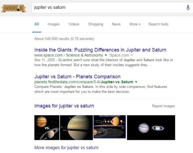
Just another casualty of a ruthless, ongoing, testing process. Evidently, these results didn’t play that well with users.
Summary
Two themes emerge from this study; an ongoing push to expand the scope of this feature, with an increase from 32% to 41% across our query set since July, and: a dramatic level of churn in the featured snippet results.
I fully expect both of these trends to continue. Google sees a great deal of value in this program and is continuing to double down on it. To that end, it’s worthwhile to learn how to improve your chances of being included within Featured Snippets, and you can learn more about that here. Also, sometime in the next 60 days, I plan to publish the results of an expanded test showing how you can get those results for your site.