Mood boards. I love them. You’ll love what they can do.
Why? As a graphic designer, using mood boards is one of the best ways for me to find a design direction. But more importantly, they help our clients decide what they are looking for – and articulate what they really want.
Plucking images, layouts and colors from existing designs can give your entire team a better understanding of your desired look and feel. Plus, the process gives you tangible visuals and a clear concept direction – without anything getting lost in translation. Case in point: what I might think is sleek and modern, one client might describe as simple and boring. With a mood board, it becomes easier for everyone to speak the same language.
WHAT MAKES UP A MOOD BOARD?
- Texture
- Design elements / inspiration
- Lifestyle images
- Color palette swatches
REAL-WORLD EXAMPLES
Asking your graphic designer to create a mood board is a great starting point. That collection of images will offer objective visuals for discussion and create a unified vocabulary.
How does it really work? Here are a couple of layout options we recently shared with a client.

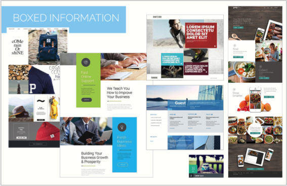
Option 1: Boxed Information
As you can see, this visual board spotlighted content with boxes. Splash colors helped enhance information and expanded a limited palette with a few fresh colors.
Large boxes were used to showcase fun or important messages.

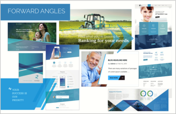
Option 2: Forward Angles
This approach introduced an overlapping of color to create more variation within a limited color palette, using subtle hue changes to strengthen visual interest.
This technique was also a great way to bridge their services, which were currently perceived as separate by their customers. It visually emphasized how these services overlapped and enhanced an overall perception of collaboration.
NARROW IN A STYLE
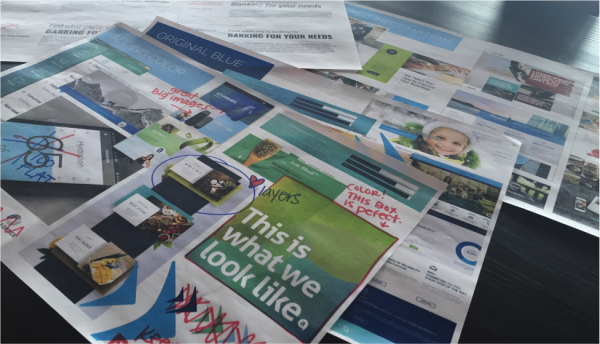
Take notes! Scribble on printouts, “X” out the junk and circle the favorites.
One of the advantages of using mood boards is narrowing and focusing direction – for the sake of both your company and your designer. Meetings with mood boards are meant to be collaborative, so you can discuss why you like or dislike elements. You all get the opportunity to explain your thoughts without any guesswork.
After all, sometime it’s hard to explain what you want. As you point out the items you like (and don’t), your designer can also educate your team about design terminology to describe those elements and techniques – keeping everyone on the same page, using the same vocabulary.

KEEP EVERYONE ON TRACK
Need one more good reason for working with mood boards? They can be your compass for consistency.
Throughout the life of a project or campaign, it’s common for some clients to start changing or adding elements. Don’t get me wrong: there are times when it’s great to make revisions. But sometimes teams simply get tired of looking at same designs for a long time. When someone feels the need to add, break out the mood boards and go back to why you landed on this style in the first place.
THE BIG PICTURE
As a designer, there is nothing worse than creating a pixel-perfect design, only find out that it misses the mark. So if you’re excited to see your look evolve, give mood boards a shot. The results? Better design options for you. Better direction for your designer.
And whatever your style may be, that’s always a beautiful thing.

