Today is the day that the official Skype For Business Client gets released!
I have been using the Technical Preview for about a week now and can honestly say that I like the new Skype-influenced interface. I have a couple customers that have been waiting for this new UI to come out before they begin their client rollout, because they feel that there will be better user adoption due to the familiar Skype interface. Microsoft has released some Client Awareness and Readiness resources to help organizations educate their end users and have a smooth transition to the new interface. These resources can be downloaded here.
This client update is available for the Office Pro Plus and Office 2013 Professional Suite. I am expecting an update to the Mobile client as well but I have yet to see too much information on it and it has yet to show up in my Google Android App Store. The update for the Professional Suite comes in the form of a patch for the Lync 2013 client – KB2889923 – and is currently available via Windows Update. The manual patch installer will eventually be made available here for download. Depending on your organization’s Lync policies, you may or may not see the new client UI as it can be controlled via a Client Policy with the attribute of EnableSkypeUI and by a registry key – more info on controlling the Skype UI can be found here.
The new client version is 15.0.4711.1002 if you would like to check to see what version you are running.
I did not have any problems updating my Technical Preview client via Windows Update, all that was required was a restart.
Now on to the actual client interface, there are almost too many UI tweaks to cover. I will hit on a few that I think are the best (in no particular order).
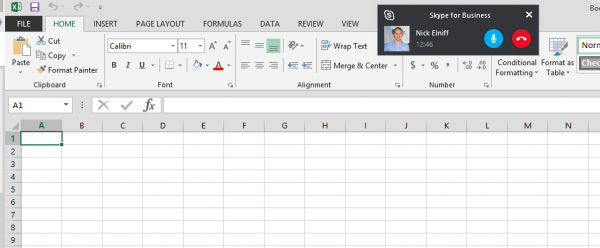
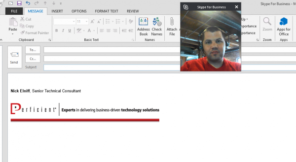
- Call Monitor – this is a compact window that will allow you to monitor the call you are in while the main call window is not up, allowing you to focus on another program. You can see the duration of the call and can mute or end the audio or video call from this collapsed view.
- Audio Call Screenshot
- Video Call Screenshot
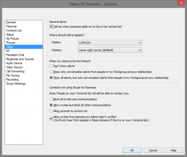
- Alert customization – I can control where my alerts appear by choosing between multiple monitors and the position that the alert toasts pop up.
- Call Window – there is no more hovering to select options! The new call control button now includes the dial pad, Call Transfer, Hold, Devices, and call volume .

My only complaint about the new Call Window is that the Participant List, Add New Participant, Instant Messaging, Call Control and Meeting Options are spread out to each corner of the window – depending on your screen real estate this can be a bit of a pain to navigate between but you can tell they had the touch experience in mind.


