I have been asked the question so many times now, I thought it would be a perfect opportunity to post a blog about it. This way I can just forward a link to people instead of blowing air at ’em.
Here it is: “Why can’t I just have an image in the foreground with text in a carousel?”, “Do I have to do it as a background image?”, “I don’t get it.”
It’s actually a pretty simple concept, thankfully. Typically your carousel image isn’t going to be a slideshow of ‘portrait’ oriented images. They are almost always oriented as ‘landscape’. What happens when a user is looking at a rectangle shape on a phone? All of a sudden they are basically looking at a sliver of a picture. The rectangle becomes squished inside of a square in effect (which is perfectly fine). But, what if there is text that needs to be associated within that little sliver of a picture? You’ve lost all of your height. Should it go to a microscopic font size?
Eeeaughhhh.
No.
And you know what? Bootstrap got it wrong too in one of their examples getboostrap.com. I think they’ve made a quick-fix to address it on their latest version by using a solid gray image instead of a real image. Download it and swap it out with an actual image. I dare you. I’ll show you the original version that includes the same markup but includes actual images, but I’ll get to that in a bit.
Anyway, time for some examples. We’ll go through three of them.
- Bootstrap’s way (WRONG, but close)
- Image in the foreground (WRONG)
- Image applied as a background (CORRECT)
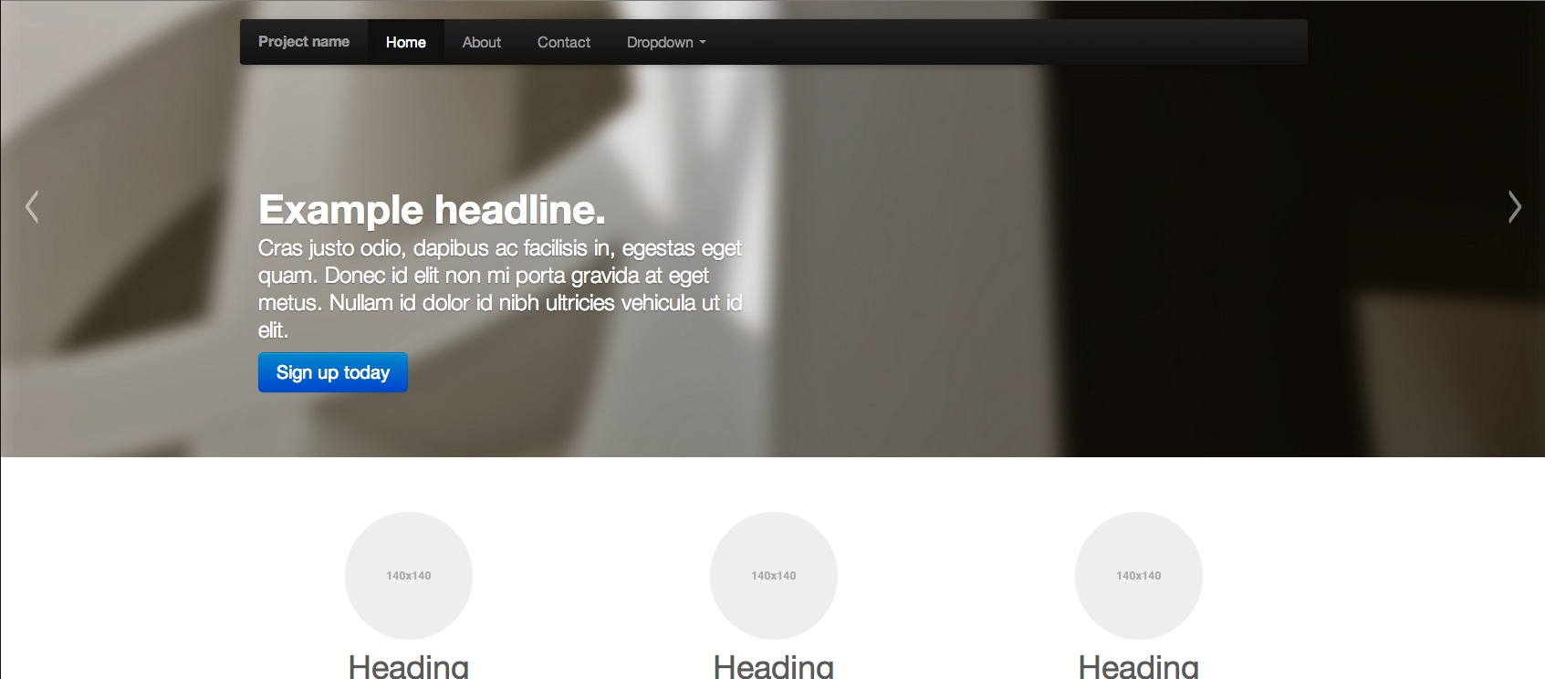
Boostrap’s way
(Desktop view)
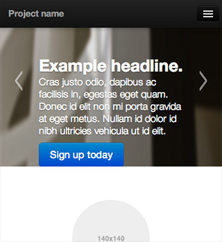
(Mobile view)
(The markup)
<div class="item">
<img src="img/slide-02.jpg" alt="">
<div class="container">
<div class="carousel-caption">
<h1>Another example headline.</h1>
<p class="lead">Cras justo odio, dapibus ac facilisis in, egestas eget quam. Donec id elit non mi porta gravida at eget metus. Nullam id dolor id nibh ultricies vehicula ut id elit.</p>
<a class="btn btn-large btn-primary" href="#">Learn more</a>
</div>
</div>
</div>
Looks fine, right? The answer is no. The image in the ‘background’ has a preset height applied to it, so this means that it doesn’t scale properly. It gets distorted quite a bit via smaller screens. It may seem hard to tell since the image is kinda vague and blurry. Here’s an example.
See how ‘squishy’ the image gets as you change the viewport size? Bootstrap has answered this by providing a plain, gray image now instead.
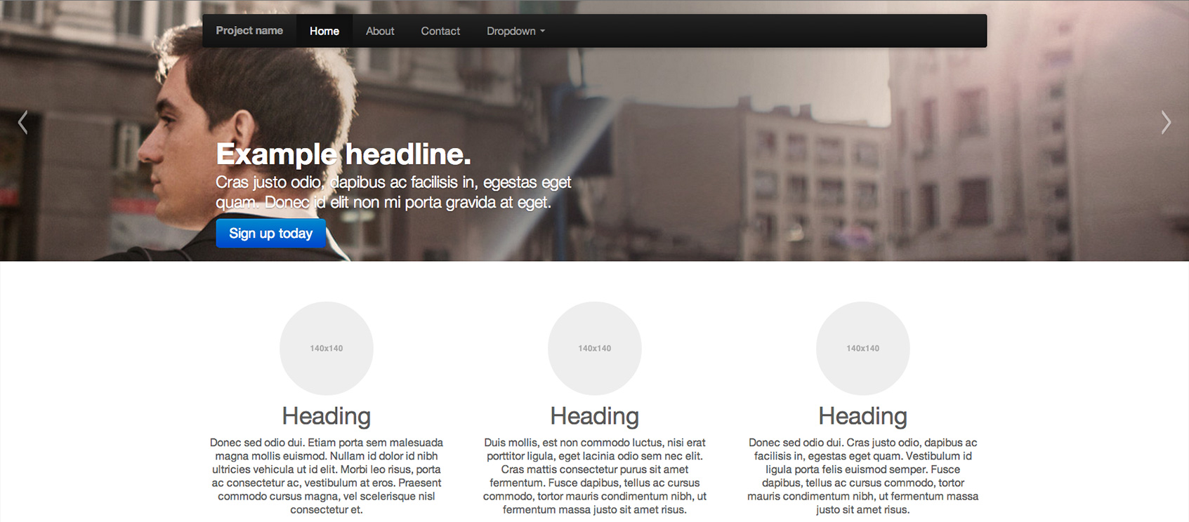
Image in the foreground
(Desktop view)
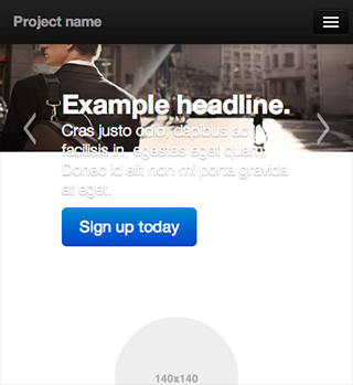
(Mobile view)
(The markup)
<div class="item">
<img src="img/hero_05.jpg" alt="#">
<div class="container">
<div class="carousel-caption">
<h1>Another example headline.</h1>
<p class="lead">Cras justo odio, dapibus ac facilisis in, egestas eget quam. Donec id elit non mi porta gravida at eget.</p>
<a class="btn btn-large btn-primary" href="#">Learn more</a>
</div>
</div>
</div>
The markup is the same as Bootstrap’s here, but now I have removed the fixed heights that their example contains. Now the height is being determined by the height of the content within each slide. Looks totally fine on larger screens, but look what happens when you get down to mobile… The image is now scaling properly, but holy shitake it gets small. Now we have text falling out of the bottom. Here’s an example.
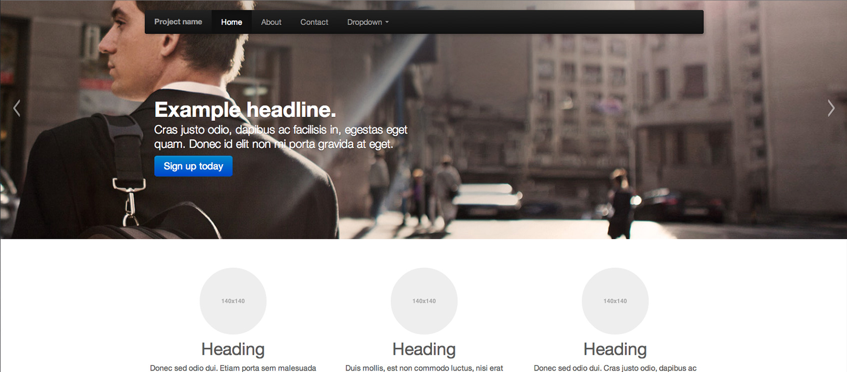
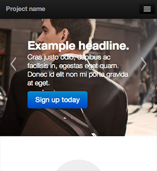
Image applied as a background
(Desktop view)
(Mobile view)
(The markup)
<div class="item" style="background: url(img/hero_05.jpg) no-repeat left center; background-size: cover;">
<div class="container">
<div class="carousel-caption">
<h1>Another example headline.</h1>
<p class="lead">Cras justo odio, dapibus ac facilisis in, egestas eget quam. Donec id elit non mi porta gravida at eget.</p>
<a class="btn btn-large btn-primary" href="#">Learn more</a>
</div>
</div>
</div>
Voilà. Apply the image as a “background” in the HTML (this way images can be dynamically injected if needed). I’m showing the inline styles in the “.item” div for clarity. You’ll need to provide heights in your media queries to suit your needs. Remember, Bootstrap’s version has the heights applied too, but their way totally distorts the image. Here, it just clips the edges by using “background-size: cover;” and applying “center center” or “left center” for positioning. Here’s an example.
Conclusion
So, in effect, using Bootstrap’s example or using an image placed in the foreground you get this type of output:

(imagine the red square as the size of your mobile phone screen)
But by applying the image as a background image (set to “background-size: cover;”) you clip out the edges for a better finish, like so:
(Applied as “center center”)

Or as in the demo (Applied as “left center”)

This demo is strictly using Bootstrap’s carousel plugin, but the principle applies to any other carousel plugin. For the most part, they all include similar markup.
Make sense?


Hi,
Could you help how i can go about for the page editor mode code for editing the background image?
Thanks,
Ramyanka.
In developing Sitecore, we often have to make special rendering “exceptions” when dealing with page editor mode. It’s a good idea to understand that
The second part means using the Sitecore PageMode to determine the state of the page (pardon to untested code)….
if ( Sitecore.Context.PageMode.IsPageEditorEditing) {

   // render the field as a foreground element

   @Html.Sitecore().Field("Some Image Field")

} else {

   ImageField imageField = Model.Item.Fields["Some Image Field"];

   var path = imageField == null ? String.Empty : imageField.GetMediaUrl();
}
Thanks a lot. That was really helpful
HI Brian,
I am facing a problem related to background images implementation in Sitecore. I want the background image of a whole page to be editable when viewed in Sitecore Page Editor mode. I have tried Fieldrender and Sc:Image but i am not able to setup the same. Can you please help how this can be achieved.
Cheers
Rajiv
Great article, exactly as it should be done, image in the background!
Hi Brian,
The image scales great on mobile, but how to scale down the font size in mobile view?
regards
Hi Sunny,
Very simple; you just need to set some media queries in your stylesheet to whatever font sizes you’d like to see…
Here is a good reference on media queries:
https://css-tricks.com/snippets/css/media-queries-for-standard-devices/
Thank you so much for this – it helped a lot.
Hi Brian,
Perfect Explanation with examples !!!! This is what i want !!! thanks a lot dude !!!
THANK YOU for a simple explanation!
Thank you!
I’ve been looking for a good tutorial cause I noticed bootstrap’s way is wrong (still wrong in 2016)
I finally resolved this 😀
great explanation with demo…. really nice.
This is great. Helped with the unwanted gray padding on extra large devices and a too tiny carousel on mobile. Thank you!
Thank you!
Hi!
Is there a way to make the carousel pane template accept videos as content, instead of a background image? And if not, how can Score handle clickable images for each carousel pane?
Thanks!
Hello! Videos are a completely different animal than background images. As of now, you can only insert a background color or image for each pane. There isn’t a way out of the box to include a background video. You can insert a foreground video with our Youtube component though. If you need a clickable image, try using the image button component. Since it is a button, it will be a foreground element as well.
Thanks a lot!