In my previous articles, we looked at all the basic concepts of creating a report in SSRS. We built a simple tabular report and made it presentable. However, simple tabular or matrix graphs are textual reports. Today, we will build a visual report – a pie chart. There are several visual reports one can build using report builder.
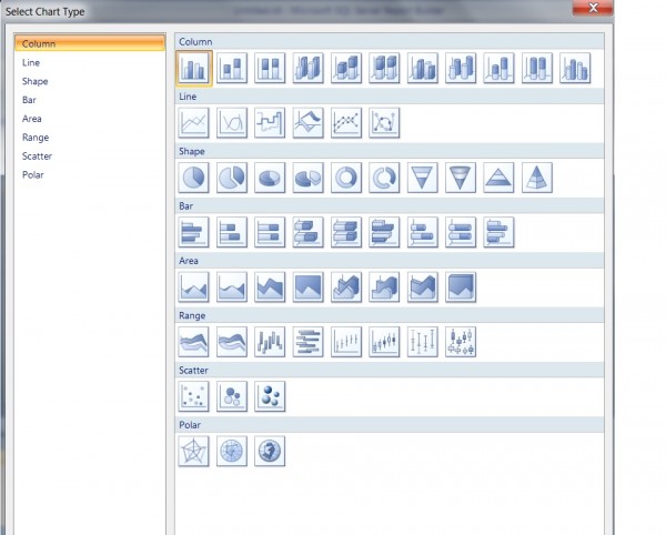
1.) Column graphs
2.) Line graphs
3.) Shape graphs
4.) Bar graphs
5.) Area graphs
6.) Range graphs
7.) Scatter graphs
8.) Polar graphs
We will focus on building a Pie Chart report today. Pie chart looks like a Pizza i.e a circle divided into smaller areas. Every area represents a set of data belonging to a group. This allows business managers to view the data as a proportion of the whole set of data. Pie charts also allow business users and managers to compare one set of data with another set of data in one chart.
Let us dive into creating our first visual report – Pie Chart.
Before creating the Pie Chart, let us see how we can divide our data set into different categories. We have primarily three types of products:
1.) Candles
2.) Hand sanitizer
3.) Shower Gels.
Great – The next step is to create a datasource and a dataset.
We will use the same Data source we created in the previous articles. However, if you missed previous articles, you can click on the link given below that shows how to add a datasource and a dataset.
https://blogs.perficient.com/dataanalytics/2013/10/25/creating-first-ssrs-report-part-2/
Let us create a new dataset and call it PieReport. You can follow the steps to create a dataset in the link given above. The only thing that changes in this dataset is the SQL query. (given below)
SELECT
[candle_soap_shop$].Product_Type, count(*)
FROM
[candle_soap_shop$]
group by
[candle_soap_shop$].Product_Type
Now that we have our datasource and dataset set up, it is time to draw our pie chart.
In order to create a Pie Chart:
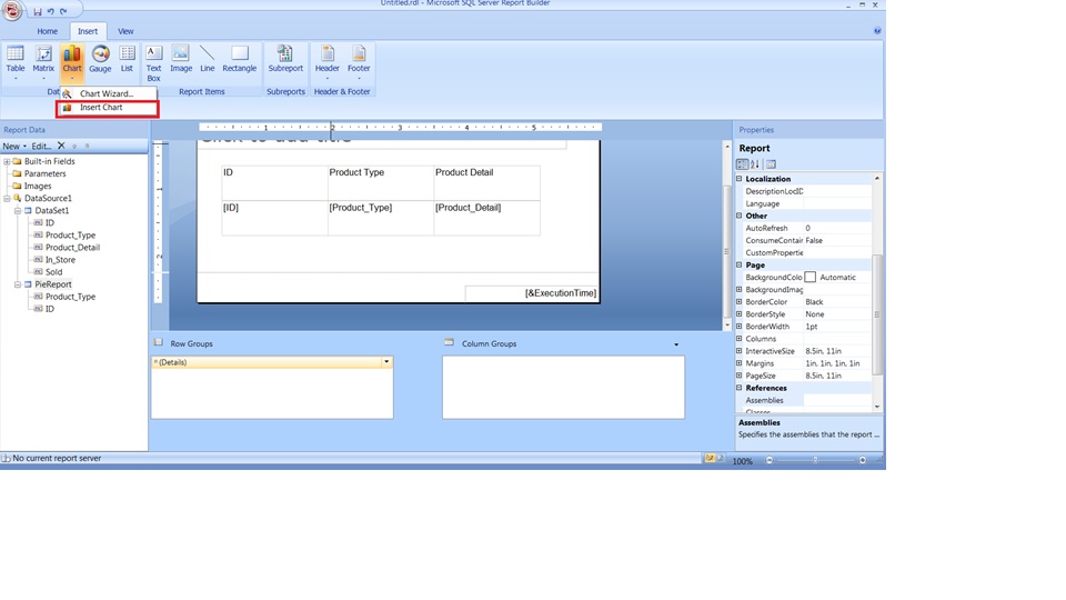
1.) Click on Chart and select Insert Chart
2.) Drag your mouse on the white canvas below the table.
3.) Select the first Pie chart from the window.
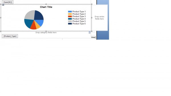
4.) Drag and drop ID under “Drop Data Fields Here”.
5.) Drag and drop Product_type under “Drop category fields here”.
6.) Right click on the chart and select – Show data labels.
7.) Run your report.
Stay tuned for more articles.


