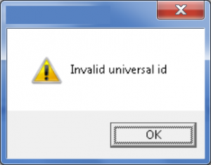
Error messages are still too often an afterthought in a development project. No offense to my esteemed developer friends out there, but you can usually tell when a developer has quickly written an error message that got thrown into production code. I just got the following error message today (box title tactfully redacted to avoid singling any piece of software out):
The message has nothing to do with the option I was trying to use, and provided no way for me to diagnose and recover. And what is a “universal id” anyway, some kind of Freudian pantheistic concept?
Ironically, I stumbled upon another problematic error message when trying to upload the error message above on WordPress: “This image has failed to upload due to an error.”
This message also does not tell me anything. The statement itself is tautological and gives me the feeling that the software knows what’s wrong, it just doesn’t want to tell me. C’mon, WordPress, help me out here so I can finish my post! (P.S. it turned out to be a permissions thing. I uploaded an image last week though, so I’ll leave it to the software gods to determine why I dropped off the approved list.)
Jakob Nielen’s Ten Usability Heuristics have been around for a long time and are hopefully common knowledge for many involved in designing and developing software. One of the ten is:
Help users recognize, diagnose, and recover from errors. Error messages should be expressed in plain language (no codes), precisely indicate the problem, and constructively suggest a solution.
While error messaging may seem trivial in the grand scheme of things, it should be given a high priority. The ability to recover gracefully from an error is a key element in the user’s experience with a product, and can have a big impact on product perception. Without a method of recovering, the user has to make the difficult decision to either abandon ship altogether and fail at reaching their goal, or take more effort in the form of searching forums, calling technical support, or other ways of fixing what’s wrong. Neither of these would be required if the error message followed the guideline described above.
As an alternative, consider this error message from Google Chrome. My 9-year-old son encountered this message and thought it was so “cool” he had to show it to me while laughing. Funny/ironic error messages can sometimes backfire if used in the wrong situations, but my visceral reaction to the two kinds of messages couldn’t be more different. One makes me want to throw my computer against the wall, while the other makes me think that Chrome is my buddy who goofed up and whom I’ll of course forgive because he’s so self-effacing in a charming way. It’s a personal connection vs. a sterile one. Plus, it tells me what to do next (though the specific problem is not identified.)
Of course, an even higher goal is to prevent users from making errors in the first place. Projects that incorporate user experience methods into their product development processes typically excel at error prevention because of the consistent focus on the users’ process flows. Also, having actual users test products helps to identify potentials for error that may not have been considered during design.
In my experience, Technical Writers are often the best professionals to put in charge of error messaging. They are used to explaining the state of something and how to get to another state, which is the essence of a good error message. They are also well-versed in writing succinctly and taking “computerese” and turning it into layman’s language.
Whatever you do, don’t leave the quality of error messages to chance. Plan for them, avoid needing them in the first place, and when they have to be displayed, make sure they are informative and understandable.
For fun, see: 35 Entertaining 404 Messages

