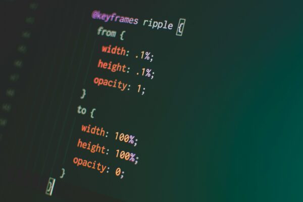
The animation and transition enhance user experience and can bring life to websites. Advanced CSS techniques allow us to create animations that are smooth, performant and engaging.
Understand between CSS Animation and Transition
Animations: They can run automatically or triggered dynamically. Able to create multistep sequences using @keyframes.
Transition: Used for state changes, for example hover effects. It requires a trigger like hover.
Keyframes – Backbone of CSS Animations
Keyframes define the stages of an animation by specifying the styles at various points.
Example: Bouncing Ball Animation
<div class="animate-ball"></div>
.animate-ball {
    position: absolute;
    top: 0;
    width: 50px;
    height: 50px;
    background-color: #00267A;
    border-radius: 50%;
    animation: bounce 2.5s infinite;
    animation-timing-function: cubic-bezier(0.42, 0, 0.58, 1);
}
@keyframes bounce {
    0%,
    100% {
        transform: translateY(0);
    }
    50% {
        transform: translateY(150px);
    }
}
This example creates bouncing animation. Adjusting the keyframes helps for better animation.
Animation Timing Functions
The timing function takes care of the control of an animation on its duration. Common predefined timing function are:
- linear: Constant Speed
- ease: Starts Slow, speeds up, and slows down
- ease-in: Starts slow, then speeds up.
- ease-out: Starts fast, then slows down
- ease-in-out: Combination of both ease-in and ease-out.
Custom Timing Functions: Use cubic-bezier() to define custom timings.
.animate-ball {
    animation-timing-function: cubic-bezier(0.42, 0, 0.58, 1);
}
Combining Animations with Transitions
Transitions can be a complement to animation for enhancing smooth interaction.
Hover Effect with Animation
<div class="action-button">Hover Me</div>
.action-button {
    display: inline-block;
    padding: 10px 20px;
    background-color: #007bff;
    color: white;
    text-align: center;
    border-radius: 5px;
    cursor: pointer;
    transition: transform 0.3s ease;
}
.action-button:hover {
    transform: scale(1.2) rotate(5deg);
    animation: glow 1.5s ease-in-out infinite;
}
On hovering of the button adds a glowing effect to the button.
Multi-Step Animations
Complex animations involve multiple style changes over duration.
A Rotating Loader
<div class="loader"></div>
.loader {
    margin: auto;
    display: flex;
    width: 50px;
    height: 50px;
    border: 5px solid #f3f3f3;
    border-top: 5px solid #007bff;
    border-radius: 50%;
    animation: spin 1s linear infinite;
  }
  @keyframes spin {
    0% { transform: rotate(0deg); }
    100% { transform: rotate(360deg); }
  }
The loader rotates continuously, providing modern effect.
Performance Considerations
Though animation can enhance user experience, they can impact the performance of the application.
Hardware Acceleration
Using transform and opacity for animations, since they utilize the GPU, making them smoother.
To avoid animating properties like width and height, as they trigger layout recalculations.
Minimize Reflows
To Animate transform and opacity instead of box-model properties like margin or padding.
.element {
  will-change: transform, opacity;
}
Adding will-change hints to the browser to optimize rendering.
Debugging and Tools
- Browser DevTools: Inspect and fine-tune animations.
- Lottie: Integrate JSON-based animations for complex effects.
- Performance Tools: Use tools like Lighthouse to measure animation’s impact on performance.
Creating complex animation in CSS involves understanding keyframes, timing functions and performance consideration. CSS animations and transitions, when used effectively makes interactive websites. For more information, contact our technical experts. Design sharp, code smart!

