
You may have never heard of Storybook or maybe that was just a glimpse leaving you a feeling Storybook is such an unnecessary tool – in that case, this article is for you. Previously, I could share this opinion, but since I played with Storybook in action when building JumpStart starter kit with Next.Js, it changed.
Why
With the advent of responsive design, the uniqueness of user interfaces has increased significantly – with the majority of them having bespoke nuances. New requirements have emerged for devices, browser interfaces, accessibility, and performance. We started using JavaScript frameworks, adding different types of rendering to our applications (CSR, SSR, SSG and ISR) and breaking the monolith into micro-frontends. Ultimately, all this complicated the front end and created the need for new approaches to application development and testing.
The results of a 2020 study showed that 77% of developers consider current development to be more complex than 10 years ago. Despite advances in JavaScript tools, professionals continue to face more complex challenges. The component-based approach used in React, Vue, and Angular helps break complex user interfaces into simple components, but it’s not always enough. As the application grows, the number of components increases; in serious projects, there can be hundreds of them, which gives thousands of permutations. To even further complicate matters, interfaces are difficult to debug because they are entangled in business logic, interactive states, and application context.
This is where Storybook comes to the rescue.
What Storybook is
Storybook is a tool for the rapid development of UI components. It allows you to view a library of components and track the status of each of them. With StoryBook, one can develop components separately from the application, making it easier to reuse and test UI components.
Storybook promotes the Component-Driven Development (CDD) approach, where every part of the user interface is a component. These are the basic building blocks of an application. Each of them is developed, tested, and documented separately from the others, which simplifies the process of developing and maintaining the application as a whole.
A component is an independent fragment of the application interface. In Sitecore, in most cases, a component is equal to a rendering, for example, CTA, input, badge, and so on. If we understand the principles of CDD and know how to apply this approach in development, we can use components as the basis for creating applications. Ideally, they should be designed as independent from each other and be reusable in other parts of the application. You can approach creating components in different ways: start with smaller ones and gradually combine them into larger ones, and vice versa. You can create them both within the application itself and in a separate project – in the form of a library of components.
With Storybook’s powerful functionality, you can view your interfaces the same way users do. It provides the ability to run automated tests, analyze various interface states, work with mock data, create documentation, and even conduct code reviews. All these tasks are performed within the framework of the so-called Story, which allows you to effectively use Storybook for development.
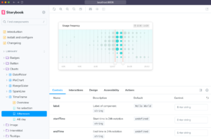
What is a Story
This is the basic unit of Storybook design and allows you to demonstrate different states of a component to test its appearance and behavior. Each component can have multiple stories, and each one can be treated as a separate test case to test the functionality of the component.
You write stories for specific states of UI components and then use them to demonstrate the appearance during development, testing, and documentation.
Using the Storybook control panel, you can edit each of the story function arguments in real time. This allows your team to dynamically change components in Storybook to test and validate different edge cases.

Storybook Capabilities
Creating documentation
Storybook provides the ability to create documentation along with components, making the process more convenient. With its help, you can generate automatic documentation based on code comments, as well as create separate pages with examples of use and descriptions of component properties. This allows you to maintain up-to-date and detailed documentation that will be useful not only for developers but also for designers, testers, and users.
User Interface Testing
Another good use of Storybook – UI Tests identify visual changes to interfaces. For example, if you use Chromatic, the service takes a snapshot of each story in a cloud browser environment. Each time you push the code, Chromatic creates a new set of snapshots to compare existing snapshots with those from previous builds. The list of visual changes is displayed on the build page in the web application so that you can check if these changes are intentional. If they are not, that may be a bug or glitch to be corrected.
Accessibility Compliance
As The State of Frontend 2022 study found, respondents pay high attention to accessibility, with 63% predicting this trend will gain more popularity in the coming years. Accessibility in Storybook can be tested using the storybook-addon-a11y. Upon the installation, the “Accessibility” tab will appear, for you to see the results of the current audit.
Mocking the data

When developing components for Storybook, one should consider realistic data to demonstrate the capabilities of the components and simulate a real-life use case. For this purpose, mock data is often taken, that is, fictitious data that has a structure and data types similar to real ones but does not carry real information. In Storybook, you can use various libraries to create mock data, and you can also create your own mocks for each story. If a component itself needs to perform network calls pulling data, you can use the msw library.
Simulating context and API
Storybook addons can help you simulate different component usage scenarios, such as API requests or different context values. This will allow you to quickly test components in realistic scenarios. If your component uses a provider to pass data, you can use a decorator that wraps the history and provides a cloaked version of the provider. This is especially useful if you are using Redux or context.
Real-life advantages
Wasting resources on the user journey
Building a landing page may seem to be a simple exercise, especially in a development mode when you see changes appear in the browser immediately. However, the majority of cases are not that straightforward. Imagine a site with a backend entirely responsible for routing – and one may need to login first, answer the security questions, and then navigate through the complex menu structure. Say you only need to “change the color of a button” on the final screen of the application, then the developer needs to launch the application in its initial state, login, get to the desired screen, fill out all the forms along the way, and only after that check whether the new style has been applied to the button.
If the changes have not been applied, the entire sequence of actions must be repeated. Storybook solves this problem. With it, a developer can open any application screen and instantly see how it looks, taking into account the applied styles and the desired state. This allows you to significantly speed up the process of developing and testing components since they can be tested and verified independently of the backend and other parts of the application.
Development without having actual data
Often the UI development takes place before the API is ready from the backend developers. Storybook allows you to create components that stub data that will be retrieved from the real API in the future. This allows us to prototype and test the user interface, regardless of the presence or readiness of the backend, and use mock data to demonstrate components.
Frequently changing UI
On a project, we often encounter changes in layout design, and it is very important for us to quickly adapt our components to these changes. Storybook allows you to quickly create and compare different versions of components, helping you save time and make your development process more efficient.
Infrastructural issues
The team may encounter problems when a partner’s test environment or dependencies stop working, which leads to delays and lost productivity. However, with Storybook, it is possible to continue developing components in isolation and not wait for service to recover. Storybook also helps to quickly switch between your application versions and test components in different contexts. This significantly reduces downtime and increases productivity.
Knowledge transfer
In large projects, onboarding may take a lot of time and resources. Storybook allows new developers to quickly become familiar with components and how they work, understand the structure of the project, and start working on specific components without having to learn everything from scratch. This makes the development process easier and more intuitive, even for those not familiar with a particular framework.
Application build takes a long time
Webpack is a powerful tool for building JavaScript applications. However, when developing large applications, building a project can take a long time. Storybook automatically compiles and assembles components whenever changes occur. This way, developers quickly receive updated versions of components without a need to rebuild the entire project. In addition, Storybook supports additional plugins and extensions for Webpack, to improve performance and optimize project build time.
Installation
First, install Storybook using the following commands:
cd nextjs-app-folder
npx storybook@latest init
Once installed, execute it:
npm run storybook
This will run Storybook locally, by default on port 6066, but if the port is occupied – it will pick an alternative one.
Storybook is released under the MIT license, you can access its source code in the GitHub repository.
Making it with Sitecore
When developing headless projects with Sitecore, everything stays in the same manner. As part of our mono repository, we set up Storybook with Next.js so that front-end developers don’t have to run an instance of Sitecore to do their part of the development work.
Upon installation, you’ll find a .storybook folder at the root of your Next.Js application (also used as a rendering host) which contains configuration and customization files for your Storybook setup. This folder is crucial for tailoring Storybook to your specific needs, such as setting up addons, and Webpack configurations, and defining the overall behavior of Storybook in your project.
main.js(ormain.ts): this is the core configuration file for Storybook. It includes settings for loading stories, adding add-ons, and custom Webpack configurations. You can specify the locations of your story files, add an array of addons you’re using, and customize the Webpack and Babel configs as needed.preview.js(orpreview.tsx): used to customize the rendering of your stories. You can globally add decorators and parameters here, affecting all stories. This file is often used for setting up global contexts like themes, internationalization, and configuring the layout or backgrounds for your stories.
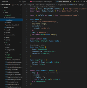
One of the best integrations (found from Jeff L’Heureux) allows you to use your own Sitecore context mock and also any placeholder to use any of your components (see the lines below decorators).
import React from 'react';
import { LayoutServicePageState, SitecoreContext } from '@sitecore-jss/sitecore-jss-nextjs';
import { componentBuilder } from 'temp/componentBuilder';
import type { Preview } from '@storybook/react';

import 'src/assets/main.scss';

export const mockLayoutData = {
  sitecore: {
    context: {
      pageEditing: false,
      pageState: LayoutServicePageState.Normal,
    },
    setContext: () => {
      // nothing
    },
    route: null,
  },
};

const preview: Preview = {
  parameters: {
    actions: { argTypesRegex: '^on[A-Z].*' },
    controls: {
      matchers: {
        color: /(background|color)$/i,
        date: /Date$/,
      },
    },
  },
  decorators: [
    (Story) => (
      <SitecoreContext
        componentFactory={componentBuilder.getComponentFactory({ isEditing: mockLayoutData.sitecore.context.pageEditing })}
        layoutData={mockLayoutData}
      >
        <Story />
      </SitecoreContext>
    ),
  ],
};

export default preview;
You put stories somewhere under src/stories/components folder, but it could be any folder as soon as it matches paths referenced from main.ts:
const config: StorybookConfig = {
  stories: ['../src/**/*.mdx', '../src/**/*.stories.@(js|jsx|mjs|ts|tsx)'],
 // ....
}
It is important to understand that getServerSide/getStaticProps are not executed when using Storybook. You are responsible for providing all the required data needed as well as context, so you need to wrap your story or component.
Component level fetching works nicely with Sitecore headless components using MSW – you can just mock fetch API to return the required data from inside of the story file.
Useful tips for running Storybook for Headless Sitecore
- use next-router-mock to mock the Nextjs router in Storybook (or upgrade to version 7 with the
@storybook/nextjs) - exclude stories from the componentFactory / componentBuilder file.
- make sure to run
npm run bootstrapbefore starting storybook or adding it to the package.json, something like:"prestorybook": "npm-run-all --serial bootstrap"– when the storybook script is invoked, thisprestorybookwill automatically run just before, using a default NPM feature.
Conclusion
The Storybook integration into a Sitecore headless project will require you to invest some time digging into it, but offers numerous benefits, including improved component visualization, isolation for development and testing.