Today I’d like to discuss the Atomic Design methodology and how I’ve been applying it to my visual design process.
First, let’s start with a little description of what an atomic design is. Coined by Brad Frost, Atomic Design is basically the analogy of chemistry being applied to design systems.
In chemistry, we learn that all matter is comprised of atoms and atoms bond together to form molecules, which then can combine into organisms to create all matter in the universe.
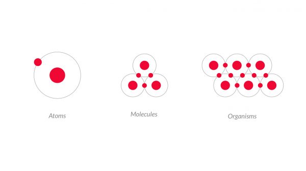
Atoms
Now that sounds like a pretty solid approach. But how do we apply it to our visual design process? I started with the building blocks of visual design and paralleled Atoms to colors, fonts, icons, textures, shapes, and space.
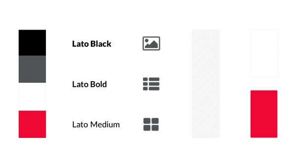
All applications and interfaces are comprised of these elements. A style tile, which is a common visual design deliverable, is basically a cheat sheet of visual design atoms.
Molecules
The next level of atomic design is Molecules, which are comparable to visual design components. Components are a combination of colors, fonts, icons, etc., with a specific function or purpose. Style tiles do include some basic component examples, but the user experience is usually generic and refined in wireframes.
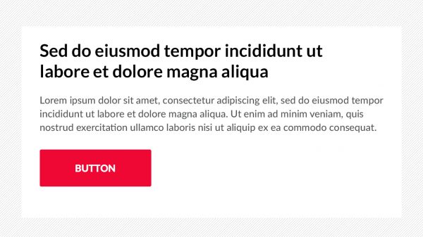
Organisms
The third level of atomic design is Organisms. These are the most complex components, with multiple functions, but are a self-contained unit. Think of headers, footers, hero components, and carousels. Each have various types of interactivity, but not all them exist in every template or page. Again, wireframes define the specifics of these complex components and where they should live.
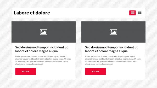
Templates
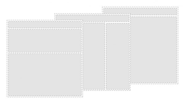
Templates are the next level of atomic design. I like to analogize this level to ecosystems, or where our organisms live. Templates are not specific destinations, but rather categories with specific characteristics. They include global organisms like headers and footers, but the body of the template varies dependent on its type. For example, a homepage or landing page template usually includes a hero component, and a details page does not. Templates are usually the responsibility of a User Experience Architect, and this deliverable is commonly known as a wireframe.
Pages
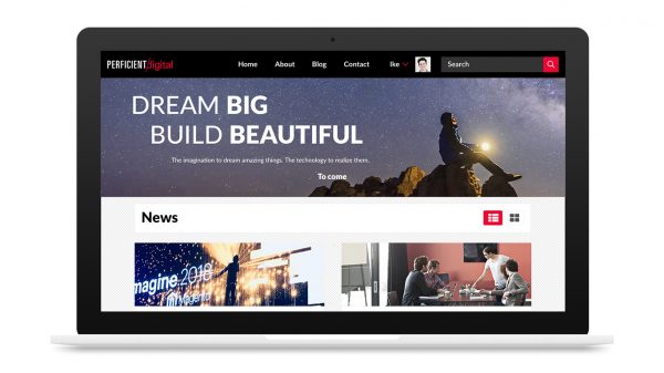
The fifth and final level of atomic design is Pages. Keeping with our ecosystem analogy, I compare these to specific places with names. Pages include real content and have a unique URL. The conglomerate of all the pages is an application or website, and this is what a visual design does: designs websites.
In summary, visual design is an extremely detail-oriented task. Applying these basic rules found in nature simplifies the visual design process for me and reiterates the goals of a consistent, portable, and reusable design system.
