Outliers are considered as single points that are not part of 99% of datasets. Outliers represent the things that are present outside the normal experience. In this post, we will see how to detect these extreme outliers in Tableau.
Steps for detecting Outliers in Tableau:
I have used Tableau Superstore dataset for detecting these outliers. Here I am going to visualize the outliers taking month as time, so that anyone can spot which month contains outliers with respect to the profit.
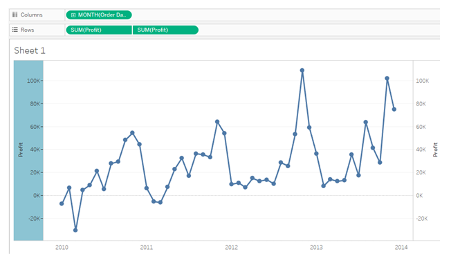
- First place Order Date dimension in column shelf, then place profit in row shelf. Change the time to represent continuous month. Duplicate the profit column in row shelf. We will get two Line charts representing the profit for each month of the year. For the second chart type, change the chart type to circle. Change the chart to dual axis chart, by right clicking the y-axis and selecting dual axis. Never forget to synchronize the axis of dual axis chart, otherwise the chart will look weird.
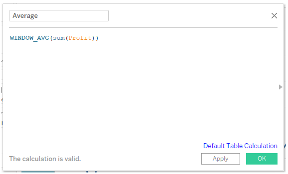
- Next step is to highlight the outliers. To do that, first we have to calculate the average of profit using window functions.
Next step is, we need upper band and lower band to identify the outliers. Any circles that are above the upper band and below the lower band will be considered as outliers.
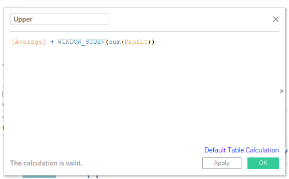
- For calculating the upper limit, use window standard deviation (window_stdev) function
Any circle that lies above this calculated field are outliers, similarly we must calculate our lower limits using window_stdev function. Any points that appear below this lower limit are outliers.
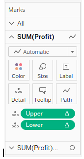
- Next step is, by using this Upper and Lower calculated field, we should create our reference band. We should use this upper and lower in views, for that drop them in details shelf as shown below,
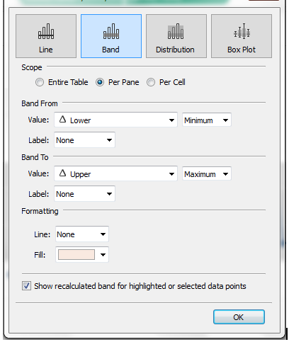
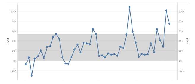
Right click on profit axis and select add reference line. Select reference band , this band starts from lower and end at upper.
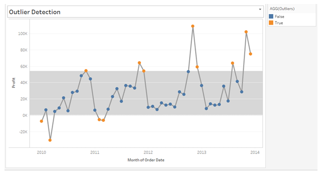
Every circle within this reference band are normal distributions for our profits. All the circles that lie outside this reference band are outliers which we must bisect it.
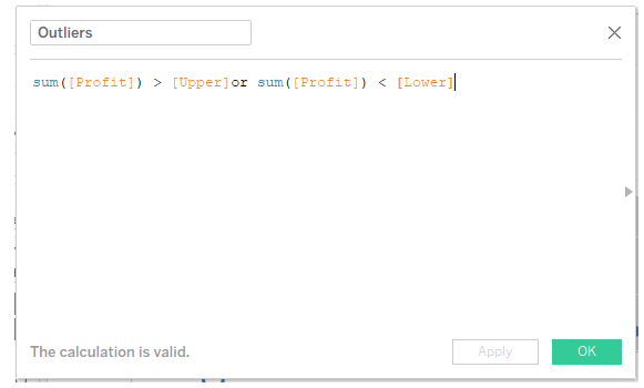
- Next step is we must highlight our outliers. To highlight our outliers, we should create a Boolean calculated field.
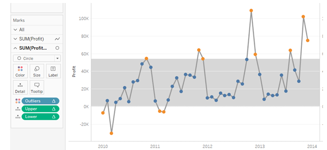
Select the circle chart type in the mark shelf and place the Boolean outlier calculated field in the color shelf. The circles in orange color are outliers and blue colors are normal distribution of profits for Month as time. Hide the header of one axis, which is on the right, enable tooltips. When you check the tooltips, if the circle is outliers, it will display as true or it will display as false.


Thank You