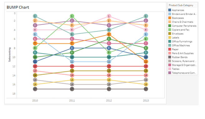
Bump chart is used to effectively visualize ranking of dimension members across different measures over time. It is very easy to interpret from bump chart, how ranking of dimensions with respect to any measures varies over time.
Steps to create BUMP charts in Tableau:
I have used Tableau Superstore dataset for creating this BUMP charts. Here we are going to see how each Product Sub-Category of Superstore dataset ranked in sales from year to year. To create Bump chart, we have to rank some dimension, here I am going to use Product Sub-Category for ranking.
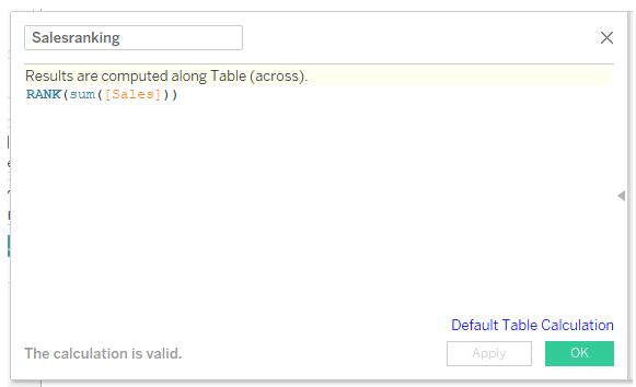
- First place Order Date column in column shelf, then place Product Sub-Category in color Mark shelf. We are going to rank the product sub-category based on their sales, so create a calculated field as Salesranking with the following expression
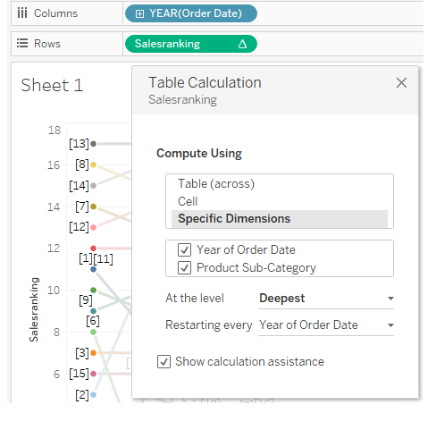
- Place new calculated field Salesranking in row shelf. For calculating ranks for each year of order date, specific dimension, we have to edit this Salesranking. Right click Salesranking and edit it.
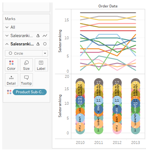
- To create bubbles for ranking, duplicate Salesranking in row shelf, you will get two line charts, for second line chart, change the line to circle chart, enable labels for line chart, align labels to center.
- Enable Dual axis for the above chart by right clicking the axis of second chart Salesranking, once done; synchronize the axis, by right clicking the axis to be synchronized.
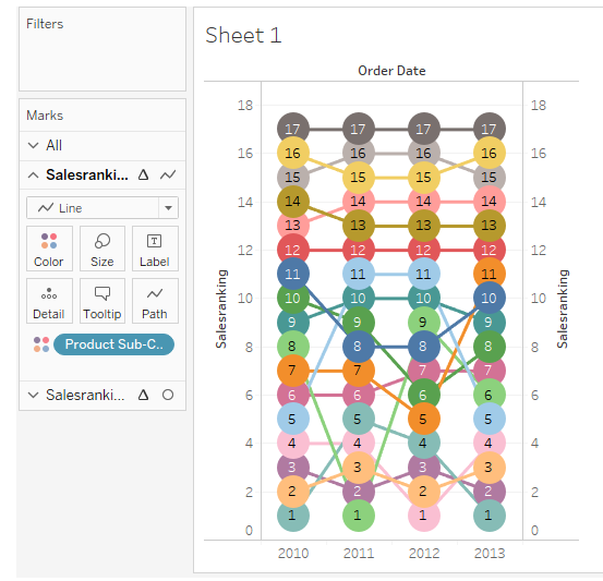
- Fit the chart to entire view, hide the second axis, remove the grid lines and reduce the size of bubbles to prevent overlapping. In the above chart, the ranking is in reverse order, to change it, right click the axis and enable reverse order. In the below bump chart, we are able to predict, how the Product Sub-Category, sales ranking varies from year to year. We can even highlight each Product Sub-Category, while presenting to our business users. We can make it dynamic, by showing Bump Chart for the user selected product sub-category alone.


