Wait … what? Hear me out. At this point, calling a web experience responsive is usually redundant. It is now assumed that websites will render in a usable manner across different screen sizes. Two years ago I wrote a post referring to responsive design as “the Holy Grail.” But as with all things tech, the tides have shifted rapidly. While responsive is still the right design approach for many websites, there are hybrid options that fit better in some cases, too.
First things first: what is responsive design?
Responsive web design is a combination of tactics used to render a website that works great on a desktop to have the same content and interactions available on smaller screens (e.g., tablets and phones).

Why should I invest in a responsive website?
- Frankly, most customers won’t use your app. They don’t want to download one more thing, not knowing whether or not it will be useful. Most people prefer visiting your website from any device.
- Most marketing efforts drive visitors to a web page.
- For most websites, it involves less maintenance than maintaining apps for two or three operating systems.
- More than 50% of all web traffic will be mobile by 2019. (StatCounter)

So what do I need to change?
The answer might be your approach.
It’s actually OK to have a different design approach for different experiences on your website. Here’s why:
- When your visitors are doing research (e.g., reading a lot), let them drill-down to content-heavy pages. Give them the option to zoom in on images, instead of always presenting them on the full mobile screen.
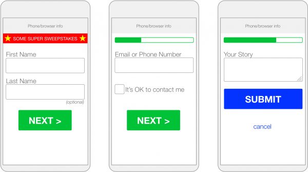
- When users are engaging in a transaction (e.g., registering, purchasing or calculating), use a progressive approach. Progressive design means allowing for an app-like experience for interaction portions of a website.
To clarify, what exactly is an app-like experience?
That essentially means:
- Only a few options per page (It involves more clicks, but it’s clear and less ambiguous.)
- Small-scale images
- Simple, meaningful graphics
- Presenting screens as steps (e.g., Step 1 of 4)
For example, while this style may be perfect for desktop users …
DESKTOP

This step-by-step, app-like experience may be better suited for your mobile users.
PROGRESSIVE – OPTIMIZED FOR MOBILE

So what’s the moral of the story?
While responsive design isn’t exactly “dead,” it’s no longer the latest trend. It’s the standard that will serve your website well in most situations. But take a look at your customer journey to decide where progressive design can benefit your users, too. You just might get the best of both worlds.

