Analytics on social platforms has long plagued us. You can get basic usage statistics like the below:
Not bad, but not a ton you can really do with that. Most platforms, out of the box, have pretty poor analytics and that is becoming an issue for companies. We are telling employees, customers, whoever to tag, rate, share, like and so on and really, there is no great way to make this look good without integrating a robust reporting platform that takes the data and dashboards it in a meaningful way. Then here comes Google +, which everytime I log on I learn to love it a bit more and here is a where I really, really love it: Ripples. First I want to take a second to thank Alan Lepofsky who has a great slideshare on social analytics to turning me on to this – so go add to the troves who downloaded the presentation – it rocks!.
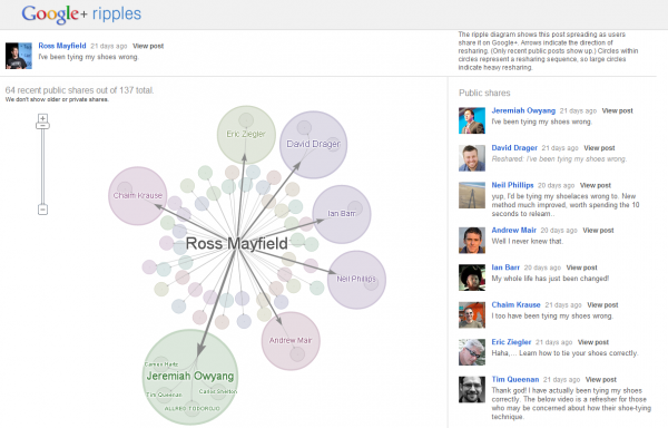
Back to Rippples, when you are on Google+ you can click on any posts’ little arrow on the right and in the dropdown you click “View Ripples” and you get this:
Now this rocks. Its meaningful. It makes sense. Its visual with is always helpful. This is how everyone should do it. It puts social equity and content in context to users. Reminds of a fortune I saw this past week: If the cake is bad, what good is frosting? – no kidding, this is a great example of the icing on the cake. Alan digs into more examples of analytics using Google Maps and such, but this really made me happy and sad that more enterprise social software companies don’t get this yet.
Where have you seen good social analytics?


