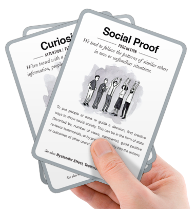
I recently purchased Stephen Anderson’s Mental Notes card deck. The cards offer “50 insights from psychology into an easy reference and brainstorming tool. Each card describes one insight into human behavior and suggests ways to apply this to the design of Web sites,  Web apps, and software applications.” Because user experience design draws insights and guidelines from many different disciplines, I often find it challenging to keep everything I’ve learned in mind when making design choices. These cards are great to page through to remind myself of behavioral patterns that factor into persuasion, comprehension, memory and attention.
For example, one that comes up frequently in design meetings relates to the number of choices to present to users. The note explains: “We’re more likely to make a choice when there are fewer options.” There’s a strong tendency among those in software development to lean towards adding more choices rather than fewer, and much has been written about why this is the case so I won’t get into it here. If we all think about it in our choosing experiences, we know that it’s true. I was just at a restaurant last night where the menu drove me crazy because too many things looked good and I couldn’t decide. Ironically, we also tend to say we want more choices, which is why feature-crazy products are often created based on market research (and why the first rule of usability is “don’t listen to users” but rather, watch what they do).
As product developers and designers, it’s much easier to add choices than to remove them. Fortunately, several design patterns are available to make additional choices available without completely eliminating them. I wrote about dealing with this for faceted navigation choices in a recent post. A deep understanding of target users’ mental models and goals helps to narrow down choices appropriately.
I’ll write about more of these cards in the coming weeks.
