Showing the last refresh date and time in a Power BI report let you know how to refresh your report data, as sometimes the report viewer can not remember the last date and time when report data was refreshed. Just in case, when you never refresh the report, Power BI keeps showing existing data until the report is not refreshed; therefore, it will be better to add the last refresh date in the Power BI report.
In this blog, we will see how to add the last refreshed date in the Power BI report. Even this can also be used to see whether your automatic refresh is working fine or not.
Steps to add the “Last Refresh Date”:
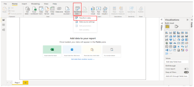
Step 1: Open the Power BI desktop, and click on the Transform Data option.
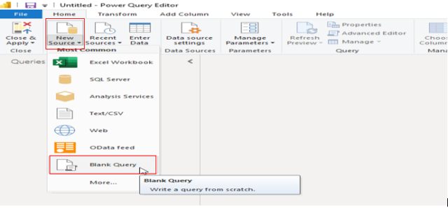
Step 2: Under the Home ribbon, click on the New Source option and select Blank Query.
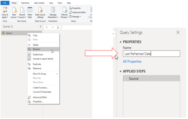
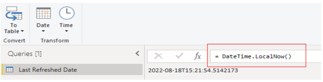
Step 3: Once you have Blank Query table Query1 in place under the Queries section, right-click on it and rename it to Last Refreshed Date.
Afterward, go to the formula bar, write below the M query, and press enter.
= DateTime.LocalNow()
Now we will convert this date data into a table format. For this, we need to right-click on the To Table tab and select the To Table Option.
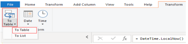
When you click on the To Table option, you will see it is converted into a single column.
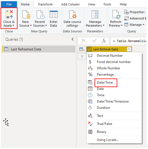
Step 4: Now, Change the Data type to Date/Time, and to save all those changes, click on the Close & Apply tab.
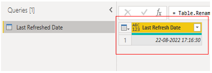
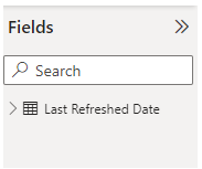
In the field section, you can see a table that returns the Last Refreshed Date.
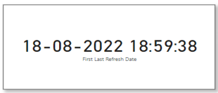
Step 5: For the analysis, let’s take a card visual on the canvas and drag the Last Refresh Date column into visual.
You can see the last refreshed date is 18-08-2022.
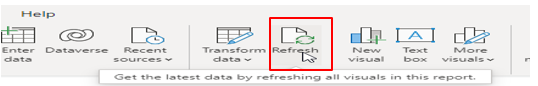
Step 6: We need to refresh the Data page or Data model, so we will click on the Refresh tab.
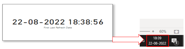
After refreshing the data, we will get the latest refreshed date and time accordingly, the same as my system date and time.
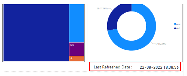
Notice that creating a column with the name Last refresh date acts like a title on the card. In my last project client had already provided this card data in a single line in their template at the bottom of every page, which is the best way of showing the last refreshed date.
Let’s create the same scenario. For that, we need to add a text box. The text box acts as the title of the card. On the other hand, the card only displays the last refreshed date and time details.
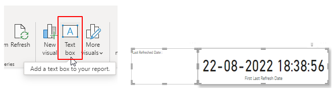
After selecting the text box from the Home ribbon, enter the text “Last Refreshed Date:” and pull the card next to the text box as shown in the above image.
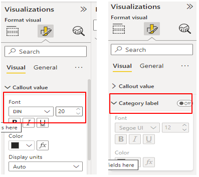
Once you have both the text box and card on the canvas, you can customize them as per your requirements. I adjusted the font size, and font color, and I turned off the category label from the format tab under the visualization pane.
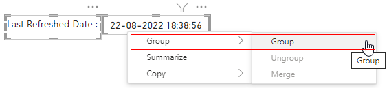
Then select both the visuals using the ctrl button, right-click on any of the visuals, and group them.
Finally, I re-sized both the text box and card in order to fit them in the bottom right-hand corner of the page. Instead of adding a calculated measure to a card, this method gave me more area for my chart.