An interactive and easy-to-use user interface always engages the user to work more. Whenever a grid/table structure is used to show the data a common scenario comes to show a scroll bar when data is more than a visual range. When the user scrolls the table using the scroll bar either the row header or column also scrolls, which is annoying for the user to identify the row/column.
To overcome this, we can simply freeze header row(s) and column(s) based on the requirement, and the rest of the grid data can be a scroll, which is very helpful to the user.
To freeze the row/column we can use a simple HTML table and CSS.
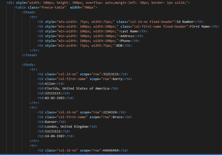
HTML: In HTML we can define the header row by <th> tag or we can use <td> tag also. Below example is using the <th> tag. We also put the table in DIV element to see the horizontal and vertical scrollbar by setting the overflow property of the DIV element.
Sample HTML:
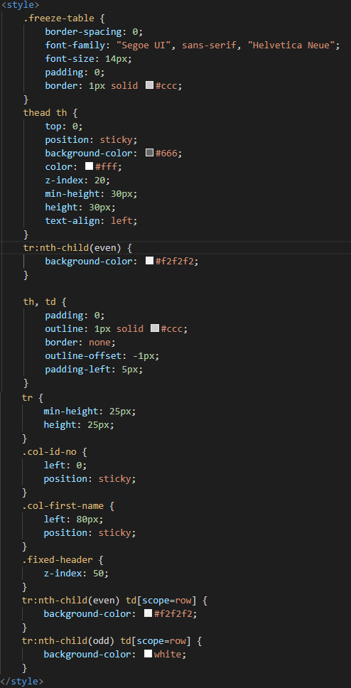
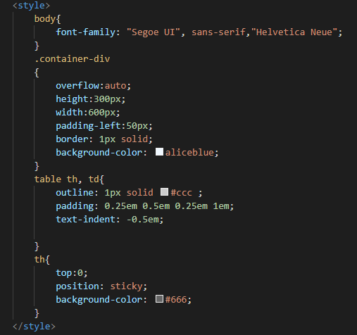
CSS: Major changes will be made in CSS since freezing the row/column will be handle by CSS. To freeze the row & column we need to consider the following CSS tag/selector:
- top: This property is used to set the top position of the element, for the header row(s) (freeze row) this will be always 0.
- left: This property is used to set the left position of the element, for the first freeze column this will be 0. For more than one freeze column the column’s (other than the first column) left property value will be the sum of the previous column’s width total.
- position: This property makes the element sticky while scrolling so, its values will be always ‘sticky’ for all freeze row & column.
- z-index: This property set the visibility priority of freeze column(s) & row(s) over scrollable column. The frozen column will have a higher z-index value than a scrollable column.
- background-color: Background color keeps the scrollable column behind the frozen column while scrolling. If the background color is not provided, then the cell value(data) will look like overlapping to other cell values.
Sample CSS:
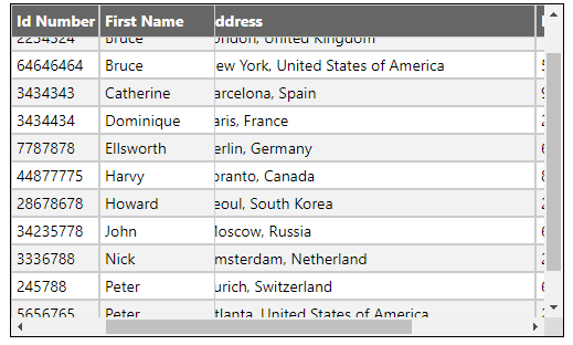
Final output:
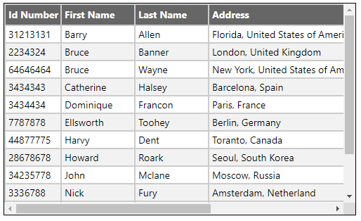
Fixed Header (top row):
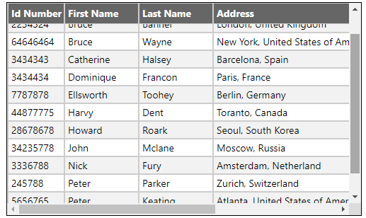
Fixed columns (first 2 columns):
“Position: Sticky – Sticky positioning is a hybrid of relative and fixed positioning. The element is treated as relative positioned until it crosses a specified threshold, at which point it is treated as fixed positioned.“
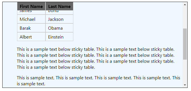
To further clear sticky positioning let’s take an example of a Sticky Header of the table within a page.
Sticky Header:
Sometimes we have the requirement to show the table inside a long page that has a vertical scroll bar. But when we scroll the page the table also gets scrolled with a header which is not helpful for the users to identify the column header. To overcome this problem, we can stick the table header until the table is getting scroll (stick the header until the last row of the table is visible to the user).
Example:
HTML:

CSS:
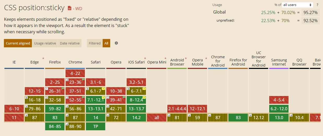
Browser support
‘Position: sticky’ tag browser support list (source: www.caniuse.com)
Sticky Header in Internet Explorer
The sticky tag will not work in Internet Explorer browser because IE doesn’t support the position: sticky CSS tag, rest of the major browser like Chrome, Firefox, Edge, etc. are well supported.
To make the header sticky in IE browser there are some workarounds that use JavaScript with CSS to make it happen. See the links below:
https://css-tricks.com/stickybits-alternative-position-sticky-polyfills/


