HTML5 semantic sectioning elements are great for identifying page structure. Landmark elements such as <header> <nav> <main> <footer> <aside> <section> <article> and <form> are much easier to identify than a sea of <div>s, and provide accessible structure for screen reader users without having to add any ARIA attributes. Using these elements properly helps developers understand the markup and indicates the page structure to screen reader users.
Should all content be in a landmark?
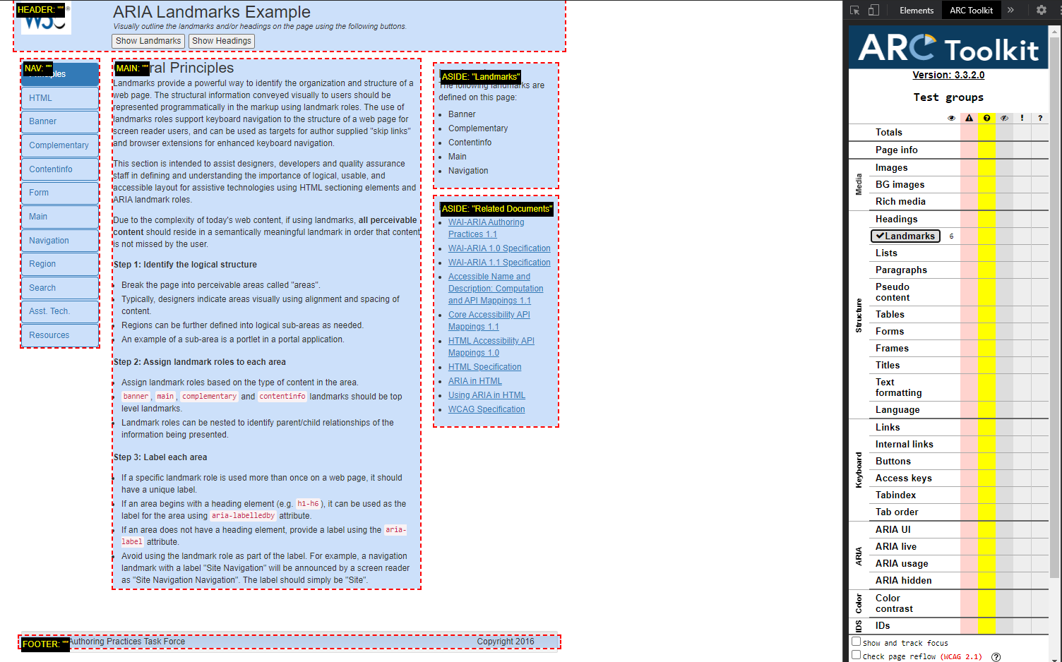
Yes. It is important that ALL content is contained in a landmark to give screen reader users an idea of the page’s structure. See this example from W3C using Arc Toolkit to expose the landmarks:

When a screen reader user reaches one of these areas (with exceptions for <section> <article> and <form> which have mixed support and may need labelling to announce) screen readers announce the user has entered that area cluing them into the purpose of that area. Take the example of <nav>. When a screen reader reaches a <nav> element, it announces something like “navigation landmark” to the user indicating that the subsequent content is part of the navigation. When the user reaches the end/closing tag, screen readers will announce that they have left that section. Because of this, it is important that all of the elements that are considered part of the navigation are wrapped inside the landmark tag as a whole and not individually.
Example:
<nav>
        <ul>
            <li><a href="#">Some Cool Link</a></li>
            <li><a href="#">Another Cool Link</a></li>
            <li><a href="#">Link This</a></li>
        </ul>
</nav>
Rather than:
<nav> <a href="#">Some Cool Link</a><nav>
<nav>><a href="#">Another Cool Link</a> </nav>
<nav> ><a href="#">Link This</a></nav>
User Navigation
Screen reader users can also use the landmarks to navigate through the page to quickly arrive to the information they want to hear about. Main landmarks are generally reserved for the main content of your page, footer for the footer and section or article or complementary for specific areas. Users may want to skip the navigation to get to the meat of the page and navigating to a main landmark makes that quick and easy.
To Repeat or Not to Repeat?
Repeated landmarks is a case where ARIA and HTML5 differ. In ARIA, banner, main and contentinfo are only allowed once on the page; whereas their HTML5 counterparts <header><main> and<footer> are not officially restricted. It is generally a good idea to only have one of each on a page. However, there may times when there are repeated landmarks. Add a label to the landmarks to differentiate them.
<nav aria-label="My cool links">
      <ul>
          <li><a href="#">Some Cool Link</a></li>
          <li><a href="#">Another Cool Link</a></li>
          <li><a href="#">Link This</a></li>
      </ul>
 </nav>

  <nav>
      <ul aria-label="Other people’s cool links">
          <li><a href="#">Some Cool Link</a></li>
          <li><a href="#">Another Cool Link</a></li>
          <li><a href="#">Link This</a></li>
      </ul>
  </nav>
Implementing landmarks are a great start to creating an accessible page. While all content should be contained in a landmark, don’t go overboard with using landmarks otherwise it will cause a lot of clutter on the page for screen reader users. The key is to think about the purpose of the content and how that should appear visually and audibly to any way user may encounter the page.

I am in tech education and am new (ish) to the world of front end development. This was super a helpful primer on landmarks and will definitely influence my projects going forward.