Apple introduced the size class to allow the developer to create one single layout for multiple displays.
This is one of the core concepts behind the adaptive layout. In this article, we are not going to cover the fundamental concepts of size class, if you are not familiar with it, you can refer to this link:
From the size class definition, size classes are traits assigned to user interface elements, like scenes or views. Apple uses the UITraitCollection object to describe these traits. It has two size classes: horizontal and vertical. And there are three values in each of the classes: compact, regular or any.
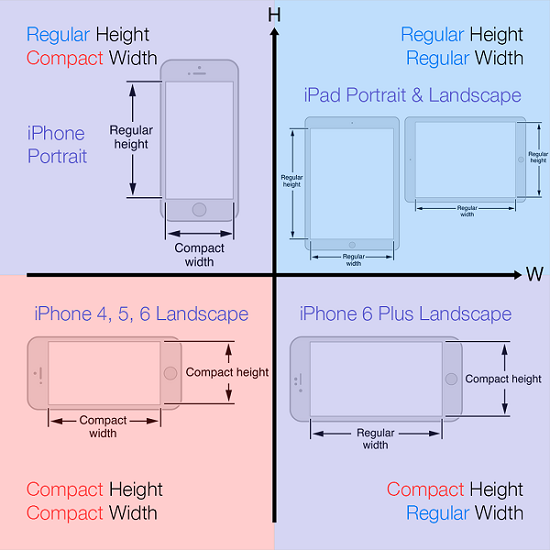
From the diagram below :
We can see all the iOS screens are mainly divided into four categories, however, notice that size classes don’t cover the difference between iPad Portrait and iPad Landscape. But there are a number of legitimate design reasons to vary the UI layout for iPad Portrait vs iPad landscape. It appears to be Apple’s intent to treat both iPad orientation as the same. And this may create some issues for developers. Nonetheless, there are number of solutions to solve this, for instance, you can set the layout programmatically for each UI element in different orientation, but this may cause tons of coding and not to mention that we also need to take care of the screen sizes and rotation.
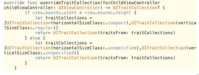
So to follow Apple’s MVC pattern, we might want to use storyboards to cover as much UI related code as possible. After a few attempts, I found out the silver bullet is to override the trait collection, Apple has a method called
This method retrieves the trait collection for a child view controller and you can modify the trait collection for the designated child view controller.
For example, for the iPad landscape, we can use the Regular Width and Regular Height, and for the iPad portrait we override the trait collection, use the Compact Width and Regular Height, concretely, find the view controller you want to implement the custom UITraitCollection,
and then go to the storyboard, there are, actually two ways to achieve this:
Method 1:
At the bottom left of the storyboard you will find some thing like this:
and then at the corner right click the “Vary for Traits” button, make sure the “Width and Height ” boxes are checked:
you will find the whole area becoming blue, like so:
and now all the layouts on the canvas you set will only affect the iPad landscape. After setting all the layouts, just click the “Done Varying” button.
For the portrait, you simply choose a device and orientation under width Compact and height Regular(according to the custom UITraitCollection we wrote above) like so:
and then do the same thing above, click the “Vary for Traits” button, check “Width and Height” and set all the layouts you want for iPad portrait, then click “Done Varying”.
And then you are all set!
Method 2:
For each single UI element, on the attribute inspector, we can find a small “plus” button, when you click it, we will get a pop menu like so:
the idea is the same as above, the only difference is you can now set the variation on each single UI element’s attribute, comparatively, it’s a much more precise way.
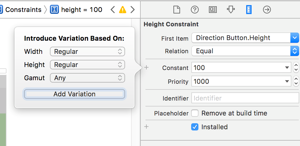
For instance, we want to set a button’s height to 100 pixels when in the landscape, we just switch the Width to Regular, and the Height to Regular,
then click the “Add Variation” .
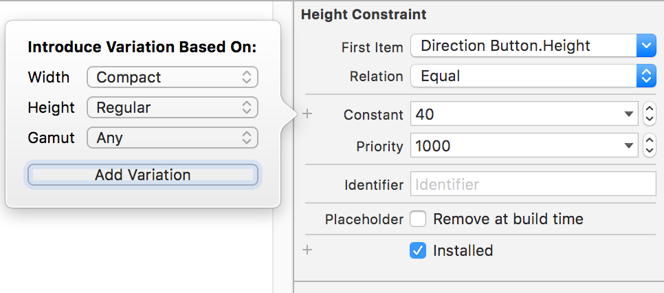
And when in the landscape, if we need to set the button’s height to 40 pixels, we just switch the Width to Compact, and the Height to Regular, then click the “Add Variation” .
So that’s the two comparatively elegant methods to handle the iPad landscape and portrait layout, hope you like it!


