Importance
For those living with disabilities, consuming web content can be a daily challenge. The web is an increasingly important resource in life today. By making your website accessible you are ensuring that all of your users, including those with disabilities, are able to access your site’s information. One of the most common roadblocks to accessing web content can be the lack of proper color contrast. Approximately 7% of the male population (10.5 million men) and .4% of females in the United States live with color blindness[i]. Having poor color contrast can make reading web content difficult and even impossible. Creative and design teams should ensure that the proper color contrast for text, tables/diagrams and other content that is provided.
Color Contrast Requirements
For web content accessibility requirements we look to WCAG (Web Content Accessibility Guidelines) for guidance. WCAG 2.1 has 3 success criteria related to color contrast. What follows is a brief description or each of these success criteria with link to reference the technical requirements and additional information.
1.4.3 Contrast minimum (Level AA): All text must have a minimum color contrast of 4.5:1, with exceptions.
1.4.11 Non-text Contrast (Level AA): User interface components and graphical objects must have a color contrast ratio of at least 3:1
1.4.6 Contrast enhanced (Level AAA): Similar to 1.4.3 but higher standard. All text must have a color contrast ratio of at least 7:1
Testing for color contrast
There are a number of accessibility testing tools available that will help you test the color contrast of your web content. For instance, the automated accessibility tool Axe will, among other things, test for color contrast. Axe works to identify the hex codes of the text and the background and examines the color contrast ratio between the two. However, in some instances a manual review of color contrast is required. This is the case when an automated tool, like Axe, is not able to extract the exact hex codes for the text or background. A typical example of this is when text is placed over an image. In these instances, it is required that a tester manually checks the color contrast between the text and the background image.
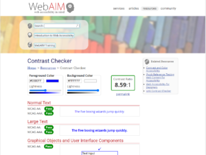
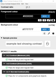
Manual Color Contrast Analyzers
- Webaim – https://webaim.org/resources/contrastchecker/ (Webpage)

- The Paciello Group https://developer.paciellogroup.com/resources/contrastanalyser/ (Downloadable app)

[i]https://iristech.co/statistics/#:~:text=In%20the%20United%20States%2C%20about,differently%20from%20how%20others%20do

