Latest update May 1, 2018 — This is the latest edition of our study on the state of the mobile web. In this study I’ll show you the level of usage of the mobile web last year (2017) as compared to desktop, and how 2017’s usage level compares to 2016. The stats in this and last year’s studies were pulled from SimilarWeb and reflect U.S. traffic across the web.

What is the Mobile vs. Desktop Story Between 2016 and 2017?
- The % of visits from mobile devices grew from 57% to 63%.
- The % of time on site from mobile devices grew from 40% to 49%.
- Mobile Bounce Rate dropped from 52% to 47%.
The details are in the charts below.
[Tweet “Study shows faster than expected shift of web usage from desktop to mobile in past year.” ]
For reference, here is my study of mobile vs desktop usage from a year ago.
Aggregated Stats: Desktop vs. Mobile
The most common stat that people like to talk about is the percentage of their traffic that comes from mobile devices. Let’s have a look at the comparison between 2016 and 2017:
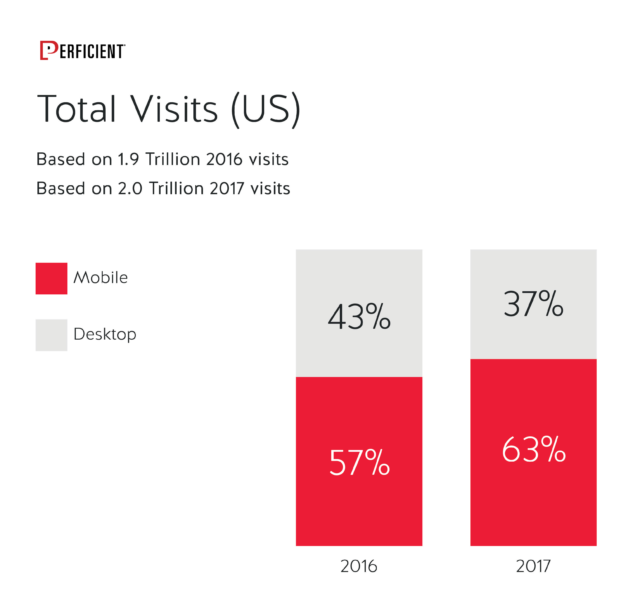
Last year I suggested that mobile’s lead in total traffic would continue to grow over time. Now it has reached 63% of all traffic in the US. Based on that, it seems likely that it will reach a full 2/3 of all traffic by the end of 2018.
Last year, time on site still favored desktop by a significant margin, but that has changed too:
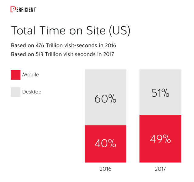
Now they are close to dead even. But bear in mind, that’s total time across all visits. What about the time per visit?
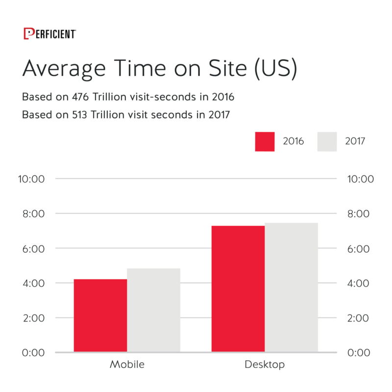
The gap is closing somewhat on a per visit basis, but it’s changing slowly. It seems likely that there will be a significant gap here for some time to come. What happened with bounce rate? Here is how it changes between 2016 and 2017:
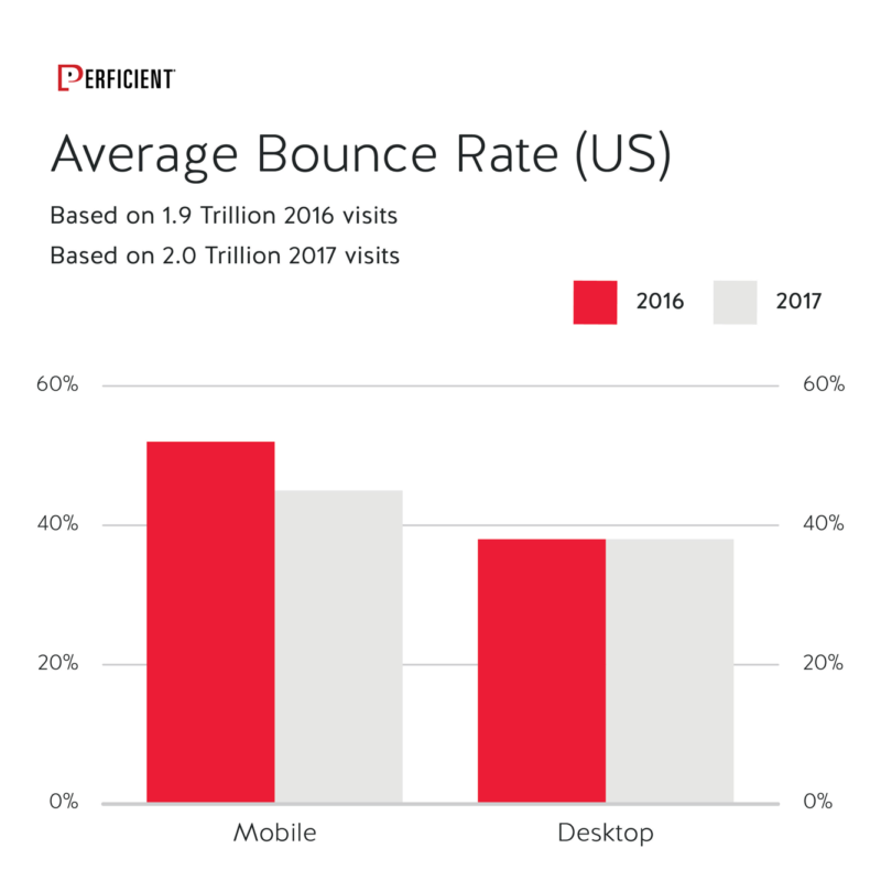
Mobile bounce rate in 2017 was significantly lower than in 2016. The desktop bounce rate did not change at all. Nonetheless, the mobile experience is either improving, or users are getting more comfortable with it (or both). However, desktop still has the lead over mobile on a per session basis.
One more story to check, and that’s what happened with page views:
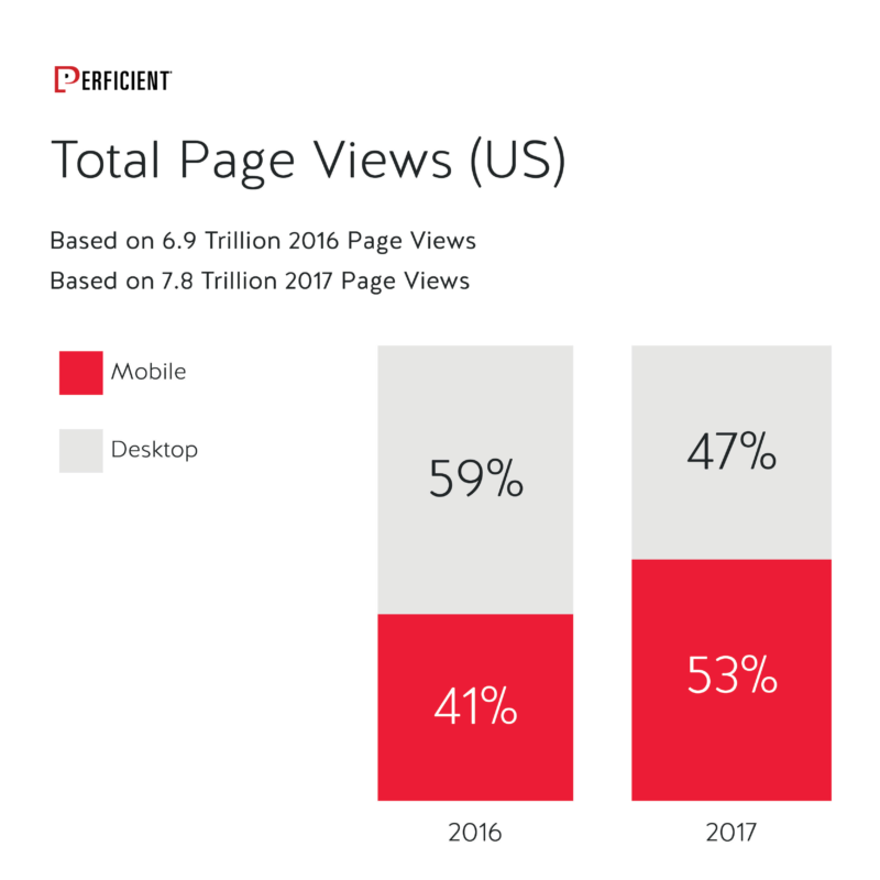
Even on an aggregate basis, mobile now has more total page views than desktop. This is a big shift.
Let’s also take a look at page views per visit:
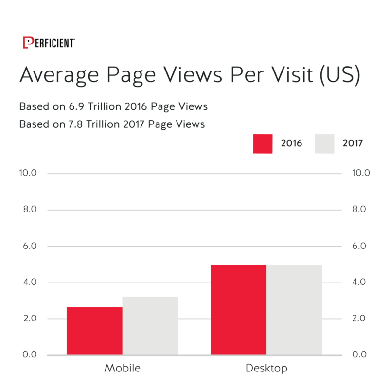
Desktop remains flat, but page views per visit are up 21% for mobile, which represents significant growth. Mobile is showing rapid progress in time on site and page views per visit, and this is a sign that industry and users alike are getting more comfortable with mobile environments. This will continue to progress over the next few years. Desktop remains a major player, however, and I think that’s not likely to change any time soon.
Stats by Industry Category
As we did in last year’s study, we also broke the data down by industry category, to see what industries are the most mobile-centric. The variance between categories remains significant:
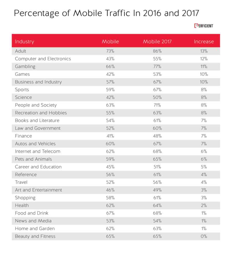 In 2016 the adult industry was the leader, with 73% of the visits coming from mobile devices, and in spite of that, it was the biggest gainer this year, jumping up to 86% of all traffic being mobile. The other fascinating thing is that the finance category and arts & entertainment categories are the only industries that still see more traffic on desktop by narrow 52% to 48% and 51% to 49% margins respectively. By next year, these should also get most of their traffic from mobile.
Next up, let’s look at the time on site by industry category:
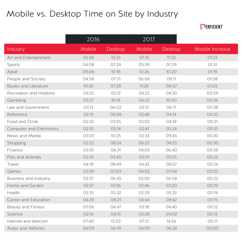 Here we see that every industry has a longer time on site for desktop over mobile, except for the adult industry, and books and literature. The latter is probably due to people reading on mobile devices such as tablets. The autos and vehicles category was the only one that did not see increased average time on site for mobile.
Let’s look at bounce rate next:
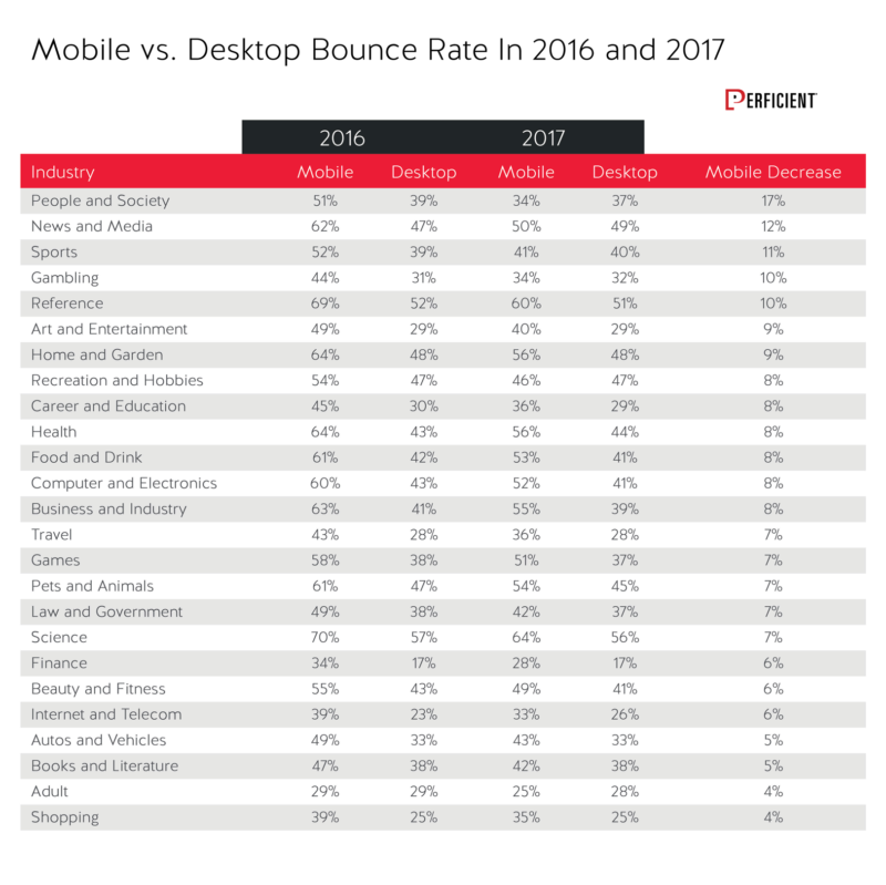
Mobile bounce rate shows significant declines across all industries. In the adult, people and society and recreation and hobbies industries, the bounce rate is actually lower on mobile than it is for desktop!
Last, but not least, let’s look at page views per visitor:
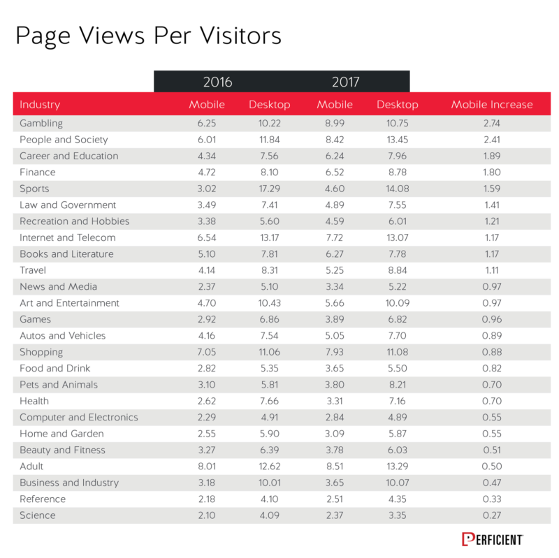
Page views per visitor increased across all 25 industries, and also remained higher in every industry for desktop than mobile.
Comparing the United States vs. Worldwide Mobile Data
As noted, the above data has been for the United States, but how does that compare to a worldwide look at things? Here is a look at the overall traffic data:
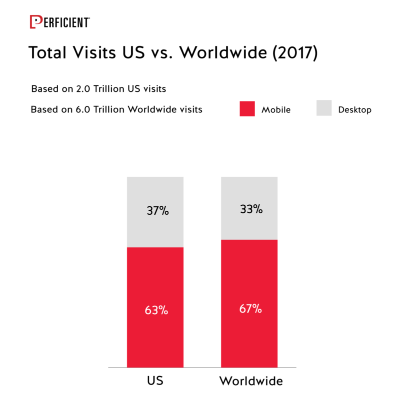 As expected, the overall worldwide usage more mobile-centric than the US, with more than 2/3 of all global traffic being from mobile devices, but only marginally so.
Here are the time on site comparisons:
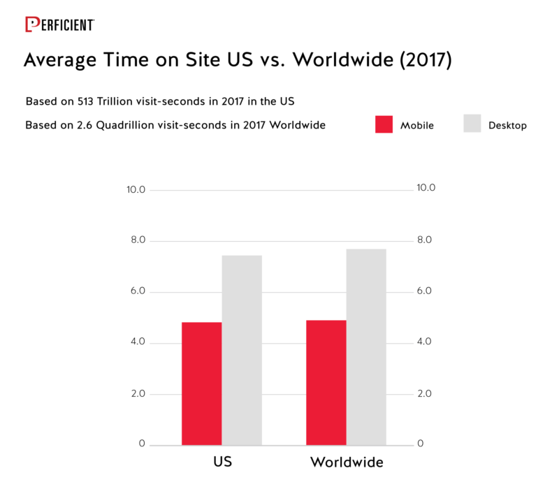
Nothing remarkable here, other than how similar these numbers are. What about the bounce rate?
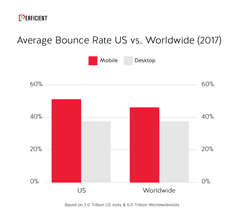
Here we see a clearer difference in the mobile bounce rate worldwide vs. the US. This is likely due to the large number of countries where dependence on mobile devices for Internet connectivity is much greater than it is in the US. We see similar results for page views per visitor:
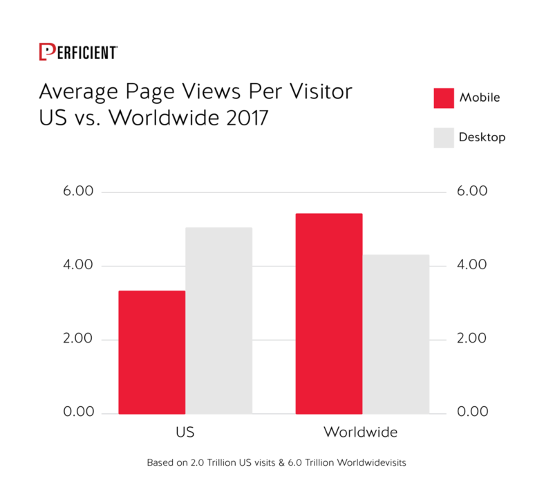
Worldwide mobile visitors view on average more than 2 pages more per visit than US mobile visitors. Another clear indication of the greater dependence on, and greater comfort with, mobile devices outside the US.
Recommendations
How can we use this data to inform our digital marketing strategy? Some of the top observations and ideas I have are as follows:
Mobile is Continuing to Grow: This means that mobile user interfaces are improving, and users are getting more used to them as well. Being mobile friendly is important in all industries, and is the largest source of traffic in most of them.
As I said last year, this means designing your mobile site before you design the desktop site. Instead of coding your desktop site and then writing style sheets to shrink it into a Smartphone form factor, consider instead designing your mobile site first. Then you can figure out how to leverage the larger screen real estate available on a desktop platform as a second step.
Important note: I’m not saying this because desktop is dead; it’s not. It’s still very important, but it’s far easier to take a mobile UI to the desktop than take a desktop on to a Smartphone.
Don’t Forget Mobile First: While this was not the focus of this post, Google is continuing to make progress towards mobile first. I suspect that before the end of 2018 you will see a large percentage of responsive web design sites get converted to mobile first crawling. Google will notify you in Search Console once they have made the switch.
By the way, I suspect that mobile subdomains and dynamic serving sites will take well into 2019 to get converted. This is primarily because so many of those sites will suffer dramatically in rankings when they convert because their mobile site content is just too different from their desktop content.
Desktop Remains Very Important: Other industry data still suggests that more conversions continue to happen on desktop in most industries, so continuing to pay a lot of attention to your desktop site makes a great deal of sense. And, if you’re in an industry where 75% or more of your conversions come from desktop, you may even want to have your mobile site experience offer users on mobile options to provide contact information, save shopping carts, or implement other functionality that allows users to differ the actual completion of a conversion to a later time (perhaps on a desktop).
The rationale for this is that users may not want to deal with complicated forms on a mobile device, and/or may not want to enter their credit card there. Following up with them later lets them come back on a desktop device and convert at a later, and perhaps more convenient time.
If you’re open to this idea, I’d urge you to test it thoroughly first, to see which gets better results for you.
Compare Your Site’s Behavior to Industry Norms: If the average percentage of mobile visitors in your industry is 60%, and your site is at 35%, that may be an indicator of a problem, such as a very slow mobile site, of other problems in that environment. See how you compare to industry norms, and if there is a large delta with your site take the time to understand why.
Pay Attention to Site Speed: Consider implementing AMP. Here is our study on AMP, which covers in detail how effective AMP is in accelerating site speed. AMP is not the only way to speed up your site, of course, but it’s an open source standardized way to do it, so it deserves consideration.
Wonder why page speed is so important? See our Page Speed Guide.

