
I took my daughters to The Barbie Dream House Experience at Mall of America the last weekend. The experience is a 30,000 square foot life size doll house created with 20 pounds of glitter and 100 gallons of pink paint.
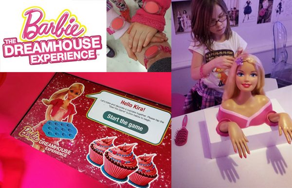
It uses RFID technology to create a interactive adventure through Barbie’s Dream House. Guests swipe their bands to interact with touch screens, projectors, photo vignettes and Barbie’s virtual closet. I was impressed with the use of technology, the execution was excellent and overall they created a good interactive experience. My children, of the iPad generation, became bored with the technology kiosks quickly. The analog interaction and general exploration of the physical environment held their interest the longest.
That day my children showed me that sometimes what we think is cool and interesting is not always that engaging. This got me thinking about simple design, how it can be more engaging than complex design. Complex design can be interesting and a challenge to create but often just becomes convoluted. Amazon has a complex and vast catalog of products, they created a simple search and filtering interface to address this rather than creating a complex navigation menu. Simple design can sometimes take a longer road in creation as well as final engagement. I am not suggesting we go back to analog anything but rather that we deconstruct the convoluted systems, flatten them out and make them simple and ultimately more engaging.
What are some of your favorite examples of simple design?
It’s SCIENCE! Not the Barbie Dream House Experience per se, but simple website designs. Low complexity websites are considered more aesthetically pleasing because the brain and eyes don’t have to work as hard at decoding, categorizing, storing, and retrieving the information displayed. There’s also a study by psychologist George A. Miller (Princeton) that shows the average adult brain can only store up to 9 pieces of information in their short term working memory (that’s the type of memory that among other things, helps in decision making). Overly complex designs can cause too much interference and hinder the brain’s ability to process the information.
The other interesting piece I took away from Jacob’s discussion on the Dream House Experience is related to the fact that his girls weren’t as interested in the techie stuff. Those of us in a generation who didn’t grow up with computers (I was about 18 before we had one in the house and even then dad wouldn’t let anyone touch it) still find things like RFID technology ‘kinda’ cool. Young adults, teens and younger children today, generations who have had exposure to computers, cell phones etc. since birth, aren’t as easily Wowed by the groovy (yeah I said Groovy!) technology that can allow a girl to look in a mirror and see herself in Barbie dresses or touch a screen and “bake” muffins with Barbie. I’m not a Designer, but I’m curious, does this change how you design sites and applications for multi generational users?