In the January release of Skype Operations Framework (SOF) materials, Microsoft gave us a set of Call Quality Dashboard (CQD) templates that cover various aspects of audio quality as well as client versions and devices. They also released a series of videos showing how to navigate CQD, build reports, and investigate quality issues.
Because audio is king and the primary modality, missing from the SOF reports are details covering video and application sharing. While potentially not as important, encountering quality issues with these modalities could lead to poor end-user experience and poor adoption. Let’s dive in and build a report for these that will give us an overall health check.
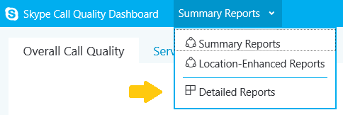
First, if you haven’t yet visited it yet, log into the CQD portal at https://cqd.lync.com (side note: we will ever lose the “Lync” name?). After logging in, you will be greeted with the Summary Reports, again primarily covering audio. In the upper left, select the Summary Reports menu and switch to “Detailed Reports”.
Here you will be greeted by a set of reports titled “All Audio Streams”. On the left, select “New” to create a new set of reports. This will bring up the Query Editor. The Query Editor has 3 components to build the report for the data we are looking for:
- Dimensions – what is used to group the data, for example, by Month or Network Subnet
- Measurement – what data point(s) you want to measure, such as Poor Call Percentage
- Filter – can filter by month or by a specific Network Subnet or Building

A good example from TechNet is: “Show me Poor Streams [Measurement] by Subnet [Dimension] for Building 6 [Filter].”
Since we are just wanting to see trending information month by month, for the dimension, we will leave it at “Month Year”. For the measurements, select the plus sign and search for “video” to bring up all the video measurement options:

From here, select the following measurements:
Video Good Stream Count
Video Unclassified Stream Count
Video Poor Stream Count
Video Poor Percentage
Make sure they match this order when listed under “Measurements”. The order can be change using the up and down arrows that appear after selecting a measurement. The order of the measurements will affect how they are displayed in the graph. In this case, the top measurement for “Video Good Stream Count” will actually be the bottom portion of the bar graph.
As you go through each measurement, you can also change the properties of the element as they appear in the graph. This includes:
- Making it a bar or line graph
- The axis to place the value range
- Whether or not to stack the data
- Color to identify the measurement (default Good, Unclassified, Poor, and Poor% colors are provided)
For our graph, we are going to place all the video stream counts as a bar chart on the Left Y-Axis with stacking and the Video Poor Percentage as a line chart on the Right Y-Axis with no stacking. I also assigned the default colors for each measurement and modified the Titles to “Good”, “Unclassified”, “Poor”, and “Poor%” (these display on the legend below the graph).
For the filter, I’ve narrowed it down to October/November/December, or the 4th quarter of last year, based on the “Month Year” attribute:

Here is the overall view of our Query Builder:
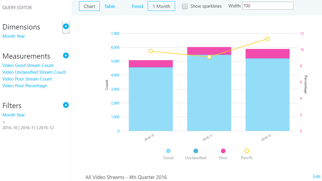
Click “Save” and you have your first custom report in CQD! As you hover over each bar in the graph, more detailed information will show for each measurement:

Additional options to Edit, Clone, Delete, Download, or Export the report configuration are also available when hovering over the graph.
To make the same report for application sharing, you can clone this report and change the measurements to:
AppSharing Good Stream Count
AppSharing Unclassified Stream Count
AppSharing Poor Stream Count
AppSharing Poor Percentage
Thanks for reading!
Hi Jeff, interesting reading material. Working with the CQD reports, is there , or do you know about an elegant way exporting these instead of zooming out in your browser and the snipping tool ?
Hi Bram, I do not. You could export the raw data and build the charts in Excel, but that sort of defeats the purpose of the portal now doesn’t it!
Hi,
We have deployed successfully CQD in our Skype On-Premises Environment.
We have 3 DC in US, EMEA & APAC and 150 Branch sites. Also we have added subnet and site information in SKype Control Panel (Network Configuration).
But when we run CQD through URL we can see only global reports not specific to site and subnet,
I have found lots of article where everyone is talking about how to upload data in Skype Online but did not get for Skype On-Premises how to upload this site and network configuration in QOEdb.
Please paste the article or tell us the way how we can deploy this?
Thanks
Vics
Hi Varun,
In the “Post-Install Tasks” on this site has several SQL queries to use to input the data into SQL:
https://technet.microsoft.com/en-us/library/mt126252.aspx
This other site has information about the SQL tables and what information is needed in the “Supplying Subnet Information”:
https://technet.microsoft.com/en-us/library/mt126253.aspx
Looks like it is a manual process and not as friendly as they’ve made it in Skype Online. I hope this helps.