
The Analytics Pane is the most important feature in Power BI, which helps to gain proper insights and observe trends from the visuals.
It appears only when you select a visual from the Power BI desktop, and there are some visuals that support nearly all analytical lines while others don’t, as we will see later in this blog.
In this blog, we will see how we can use the analytics pane to find insights and trends one by one.
Steps for Selecting Dynamic Reference Lines:
- Select the visual on which we want to observe any trend or insight.
- Click on the analytics pane option (search icon), which opens after selecting visual
- After clicking, a list of reference lines will appear.
- Select any line as per the need and click the “Add Line” option, after which the desired line will be added.
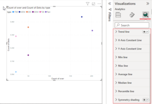

From the Above Figure, We Can Observe that We Get the Following Options for Reference Lines:
- Min line
- Max line
- Average line
- X-axis constant line
- Y-axis constant line
- Median line
- Percentile line
- Symmetry shading
- Error Bars
- Forecasting Line
These reference lines are unique in their uses; we can also use multiple lines for a visual depending on the use cases.
Note: 1) Each reference line is available for selective visuals; we can’t apply all lines to every visual.
2) We can apply multiple lines in a single visual
3) Nearly all analytics lines are available for area charts, line charts, clustered bars, column charts, and scattered charts.
Now let’s see the types of lines and their uses:
1. Min and Max Lines:
The Min and Max lines are used to plot the lines at the minimum and maximum values, respectively. We can track the minimum and maximum values in the visual using these lines.
Steps for using the Min and Max lines:
- Click on “Min Line” from the Analytics Pane.
- Click on the “Add Line” option, and after that, the respective line will get added.
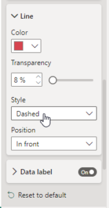
- In the line, we can also see the data labels for showing values. That line can also be formatted by color, transparency, style, and position. (Refer to the attached image.)
- Repeat the process for the Max line option, as the steps are the same and we can give Max line a different color for identification.

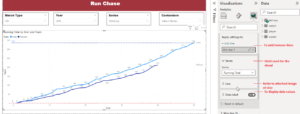
- In the example shown in the image; it’s the run chase overwise of two teams, India and Pakistan where we can see the runs by over.
- So here we have used the Min and Max lines to know the max and min runs scored team-wise. By those lines, we can observe 336 runs as the maximum runs scored and 0 runs as the minimum runs scored by the team overwise.
Visuals Supporting Min/Max Line: Line Chart, Clustered Bar Chart, Clustered Column Chart, Area Chart, Scatter Chart
2. Average line:
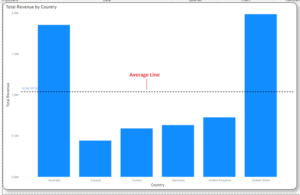
As the name suggests, the average line is used for displaying the average on the visual. You can easily customize it by selecting the color and transparency. It simply displays the average of the data displayed in the visual.
Click on the average line and click Add. You can change the color and transparency as shown in the attached image. Thus, the average line is created.
In the image, the average line is used to display or track down the average of the total revenue across the countries (refer to the image).
Visuals Supporting Average Line: Line Chart, Clustered Bar Chart, Clustered Column Chart, Area Chart, Scatter Chart
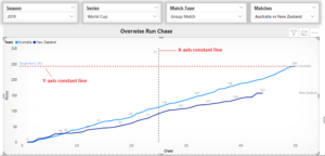
3. X-Axis Constant Line, Y-Axis Constant Line, or Constant Line:
These reference lines are customizable, and we can use them as per our needs. Also, labeling can be done in that way; these are very helpful for tracking metrics and the desired goals of the user.
We have X and Y axis constant lines for using reference lines axis-wise. In the figure attached, we have both lines, and for showing target runs, we have used the Y-axis line, which helps track down the team runs scored.
While comparing both team’s runs in the 25th over, we have an X-axis line to track down runs scored in that over.
In this way, we can use both lines and customize them as per the requirements.
Visuals Supporting X-axis Constant Line: Stacked/Clustered Bar chart and Column chart, Area and Stacked Area Chart, Scatter Chart, 100% Stacked Bar/Column Chart
Visuals Supporting X-axis Constant Line: Line Chart, Area Chart, Stacked Area Chart, Scatter Chart
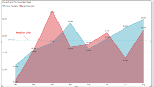
4. Median line:
The median line is simply used to display the middle value for the data shown in the visual. It gives the mid-range; for example, if we want to find semi-annual sales or any 50% values of the data, we can use this line.
The steps are the same for creating a median line, as we have seen in the above lines. Also, formatting can be done if needed. And for displaying values of the median line, just click on the Data Bar and toggle it on.
Visuals Supporting Median Line: Line Chart, Clustered Bar Chart, Clustered Column Chart, Area Chart, Scatter Chart
5. Percentile line:
This line has a dual purpose: first, we can observe the data in visuals division-wise. For example, if we want to observe data quartile-wise, semi-annually, or yearly, we will use the 25%, 50%, and 100% percentile lines, and the data in between those lines will be our required one.
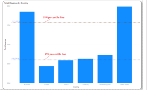
Another use is that it can be used for outlier detection, or we can say for finding any out-of-range values or data as compared to a certain percentile value. Let’s take one example: in our requirement, we need only data for 90%, so for that, we will use the 90% percentile line (refer to image), and if any data shows above that line, it is an outlier.
Identifying outliers is very important in BI reports, which we can do by capturing the outlier points with certain percentile values.
Visuals Supporting Percentile Line: Line Chart, Clustered Bar Chart, Clustered Column Chart, Area Chart, Scatter Chart
Visuals Supporting Percentile Line: Line Chart, Clustered Bar Chart, Clustered Column Chart, Area Chart, Scatter Chart
6. Trend Line:
Trend lines are the most important feature in Power BI. Adding trend lines gives users much more insight into the data.
It’s very useful in finding trends from the visuals, where we can estimate how our insights are going, whether upwards or downwards.
For example, we have a yearly sales graph, and by using the trend line, we can identify whether our sales are moving or making downward progress. There might be fluctuations in points or data lines, but the trend line shows the overall final progress.
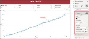
Figure: We have date-wise (yearly) sales in the area chart, and by using the trend line, we can observe that the sales are increasing year by year, as indicated by the upward trend line.
Note: The X-axis (date) must be continuous, then only we can use the trend line in the line chart. For that, just convert categorical to continuous and use the trend line.
Visuals Supporting Trend Line: Line Chart, Clustered Column Chart, Area Chart, Line and Clustered Column Chart.
** Till now, we have seen lines and the visuals supporting respective analytics lines, but there are visuals that do not support any lines, and they are:
Table, Matrix, Slicer, Card, Multirow card, KPIs, Ribbon Chart, Funnel, Tree Map, Map, Filled Map, Gauge.
Conclusion:
So, this is about the analytics pane in Power BI. We have seen how lines are used and which visuals support them. There is also one analytics line that is Forecasting, which we will see in the next upcoming blog, where I will give in detail about Forecasting in Power BI along with details of the Symmetry Shading and Error Bars lines of the analytics pane.
Stay Tuned,
Thank You!
Great insight. Keep it up!!!
Great job. Nice insight. Keep it up!!!