
Images as a Filter
As technology is evolving so, the reporting standards need to be in sync with the current trend. Nowadays, looking at the numbers is not only the purpose of the dashboard but how your dashboard looks in terms of the colour, graphs, filter position, etc. Also, users are leaner toward the interactive dashboard, so instead of traditional filters, we can use images as filters in Tableau; it will give a nice aesthetic look in a more appealing way to the dashboard.
Tableau has that functionality where we can use images as a filter in a more attractive way, where it can give us an edge while presenting to stakeholders.
Custom shape filters can help simplify busy dashboards with multiple charts and views. They provide users with an intuitive means of interaction and add a new pictorial element to the dashboard.
How to Achieve Images as a Filter
I wanted to visualize Revenue and Profit for various regions for different categories. And I decided to use custom shapes as a filter for each category.

The Future of Big Data
With some guidance, you can craft a data platform that is right for your organization’s needs and gets the most return from your data capital.
The first thing that we need to do is find relevant images for all the different categories.
Download the image as png and save it under Document > Tableau repository > Shapes >
When you hover on the filter, it will show you the name of a category.
Now, open your dashboard and drag your field on the columns. Then changed the marks card type from “automatic” -> “shapes” and dropped another copy of “category” onto “shape” in the marks card.
 Filters
How to Set an Image as a Filter:
Go to Dashboard > Actions or (Ctrl+Shift+D) > Add action >Filter
Select Source sheet and target sheet, select run action as select, and use all values.
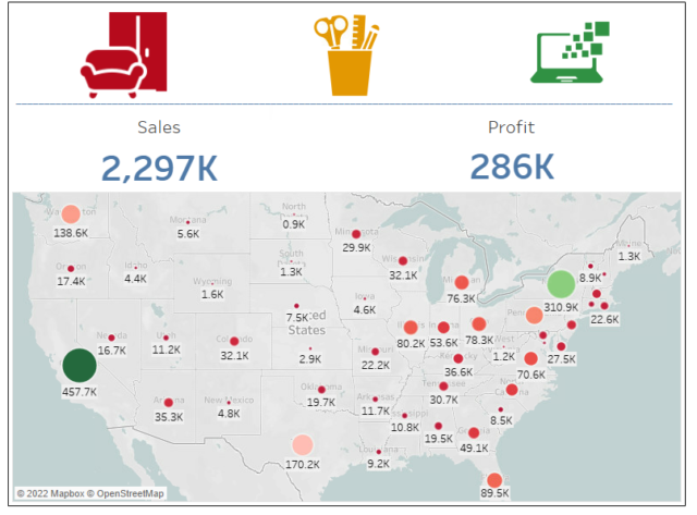
When a user clicks on a particular category, the charts on the dashboard filter to only show the data from that particular field. Below is the final version of the dashboard, showcasing the design and interactive power of using custom shapes as a filter.
Nice Blog
New information, Thank you