
We all want the World Wide Web (WWW) to be a more informative and engaging place, right? We want to see new design trends bringing life to the digital space every year. As designers, marketers, and creatives, we sometimes sit and wait to find out what trend we should be following for the next year, and then we come to find out that there are trends that have been around and evolving since the beginning of typography itself.
So, what is expressive typography, you ask? It’s a creative strategy to blend and bend typography rules to communicate a concept visually. It can use font, size, repetition, form, color, contrast, position, and space to evoke a feeling or send a message. The use of expressive typography allows the creator to break free from typical typography rules to create a narrative while allowing the viewer the freedom to interpret the creator’s art in their own way.
Take our first example, it uses font, size, color, contrast, and space. At a glance, we may read the word and know what it is conveying. At a second glance, there are feelings that may also be evoked with the way the word is styled. If someone were to ask you how you might describe this graphic in a few words without using the word that it spells, some adjectives that may come to mind are peaceful, calm, and collected.

Let’s replace the written word but keep the styling and those are emotions still tied to the way it looks and feels. That’s a powerful thing in visual communication.

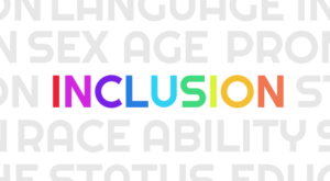
Our second example is using font, repetition, color, contrast, and space to send a message. First and foremost, you see the word inclusion in a spectrum of colors mainly because it’s bold and bright in relation to the text around it – that alone can send a pretty powerful message. However, when you start to read the words in the grayscale surroundings – your mind may create a narrative all on its own. These are the very things that makeup inclusion. This graphic might be trying to evoke feelings of warmth, acceptance, and accessibility. But also, it informs the viewer that nothing can be left out and that it is truly inclusive.
The User Experience (UX)/User Interface (UI) Benefits
Increase legibility and engagement
Maybe you want to increase conversions or increase engagement with your brand or product. Leaning on an expressive typographical treatment not only breaks up the monotony of content in paragraph form but may help you communicate visually what you want your users to feel.
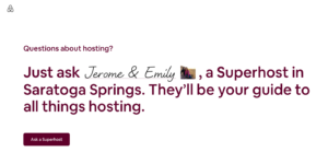
Let’s look at Airbnb’s ‘Ask a Superhost’ page. At first glance, the large typography might catch your eye, but as you keep reading, your eyes run over superhost names filled in handwriting script. A designer’s brain may think this is just handwriting script font, but a user who is unfamiliar with the font family may think this is the host’s handwriting. Indirectly making this call-to-action feel welcoming and approachable. Airbnb wants more hosts to get on board so they emphasize the ability to get your questions answered by real people with the use of expressive typography.

Differentiate and personalize your brand
The possibilities are endless when creating a visually pleasing experience with expressive typography. Why not use it to set your product or organization apart from the rest of the competition? It can instantly increase your chances to become memorable and recognizable.
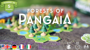
For instance, let’s take a Kickstarter project I came across – Forests of Pangaia, a brand for a unique board game. The clever use of negative space shaped into a tree in the ‘A’ at the end of Pangaia is seemingly a small, but powerful trait of their brand. The now tree-shaped counter (the once-closed space inside of an A) not only creates something interesting to look at but also communicates a story. When their desired audience sees just that one letter or symbol, they’ll know exactly which brand it will represent after it gains some popularity.
The most unique aspect of this brand is they could use the expressive ‘A’ symbol alone on business cards, social media ads, assets in the digital space, avatars, and more. Expressive typography used in brand identity materials can help propel and make your identity memorable as opposed to one without.
Improve professional appearance
Not everyone can come up with useful ways to showcase expressive typography. Leaning on the art form allows your audience to intuitively understand you take visual communication seriously.
Expressive typography can be achieved with animation as well – take One Medical for example. Animating through several service words not only emphasizes the brand font throughout the website but also lets the user intuitively understand this organization has a wide range of services they offer. Alternatively, they could’ve just listed them out, but this unique, space-saving treatment allows your audience to feel like this is a one-stop-shop that also emphasizes their brand.
Emphasize important messages
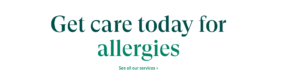
Expressive typography doesn’t always have to be a wild script or misplaced letter to make an impact. For example, UCSF Health uses a simple but effective gradient across the important words to engage its users. By showing a beautiful spectrum of colors as a text fill, it creates a welcoming and inclusive feeling even if you weren’t to read all the words by yourself.

Tactical Considerations
Keep it simple
When making use of expressive typography part of your brand identity, UX, a statement image, or a call-to-action, be sure to make it meaningful, not only to you but to your audience – without them, then no one is looking at your stuff, right? The average human brain visualizes and processes information in the blink of an eye, so keep that in mind when using expressive typography as a design tool to communicate something. A word or collection of words that are over-complicated where it becomes illegible, creates cognitive load, and may lose the intended value altogether.
Keep it accessible
When creating graphics or image assets that contain expressive typography such as some of the examples we’ve seen above, be sure to think about accessibility standards and describe in the image’s alt-text to the users who may not have the same visual abilities that others do. This allows for your users who are utilizing screen readers and keyboard navigation to interact and experience your creations as any other user would.
Keep it fun
Lastly, our lives without all the different ways of communication would be boring, wouldn’t it? So have fun with it and get creative. Make your brand unique, increase your viewer engagement, improve your professional appearance, and put emphasis on important messages.
If you need help with any UX or design needs, read more in our web design styles series, and contact our experience design expert today.
I am really impressed by your article and really appreciate you. Your content is very helpful for me. I will must use in my next projects.
Thanks.