
Many companies are faced with a problem – how to see the data that is most relevant to their business to gather insights. A recent client needed a way to see and show leadership relevant, high-level data that was most important to the business. Enter analytics dashboards! These dashboards, as defined by Google, are “a collection of widgets that give you an overview of the reports and metrics you care about most”.
Our client wanted a way to monitor many dimensions and metrics at once so they could quickly check the health of their site so a dashboard was the obvious choice. Not every business is the same so the data to be shown on the dashboard will most likely not be the same either. While analytics platforms like Google and Adobe provide some out-of-the-box templates to use to create dashboards, for this client, creating a custom dashboard was the best way to show the information wanted.
A Customized Plan
Our client provided requirements of the different data they wanted to report on, guidance on dashboard variations depending on the audience reviewing the dashboard, and some basic look and feel preferences. From these requirements, we did some planning and determined what platform to use to create the dashboard. The client’s analytics data is stored in Google Analytics, so when choosing a reporting platform, Google Data Studio was the option with the lowest level of effort. Once the platform had been chosen, planning what the data would be shown and was next up!
Next, I began to divide the data into types: out-of-the-box and custom. OOB data is readily available from Google Analytics and does not require any manipulation. Custom data was not available within Google Analytics and tracking needed to be added to capture this additional information. After setting up this custom tracking to get the remaining data needed, it was time to build the dashboard.
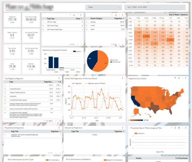
From Data to Information
A free Data Studio account can be created and the data from Google Analytics linked to the Data Studio account. After setting up the account and linking the data, I added all of the different widgets with the desired data to the dashboard. Once the data was connected and added to the dashboard, the last task was to update the look and feel. Referencing branding from the client’s website made it easy to style the dashboard to look like an extension of the website.
Dashboards are a great way for companies to be able to access their data from anywhere and in an easily readable format. Creating dashboards, depending on the information to display, can be relatively easy to create as well especially with platforms such as Google Data Studio. If you want to chat more about Google Data Studio, dashboards, or something related, feel free to comment or you can always message me on LinkedIn or Twitter @sitecorejo.
Jo Troxell will return!