
As new technologies emerge and offer additional ways to interact with your customers, it’s imperative that you consider and provide a consistent, seamless user experience across ever-expanding channels and platforms. Easier said than done?
Eric Enge (Digital Marketing Principal, Perficient) and Jay Baer (Founder, Convince & Convert) teamed up to present considerations and best practices for creating a seamless experience for your users.
Watch below as they discuss how to optimize your UX investments, opportunities you may not realize you’re missing out on, how UX can impact your organic ranking, and more.
Note: This webinar aired live on February 27, 2020.
Transcript:
Eric: Hey, everybody. Eric Enge with Perficient here. Thanks for joining us today. With me is Jay Baer. I’m thrilled to have you here, Jay, who is a seventh-generation entrepreneur. I found that whole thing about your background fascinating. Although I understand your son has one-upped you because he’s starting his own business. So, he’s an eighth-generation entrepreneur.
Jay: Yes. He has his own fashion label that he started when he was sixteen. So yes, he is the eighth generation. My family started in the late 1700s or 1800s in the casket-making business. So, if we have any questions in today’s session about how to make a great casket, I could weigh in on that as well.
Eric: There could be some UX issues related to that.
Jay: Absolutely. Got to have handles, for example. Don’t forget handles.
Eric: Yes, absolutely. So, you’ve written a bunch of bestselling books — six, I believe. A bunch of multimillion-dollar companies along the way, and an inductee in the professional speaking hall of fame. That’s a whale of a resume, dude.
Jay: Oh, thank you. Very kind. Most of it’s true, some of it’s not. But for purposes of today’s presentation, it will suffice. It’s great to be with you. I always enjoy our chats.
Eric: Likewise. So, let’s dig in. We’re going to talk about UX and also about UX and its impact on SEO, so we’re going to get flavors of both. Let’s start with this — what’s the cost of a poor UX?
Jay: Well, it’s somewhat difficult to define because it is, by definition, circumstantial and scenario-driven. But I think without being terribly alarmist, the potential cost of poor UX is the viability of your company. Increasingly, when products and services find equilibrium — and what I mean by that is that more and more and more what you sell, whether it’s a product or service, is pretty similar from what everybody else sells — it’s harder than ever to differentiate based on product or service. Consequently, sometimes the deciding factor between your success and your failure is user experience, ease of use, and related issues. So, it is surprising to me.
I started off doing UX consulting many, many years ago, in the early days of the internet. I started online in 1993, when domain names were still free. So, I’ve seen the entire unfolding of this circumstance and, from then to now, UX is a bigger deal than it was then. But even now, I find it criminally understudied and under-discussed. Hopefully, we can help that a little bit here today.
Eric: Absolutely. I’ve got to flash up a quick example here of an outdated looking UX from a company called the Tokyo Marine.
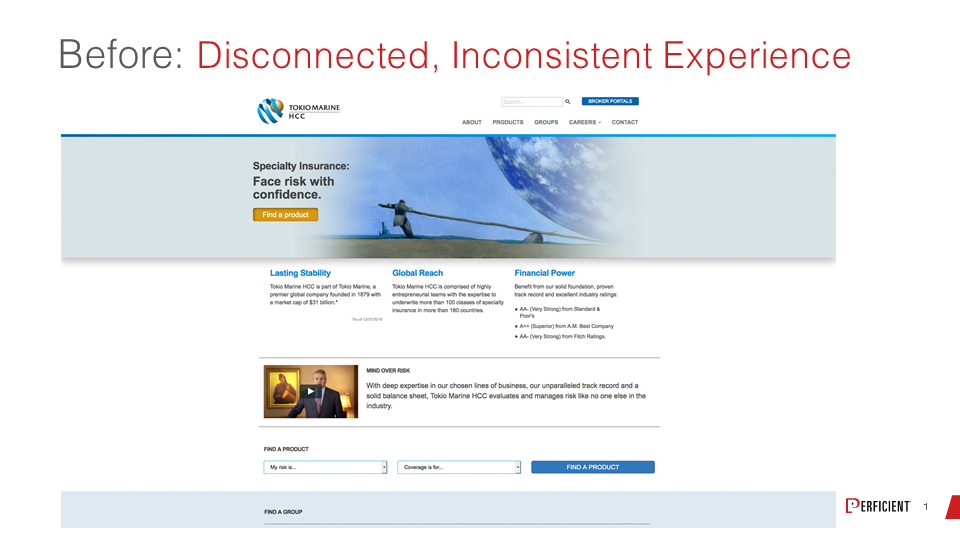
This is something that we worked on and helped them with. You see that this has a flat, lifeless feel. It’s a little bit disconnected and inconsistent, as it says in the title line. And after doing a little work on it, we’ve got a UX that looks more like this:
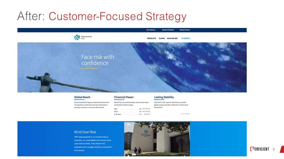
It definitely feels more engaging, more customer-focused, and frankly just more ready to be scaled to a mobile device than the original site.
Jay: I think it’s an interesting example, because the before is not abjectly terrible, right? It’s not comically bad where you’re like, that’s clearly an animated envelope-into-the-mailbox-style UX from back in the day. We’re not using a MIDI file to play a song on the homepage. But the small differences can have such a colossal impact on user experience.
Eric: Right. And how people feel about the site really, and I think that’s part of it.
Jay: That’s it.
Eric: So, user experience has been around a long time. I guess the question is, is it more important than ever before? What’s your take?
Jay: I think it is for a couple of reasons. One, as mentioned, it’s harder than ever to differentiate based on product or service or even price. It used to be — yes, our UX is kind of terrible, but we have such a better mousetrap, or our mousetrap is so much less expensive that we can afford a less than adequate UX. And for most businesses and most industries, that play is no longer valid. It’s just really, really difficult to make that stick. That’s the first thing.
And the second thing is, I believe consumers and customers of all types, sizes, and descriptions have more of an awareness of UX. They have experienced great UX and manifestly terrible UX, and their patience for less than adequate user experiences is at an all-time low. There’s a lot of research to suggest that is the case as well. I feel like people don’t give you a pass the way they used to.
Some of that is just kind of the nature of consumers and their comfort with technology and interfaces. And some of it is this phenomenon that we talk a lot about to our clients at Convince & Convert — this notion that customer expectations are liquid now. And when I say that, I mean they slosh over from category to category.
So it wasn’t that long ago that somebody would say, “Well, that’s not a great UX, but it’s good enough for a bank,” or, “That’s not a great UX, but you know what? They’re a hospital, so I don’t really expect that from them.” And that isn’t really the case as much anymore. Nowadays, customers and consumers expect UX consistency, expect UX excellence regardless of your category of business. And that’s a pretty big change. So, I would say, to answer your question, yes, it’s more important than ever before.
Eric: Right. So just to net that all out, once you’ve seen a really good one, it’s so jarring to go back to a bad one. With your hospital example, you deal with this hospital, you deal with that hospital, you get used to crappy UX, and then you’re dealing with another hospital, and it’s really well put together. And you go back to those first two and think, “What’s wrong with these people?”
Jay: Yes. You think, “If these guys can do it, how come they can’t do it?” You just expect that everybody can match up.
I remember very clearly in my hometown of Lake Havasu City, Arizona, when Taco Bell became the first fast-food franchise to be open 24 hours a day. And my first thought was, “You’re telling me I can get a taco at 2:30 in the morning. This is the greatest thing that ever happened.” And my second thought was, “Well, what’s Burger King’s problem? Why are they closing at 10?” Once somebody has set the bar, you want everybody to meet that same level, and I think UX works exactly the same way.
Eric: Yeah. The competitive market pressure is to win out in the end.
Jay: Yeah, it’s huge. So, hopefully, our participants in today’s session agree that UX is more important than ever. But of course, UX isn’t free. UX optimization isn’t without costs. In organizations where there are resource constraints, which is fundamentally all organizations, how do you make the case for UX optimization? How do you make the business case to say, “These are dollars worth spending or euros worth spending or whatever your currency is, and that will pay off for the organization at the end?”
Eric: Well, obviously, there’s some variance depending on who you’re selling to within the organization. And whenever I get these kinds of questions, regardless of the dimension that people are asking about, you have to learn to speak their language. But at the end of the day, I think it’s always very helpful to pull up real metrics. So, I’m going to show a chart here from a company called SimilarWeb, which has a great tool for monitoring actual traffic.
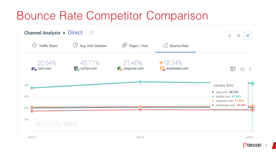
This is a chart showing several companies in the used car listing space, and it’s got several metrics on it. If you click through right now, the graphic is for bounce rate, but you can actually click things and see page views per visitor, time on site, those various metrics. In this particular case, we see that Carfax is the blue line up top. They have a much higher bounce rate than their competition. And if I were working with Carfax, I’d go to management and say, “Hey, look at this. We have double the bounce rate of all our competitors.”
And making that competitive argument is always really telling. It’s such a motivator for people to get them off the dime and be willing to do something. There are tools like this, and as I said, you get page views per visitor, time on site, they’re all good metrics.
Another way you can go about that is to show them some various industry studies. So, here’s some data from eMarketer, which basically talks about the impact of negative experiences on users and how people respond to these things.
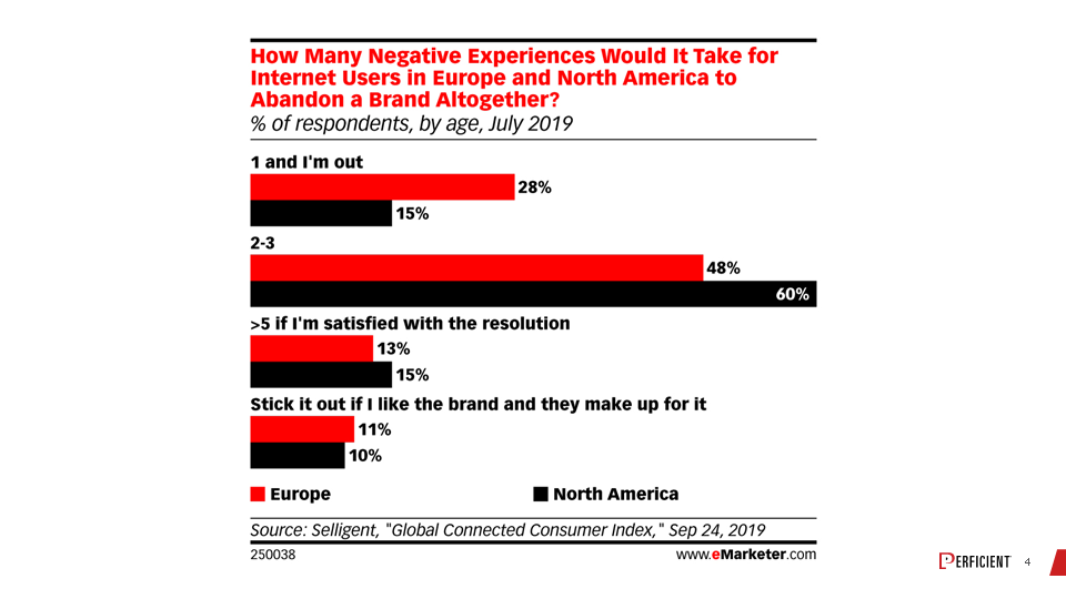
And this is pretty telling too — one and I’m out basically, one bad experience and I’m done with you. And that’s a pretty significant percentage of people that give you one shot, not even two.
Jay: And I think it’s three quarters or so are out within three bad experiences, three out of four customers. So that’s a real definite one in theory.
Eric: Absolutely. Both of these things can be tied back to money. At the end of the day — and this ties into what you said at the beginning — if users are leaving the site more often than they’re leaving competitive sites and they’re not coming back, that’s going to hit your revenue line. So, it turns it into dollars and cents.
Jay: Another way that we think of UX influencing the top line and the bottom line, especially in digital and in web, is the role that UX plays in search engine optimization and placement of various sites in search. Would you argue that the Carfax example that we looked at a moment ago, that because their bounce rate is higher, would you conclude that they would have less optimal search rankings as well?
Eric: It could be that that happens. As we know, Google has stated many times that they have over 200 ranking factors, and we do need to remember that relevance is by far the most important always. But having said that, there’s a ton of discussion that happens in the SEO community about the impact of user engagement on SEO, whether it’s direct or indirect. And there are I don’t know how many patents published on this topic. Large quantities of them are out there. But unfortunately, it’s a patent. It doesn’t mean they actually use it in any meaningful way, so that’s the challenge. But we have to remember that the web is an ecosystem and if you’re creating bad experiences for people, that’s going to hit you in other ways. You’re going to get fewer links from websites. Nobody argues whether links are a ranking factor.
You are definitely going to take a hit on the conversion rate side of things, so the revenue you get from SEO is down. There may well be other direct factors that Google might use to impact your SEO. But whether it’s direct or indirect, I don’t care. Because, if at the end of the day, it’s creating negative pressure on your organic search rankings, the directness of the signal is actually irrelevant.
I will say, to finally get around to answering your question directly — yes, I do believe it could have an impact on the organic search rankings for Carfax, which happens to be doing quite well for other reasons. But that doesn’t mean that they couldn’t be doing better and that there isn’t something there. So that’s my long-winded take on that one.
Jay: I was going to ask you about this concept of pogo sticking that you’ve mentioned to me in the past. I remember you saying that before, but I’m not totally clear what that user condition is. And I think we’ve got a slide for pogo sticking as well.
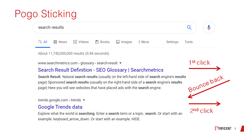
Eric: We do, and I should talk to that. So, here’s an example of the thing that Google could look at. I’m not saying they do, but just to give some people some intuition for the kinds of things that Google has as signals. Imagine someone enters a query, and they arrive at the search results, and they click on the first result and don’t get what they want. Let’s imagine that they bounce back very quickly to the organic search results, and they click on the next one, and then they don’t come back. Their session appears to be complete.
This is what we call a pogo sticking, and it is something they could use as a direct measurement. There are many other things that Google could be looking at related to this. People sometimes say, “Is a high bounce rate a negative ranking factor?” That’s even simpler than pogo sticking. They go to your page at the search results and then come back a short time later. And that signal is probably a little too simple. It would be easy game. But the idea is right, that Google would try to measure these kinds of things.
I do want to say one other thing briefly on simple bounce rate. The reason I don’t think they use that as a direct signal is I can name queries for you in which a fast bounce back out of the search results could actually be a good thing.
Jay: Absolutely. I was going to mention that, that sometimes being able to conclude your information retrieval rapidly is a sign of success, not a sign a failure.
Eric: Correct. So, somebody types in, Convince & Convert phone number.
Jay: I just did it. Right before we got on the air, I went and did a peso to dollar conversion. I’m going to Mexico next week on vacation. Peso to dollar conversion, click, got it back. It was a seven-second session and a very, very quick bounce, but I got what I needed, and I was out.
Eric: You’ve got to be careful about those signals, but the idea is right. These are the kinds of things that Google can measure.
Jay: I was going to ask you about mobile. So many people are visiting sites on phones now, increasingly so, and in some categories predominantly so. What’s the impact of that on UX?
Eric: It’s a funny thing because, obviously, when you have a screen like that, it’s quite a bit different experience than the typical laptop experience that we all grew up having in this industry, or desktop experience as we still call it. There’s a lot less real estate to work with, and there are very conventional things that most mobile UX designers know instinctively. If I’m dealing with a smartphone screen, I’ve got to make the links large enough so my finger can touch them or make the text large enough so that I can read it on a mobile device. Remember that while your designer might be 25, the person using the screen might be 55, and maybe their eyesight isn’t quite as good.
Another design element for mobile is, am I going to put a thousand-word article on my smartphone? The answer is maybe, but maybe I have to fill it with accordions and different ways of breaking up the content so I can find what I want quickly on those pages. I think that’s important to remember when you think about mobile design. One thing I like to advise people about, which almost nobody does, is that we should be at the stage today where we design our mobile site first and figure out how to extract our desktop site from that, rather than designing our desktop site and then squishing it down into a little tiny screen.
Jay: So true. And so few people do it that way. I’ve seen a shift in that regard in many cases in email design. We do a fair amount of work with people in the email space, and you’re starting to see more and more enterprise-level email marketers, email design specialists literally build mobile first and desktop second. Hopefully, once that takes root, you’ll start to see it more and more on the website side as well.
Eric: Absolutely. Although I do want to remind people not to forget about desktop. There’s data that I saw from Google that’s about three years old, and I don’t think it’s changed dramatically, that 75% of conversions still happen on desktop. So, you’ve got to do both to be truly successful.
Jay: No doubt.

Eric: So, what about the impact of audio and video? This has interesting UX implications too, doesn’t it?
Jay: No question. And I’ve certainly lived that transformation myself. I used to personally write four blog posts a week, and I did that every week for almost ten years. And now, I write a new blog post every six or eight weeks, yet I have three podcasts that I record per week. I have multiple videos that I record per week. So, my own content creation, and frankly my own content consumption at some level, has absolutely shifted, at least in part, from the written word to multimedia. And I’m certainly not alone. Every time I see more data published on the consumption of a video, I think, surely, that’s the end. Surely, we’ve reached peak video. Then, all of a sudden, I get another report that it’s up another twenty-two percent.
I see this myself sometimes when my son is home. He’s a big sports fan as am I, and a lot of times we’ll be having breakfast at the counter in the kitchen, and we’ll both be on ESPN as we often are in the morning. I will be reading a story and I’ll look over and he’s watching a video of the exact same story, because on ESPN almost every story has the written story and then a video with the exact same content. And some of it’s just consumer preferences. Younger consumers prefer multimedia even more so than middle-aged and older consumers. So, we’re seeing lots and lots of people putting lots and lots of time and energy into creating audio and video content. And that’s great. It makes sense. Consumption patterns change. However, especially when you combine that with mobile, etcetera, it’s not always as easy to navigate those things. Sometimes it’s harder for search as well.
So, my advice is that you should do both. Because here’s the thing — if you’ve got video, you have audio, you just strip out the audio file. And if you have audio, you have text, you just transcribe it and clean it up. So, my advice is if you want to do more video, you want to do more audio, spectacular. But don’t force a site visitor into using that modality. Let them pick the format that they prefer. And, in fact, on our website, Convince & Convert, which we’ll talk about in a second, on most of our articles, most of our blog posts, we actually allow people to click to listen to them. We audio transcribe every article. Here’s a fun fact. The average time on site for written posts is two and a half minutes; the average time on site when people listen is nine minutes.
Eric: That’s interesting. And I really like that you put it out there because I was going to say it. Give people the choice and make it really easy for them to configure.
Jay: Yes. Let them pick.
Eric: Right. You go to sites like CNN, for example, and the video automatically starts playing whether I want it to or not.
Jay: It’s so annoying. Autoplay video is the worst.
Eric: Speaking of that as a common UX mistake, maybe we can talk about some others. You were going to show an example. You were going to reference your own site here — throw yourself under the bus, it seems.
Jay: We always want to try and do better work and eat our own dog food, as the metaphor goes. This is our current website, Convince & Convert, our homepage.
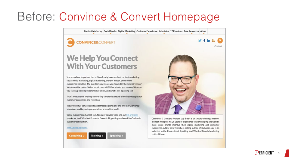
options. What do we actually want to want to do? And as you scroll down, when we start to look at our blog posts and our podcast episodes, etcetera, there are a lot of thumbnails and a lot of visual noise there.
So, we are literally days away from launching a new homepage, which is much more simplified, much easier for users to make choices and understand the services that we provide.
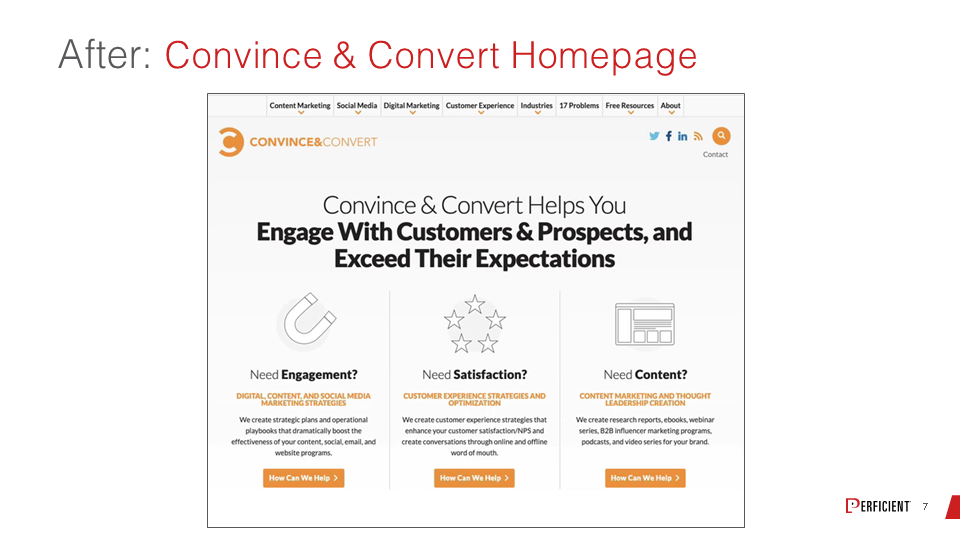
And also, and I know you’ll appreciate this, Eric, it loads a lot faster because we’re not loading thumbnails for every blog post, every podcast episode. It’s much more text-driven as opposed to photo-driven, and I think that’s going to help a lot. And because of the way it lays out, it works a lot better on mobile, to your earlier point.
Eric: Yes. And, since you mentioned speed, I’m going to show a quick chart here, which is a Lighthouse report for a major brand.
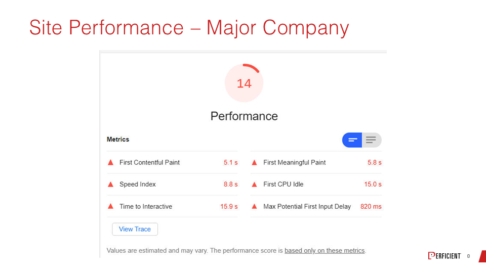
I’m not naming it in this case, but it’s a globally recognized brand scoring 14 out of 100 for performance. Especially on your mobile devices when the performance of the site is so dismally slow, talk about low lying fruit in the UX arena. When you have a poor performing site, that’s a really poor user experience, and it’s something that people have to get better at.
Jay: And it’s typically a byproduct of having too many graphics loading and too many scripts loading. Yes?
Eric: Absolutely. And usually, there are some simple things to do; unfortunately, sometimes it’s a little bit complicated too because these tools give you all these metrics for things that are taking too long. But because the loading process of the page has many threads running, trying to figure out the right combination of optimizations is sometimes a little hard, but it’s really important to do this work.
Jay: No question. But would you say from a low hanging fruit perspective, do you think the first one is to make it faster, or is it to simplify or take things off of a particular page? If you were to say what the first thing is you’d probably work on, what would it be?
Eric: Well, on so many sites, the mobile experience is just messed up. So yes, site speed is definitely on the list, but I go first to look at the mobile site, see how that looks, even though a large percentage of conversions do happen on desktop, as I said earlier. The data we have says something on the order of 60 percent of all your visits start from a mobile device. You’ve just got to make that experience look good because if that’s the first interface somebody has with your brand, don’t lose the opportunity to put something good in front of them and make them feel good about it.
The other thing that I find that happens a lot is the way you manage linking on your site. That’s kind of a big deal. I’ve arrived at sites and flipped through the main navigation, and there are a thousand links. It’s like People have to realize not every product or every category in your site necessarily has the same priority. Help organize this thing and make it a little easier for people to find their way around.
Another popular one is sites without breadcrumbs. Breadcrumbs are really good for search. They’re also good for users. It helps them just quickly reconnect and understand where they are in the site hierarchy. And site speed is definitely on the list as well.
Jay: I love the millions of links example. What I always tell people is, if everything is important, by definition, nothing is important. There’s no circumstance by which this is all of equal importance. That can’t exist. I think we have a before and after example to look at, don’t we?
Eric: Yes, we do. So, we can take a look here.
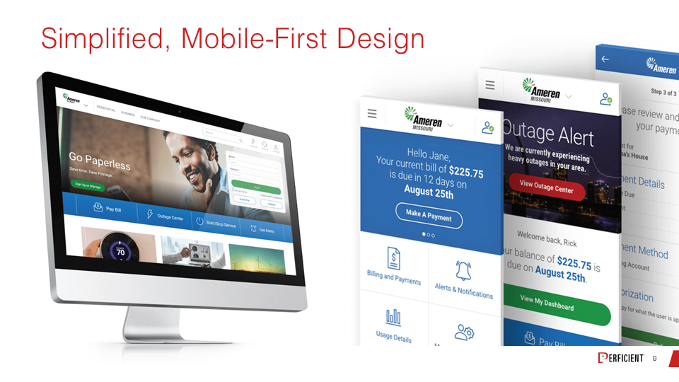
This is a site called Ameron, and it’s not so much a before and after example, but you’re seeing both the desktop and the mobile design. Here’s a case of trying to have a site that’s meant to be very approachable in both environments. You’ve seen how different they are, even though they’re drawn out of the same user needs set. So, you get a really good adaptation to the mobile environment here. That’s a big thing that we’re seeing.
Jay: I love that mobile homepage. Here are five things. Click one or leave. Those are your choices. Click one of these five things or leave.
Eric: If you get the large percentage of users that way, that could be exactly what they want.
Jay: It almost reminds me of classic landing page design considerations. Reduce the number of options. You want to increase conversion, you reduce options, and you reduce leaking that traffic. We think about what you want a landing page to do. A mobile homepage, or any mobile interface, can probably adhere to some of the same principles.
Eric: Absolutely. I’m a fan, and when I’m out speaking about things, I speak about how important it is to offer comprehensiveness in your content. I do believe that’s important, but that doesn’t mean you put it all on one page.
Jay: Not all at once.
Eric: Yes, exactly.
Jay: Not on the same page.
Eric: That’s right. You’ve got to let people layer into it, and you’ve got to make it easy for them to do that. So that is a UX challenge. But not all at once, as you said. So, I guess the next question is, if I’m trying to measure this stuff, what kind of metrics should I be using, and how do I go about doing that?
Jay: It depends a little bit on what kind of company you are and what kind of site you’re running. But I will say one thing categorically — you shouldn’t measure everything, right? There are a lot of things you could measure, but that doesn’t mean you should measure them. And I often think in UX and in digital in general, we’re guilty of over-measuring. There are too many success metrics. And then we get conflicting stories, and we don’t see a clear narrative. We say, “Well, I don’t really know what any of this means.” So, I would advise you to pick a handful of metrics that really matter your organization that everybody buys into as important and then really focus on those.
I think we have an example of a few that might be relevant for a lot of different organizations.
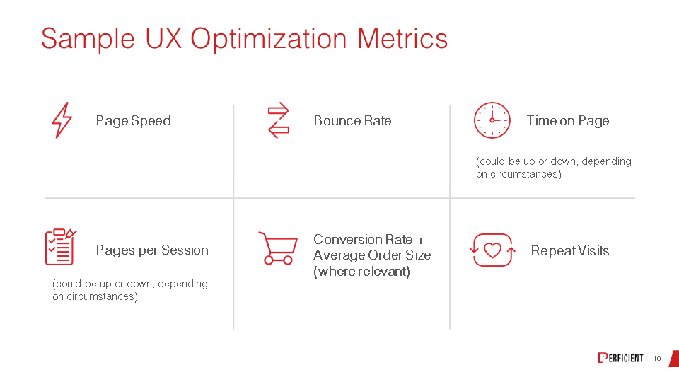
Page speed, as we talked about earlier, bounce rate, as we also talked about a little bit earlier, and time spent on-page. When people show up on the site, how long do they stay? As we mentioned, in some cases, you want them to stay longer, and in some cases, you don’t want them to stay longer. You want them to get what they want and leave. So, you’ve got to understand what you’re trying to accomplish.
On a related front, pages per session, how many pages does a visitor consume on your site? In some cases, you want that number to be up; in other cases, you want that number to be lower. And today, with more and more sites adhering to a long scrolling page format, pages per session is sometimes less important than others. It just depends on how your site is built. Certainly, conversion rate and average order size, if you’re an e-commerce business, is pretty critical.
I’m a big fan of repeat visits from a content quality standpoint. If somebody comes once, unless they have a very transactional query, I would love for them to come back again and be able to measure that. As we looked at in that eMarketer chart, if people say, “Hey, I’m through with this organization after one, two, or three bad experiences,” if we see people coming back to the site over and over, I think we can stipulate to the fact that they haven’t had enough bad experiences to turn them off.
Eric: I think interesting examples of this are blogs, videos, or podcasts. Those very often might be single pages per session visits because the person got what they wanted, so that’s a good thing. But if you did a good job with the content, they’re a repeat visitor.
Jay: That’s right. They’ll come back for the next edition.
Eric: Yes. So, you have to have to think through the interaction of these things. It’s not reasonable to expect something that is effectively blog level content, even though it may be a video. I’m just looping in the same bucket here. You should expect that the bounce rate might be high because the person came for a piece of content. They got it, they were done. But did they come back? So, that’s a good one. How do you go about testing these things with real users, or do you have other techniques that you recommend?
Jay: Ideally, you would test all UX enhancements with real people. You would test every UX enhancement with an AB test or a challenger and a control. I think we all understand why that is important and how that can yield superior outcomes. As a practical matter, I think it would be unfair of myself and Eric to suggest that you’re going to do that every single time out. But I will tell you this — when you are figuring out what your overall budget and investment is for UX, don’t forget to add some budget for testing and optimization, whether that’s software-driven or personnel to help you run those kinds of tests. Don’t think, here’s the optimization budget, and then we add a second budget for testing. A lot of times, that budget gets killed, so make sure you roll it all together. It’s an easier way to go about it.
But I will tell you one thing after having been in this business now for almost thirty years. Even when you’ve been doing this for almost your whole career, a lot of times you believe that you are right, and you know what will work because you’ve done it for so long. And I cannot tell you how often that is mistaken. There is something called the curse of knowledge, and the curse of knowledge very much applies to user experience, in my estimation. I have been down this road so many times — you think you know what’s going to be a superior layout, a superior submit button, a superior form design, and when you actually test it, your assumptions were manifestly incorrect. So, this is one part of your business where trusting your gut is bad advice.
Eric: Absolutely. I’m fine with telling people that the chances that you take a bunch of smart people, put them in a room, and come up with the best UX they can — the chances you got it perfect are exactly zero percent.
Jay: You might get it “okay,” but there’s always a way to do it better. I’ve also discovered, and I’m sure you have too, Eric, from a testing perspective, sometimes the littlest darn things can have such a big impact on performance and conversion and customer satisfaction, things that you’d almost overlook.
I remember one time we did a test on whether the labels for a forum should be to the left of the box or on top of the box. It was around a 13 percent difference in conversion, just making that little change. But little tiny things that are almost unimportant can have huge impacts. So, don’t overlook it.
Eric: Well, now the audience wants to know the answer. Was it on top, or was it to the left?
Jay: On top, in that case. On top was superior.
Eric: Cool.
Jay: Let me ask you this. There are a lot of things we could do right from a UX perspective. We’ve mentioned a lot of them here today. How would you prioritize?
Eric: You want to try to start with the things that are big and that are always big. Whether the label is to the left or on top of a box, that’s a subtlety.
Jay: Not big.
Eric: When you get to that level, you may find those things. For years, people talked about orange being the color of converting buttons.
Jay: It’s the new black.
Eric: Sometimes, that still works, but there are simpler things. I already mentioned a little bit about this earlier — what does your mobile site look like? Make sure it looks clean, tappable, readable, that sort of stuff.
You can talk about accessibility here and making sure those who have some sort of impairment can have a good site experience. The navigation, making sensible decisions on prioritizing people’s ability to find the content they’re looking for. And a really thoughtful approach to prioritization, which impacts your linking, navigation, and layout. Those are things that you should be able to get somewhat close to with the smart people in the room that I alluded to before.
So, we have an example here from Cedars-Sinai. This is a “before” picture with messy navigation for this particular site.
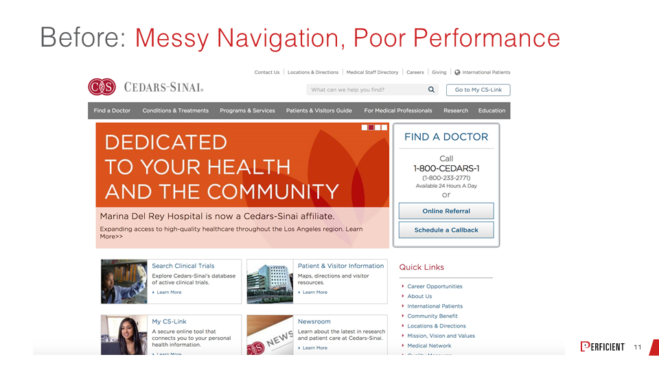
But, if we look at the “after” chart, you’re going to see a much cleaner look.
It just feels more approachable. It also feels more mobile-ready. From the design, you can see it’s going to be much more compatible with a mobile layout with minimal change in the way the site is laid out. So, the cleaner feel actually matters to people, and the ability to find what you’re looking for are really big deals.
Jay: Definitely more welcoming as well. It just feels, as you said, more friendly and inviting.
Eric: Absolutely. So, we have a little bit of time left. Why don’t we see if we can take some questions from the audience?
Jay: Let’s do it.
Eric: Oh, wait. I meant to share one metric on Cedars-Sinai.
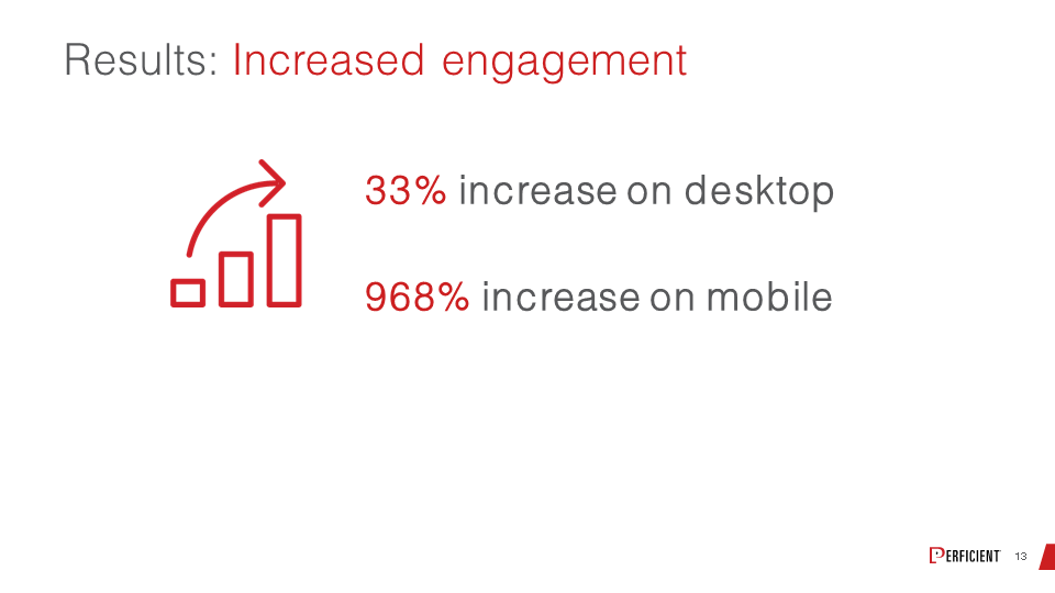
To give you an idea of overall engagement, there was a 33 percent increase on desktop and a crazy 968 percent increase on mobile.
Jay: That is remarkable.
Eric: It is remarkable. Let’s go ahead and take on the questions. I’m going to fire this one at you, and you and I can collaborate on it. What do we think the most important design elements for SEOs and UX designers to collaborate on are?
Jay: Well, the first thing I would say is information architecture at the H1, H2, and H3 level. How you treat your headlines and your subheads has a pretty big impact on the visual design, which your designers are going to care about. But it also has a pretty big impact on SEO because it gives a lot of strong queues in a search engine. So, off the top of my head, that would be the first thing I’d make sure everybody’s on the same page about.
Eric: I have already been talking about navigation and interlinking, and I think that has a big impact on SEO. But we can’t forget that this is all an ecosystem that we’re living in across the board. So, bad user experiences rebound on you in many, many different ways, including how linkable your site is. Anything you do to make the site more engaging and valuable to users will ultimately have some level of impact on your SEO.
Jay: It’s a good question. I want to ask you one question that we didn’t address here. You looked at the Cedars example and the before and after at the end there. That kind of a project where they’ve got a site, and again, it’s not a disaster, but it definitely needs some work. How long does that take? I know that’s an unfair question, but if you say, “Hey, we’re going to redo your UX here to make this homepage a mobile site, all this stuff more inviting,” and obviously we saw the eye-popping results in performance and success, is that a 60-day project? Is it a 17-year project? What’s the window to think about for something like that?
Eric: I think it depends on the level of formality you put into the process. And the reason why I’m bringing this up is, ideally, all of this should go all the way back to mapping out the personas and the customer journeys of the people who are your prospective buyers. And that part by itself can provide so much insight into what you should be trying to do with your site.
Being very thoughtful and thorough about that by itself can take 60 days, and we can’t overlook the importance of understanding your target audience and what it is that they’re going to be looking for on a site. Then once you get through that, what do you do in terms of creating storyboards or markups for what the site is going to look like? Do you create multiple scenarios and then do a user testing even before you build a site with those?
You can take six months on a process like this, and for the right brand and the right business and the right amount of audience at stake, that’s probably what you should do.
Jay: It’s probably worth it as well if you’re going to get those kinds of results.
Eric: Exactly. On the other hand, there are a lot of smaller businesses out there that can’t afford all of that formality, and they can approach things a lot more tactically and still get good results. So, I talked on the idea of the smart people in the room; by all means, put the smart people in the room and be thoughtful about it.
Jay: It’s better than not putting any smart people in any rooms.
Eric: That’s right. And then you still use the idea of trying to understand what your personas are, even though research might be less formal and what the customer journeys are like. You can look at the data you have available and maybe complete that process in two or three months and make some really significant improvements.
So, in terms of the navigation items, what do you think those should focus on? One of the questions from the audience is, should they be used to promote benefits as opposed to features or functionality, that kind of thing?
Jay: I think yes. And it’s funny you ask that because, in our own example of Convince & Convert, we looked at our future homepage. The project that we completed just before this homepage redesign was a fundamental overhaul of the navigation on the site. For the longest time, our navigation was focused on “what do we do?” and now it’s focused on “what do you want?”
As an example, we would have a nav label that would be consulting. Now we have a nav label that is content marketing. And inside that, we have content marketing consulting, content marketing articles, content marketing podcasts, content marketing research. So it’s topically aligned more so than services aligned because when we looked at all of our users and interviewed them and studied them and looked at our search volume, everybody was coming to the site for a specific flavor of digital marketing or customer experience advice and counsel. So we decided to reorient all the navigation around that topic as opposed to here’s what we do and why you should give us money to do it.
Eric: I do think that focus on the benefits is just good marketing in general, and it cuts across everything that you do with your website and even what you do with your SEO, for that matter, to tie back into that.
So, I have a question here about coming up with a good balance and what would be a good balance between data-driven design versus result-driven design, like testing and planning before the release or responding to change in metrics after release. It’s the balance between getting it outright as much as possible upfront versus after.
Jay: Well, eventually, you’ve got to ship it. The reality is, if you’re going to test UX enhancements until they’re perfect before you launch them, you will never launch them because they will never be perfect. So, I think the answer is both, but you have to do it in a structured way, not an ad hoc way. You have to say, these are the thresholds that we’re going to meet for testing and optimization. Once we meet those thresholds, even though it’s not perfect, we’re going to launch. Then we’re going to use actual user data to make a second round of enhancements and optimization recommendations based on an additional sort of threshold or set of objectives. But you can A/B test yourself into inertia quickly. I’ve been down that road, so I would suggest you get it 85 percent right, launch it, and then add the other 15 percent after it’s launched.
Eric: Right. I mean, perfect is the enemy of progress in business, right?
Jay: So well said.
Eric: Absolutely. So, I think we’re out of time, but thanks so much, Jay. This was awesome.
Jay: It was a blast. I really enjoyed it. So much fun.
Eric: And thanks to all for listening. We hope you found it valuable and hope to see you in an upcoming webinar sometime.
About Jay Baer, Founder, Convince & Convert:
 Jay Baer, CSP, CPAE has spent 25 years in digital marketing and customer experience, consulting for more than 700 companies during that period, including 34 of the FORTUNE 500. He is the President of Convince & Convert, a firm that provides word of mouth, digital marketing, and customer experience advice and counsel to some of the world’s most important brands. Jay is a 7th generation entrepreneur, best-selling author of 6 books, and a recent inductee into the Professional Speaking Hall of Fame.