This is a continuation of my Data As Experience Series. My last post in this series focused on Context. In this post, we will discuss a process of designing for the user experience.
Designing for The User
All too often, I see a report designer think more about how to make a report grab the right data than about what the end user really needs. I often see an even more cavalier attitude that as long as you give the user the right data, then throwing up a report should take no more than a few minutes. Frankly, the advent of really powerful visualization tools have exacerbated this issue.
In reality, getting the user what they need represents one of many equally important steps. Yes, data foundation, governance, data flows etc are important. But you should not discount the important of insight design. Note that I emphasize insight rather than report. These days, it’s no guarantee that what you create can be classified as a report sitting in your reports portal.
So how do you go about designing for the user? In short, you take a page from the user experience professionals and follow some of their design processes. Here’s what some of the experience designers in our analytics process follow:

The Future of Big Data
With some guidance, you can craft a data platform that is right for your organization’s needs and gets the most return from your data capital.
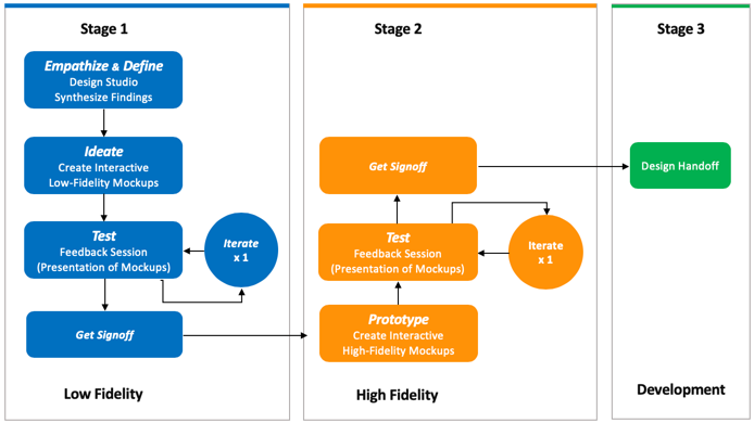
I like this process because it takes a measured approach to:
- First understanding the user and their needs
- Quickly getting to showing what insight the user needs
- Iterating to a high-fidelity version that a developer can use
Understanding The User
When I first started working with the UX researchers who follow this process I was skeptical. But after watching the process in action with a number of risk analysts and “quants” at a financial services client, I was sold. You cannot create the right insight or report without understanding what they need, how they work, and where they work. You really do have to empathize with them even if it sounds a little odd to those of use who are more analytical thinkers. That said, anyone can step back and ask certain questions.
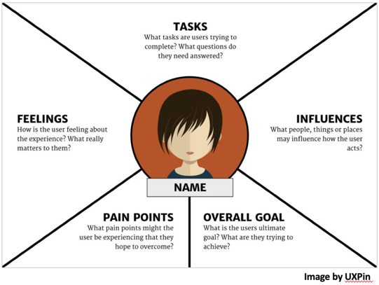
Keep in mind that asking these types of questions will give you answers that influence not just what “report” you write. It will tell you:
- Whether it belongs in a typical report portal
- If the user needs a visualization or dashboard
- If the insight or insights are standalone or if they are part of a larger application
- Whether or not you need to connect insight to some sort of action
- If the context demands a different way to create initial inputs like using an image and AI to identify a product
- etc.
The Importance of Mockups
“A picture is worth a thousand words” may be my favorite saying. Most end users do a bad job describing what they want or need. They may not even completely understand their needs. Giving them a picture or something they can interact with speeds up the process and ensures you don’t deliver a report no one uses. That said, prototypes come in two flavors:
- Low Fidelity: This shows the placement of the insights, visualizations, etc. It defines any navigation and labels. It gives you an idea of what it will be like to interact with it.
- High Fidelity: Lets the user see exactly how the report will work. In many cases, it may even be an interactive prototype. This also give the developer a good understanding of how to develop it using his or her toolset.
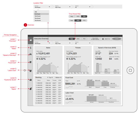
A low fidelity prototype
When to Use A Design Process
You can use this for many scenarios. Some are more beneficial than others. The bottom line is that the more you have of previous reporting failures and the less understanding you have of the users needs, the higher the value from the design process. Here are some examples:
- A brand new reports portal for just one department or user type. We did this with one client who had risk analysts who needed a portal.
- The second try at creating insights and reports for a defined set of users. If you got it wrong the first time then you missed something or the business failed to explain what they needed. Both ways, you need to understand them better.
- The very first time you have a new visualization, AI, or other tool to create insights. New tools mean you need to create new patterns of interaction. The user needs to understand the options as well.
- You are designing for a new context. This could be mobile, embedding insights into a new system like Salesforce, etc.
- You are hooking insight to action. If this “hook” is new then design and test to ensure it’s done right.
When Not To Use A Design Process
Yes, there will be plenty of times you don’t need even a simple design process. This has less to do with your budget and more to do with understanding of your users:
- When you have an existing reports portal with established design patterns. The portal is well used by your constituents. Everyone is on the same page
- When you have already completed a previous design process and understand your users needs and can continue to create insights
- The tool is well known and the users know exactly what they need and will get from it
Bottom Line
Taking the time to really understand users needs and then designing and creating a set of insights to meet those need will ensure success. If you are stuck with a great set of tools that everyone hates, then you probably need this process……..or better governance which is my next post.