
Power Bi is a business intelligence cloud service tool that provides interactive visualization with data ware house capabilities. In Power Bi, option to show relationship between two or more measures across same dimension in line charts is not available. We can achieve the same in PowerBi using R Script. The visualization can be created by using package ‘ggplot2’ in R.
Steps to follow to draw a basic Multiple axis line chart in R Script:
Install package ‘ggplot2’.The ‘ggplot2’ is used to create visualization using the grammar of graphics.
Open R shell and type following in it
install.packages(‘ggplot2’, dep = TRUE)

In Power BI, click R script in Visualization Pane and following screen will appear.


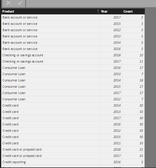
By selecting the fields, the dataset will be automatically created in the R Script editor. 
 geom_line : Connecting observations, ordered by x value
geom_point : point defined by an x and y coordinate
After running the script, Multiple axis chart will be created.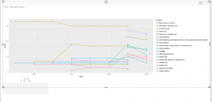 Based on the requirement, options are available to change the line type, color, and Legend position.
# Line plot with multiple groups
ggplot(data=dataset, aes(x=Year, y=Count, group=Product))
geom_line(linetype=”dashed”, color=”blue” , size=1)
geom_point(color=”red”, size=3)

By using this we can compare the multiple measures across same dimension.