In Adobe Experience Manager (AEM), Granite UI is the foundation UI framework to build touch-enabled UI consoles and component dialogs. It provides a set of out-of-the-box (OOTB) components that you can use to build consoles or component dialogs. In this blog, I want to talk about a small tech gem that a lot of AEM developers are not aware of, Granite UI common attributes. In fact, I firstly encountered them in the AEM WCM core components, then when I was reading the Granite UI migration guide for the dialog conversion from Coral UI 2 to Coral UI 3 (AEM 6.2 to 6.3), I saw that this is listed to streamline the API and replace existing properties.
Note: this was tested on AEM 6.3. All the source code used in this blog can be found in my GitHub project.
Add granite xml namespace
To use Granite UI common attributes, you will add the following xml namespace to your console or dialog content.xml in order for it to build.
xmlns:granite="http://www.adobe.com/jcr/granite/1.0"
Replace HTML global attributes with Granite UI common attributes

In your component development, you may use a lot of class and id attributes to apply styles and/or target your dialog field. Now you should use Granite UI common attributes instead. Below is a list of Granite UI common attributes that I think developer uses a lot in their component dialog:
granite:class
granite:id
granite:title
Note: this is for HTML title attribute. Do not confuse this with jcr:title, which is a JCR property name. This should not replace jcr:title attribute.
granite:hidden
Note: this is for HTML hidden attribute. Do not confuse this with granite:hide, which is another Granite UI attribute that can be used to dynamically render components. (see below section)
Use granite:data to provide data-* attributes for your components
If you are a front-end web developer, you’ve probably known how much you use the HTML5 data-* attribute, either to target specific element, toggle elements, trigger events or to pass data from front end to back end…Similarly, as an AEM developer, you should know that data-* attribute can also be used to pass data for Adobe Analytics, component dialogs…
While you may have been already using data-* attributes in your component dialog by defining a custom unknown attributes, you should replace them with granite:data, in order to follow the best practices.
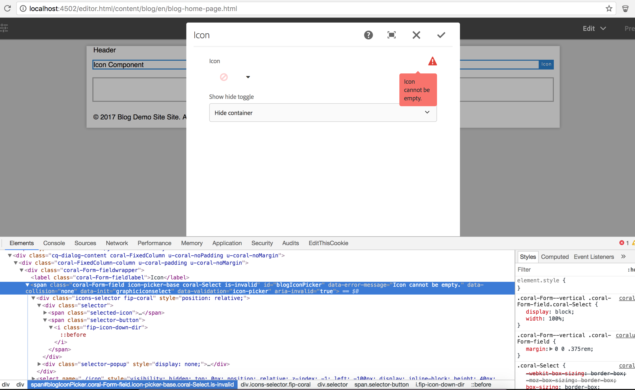
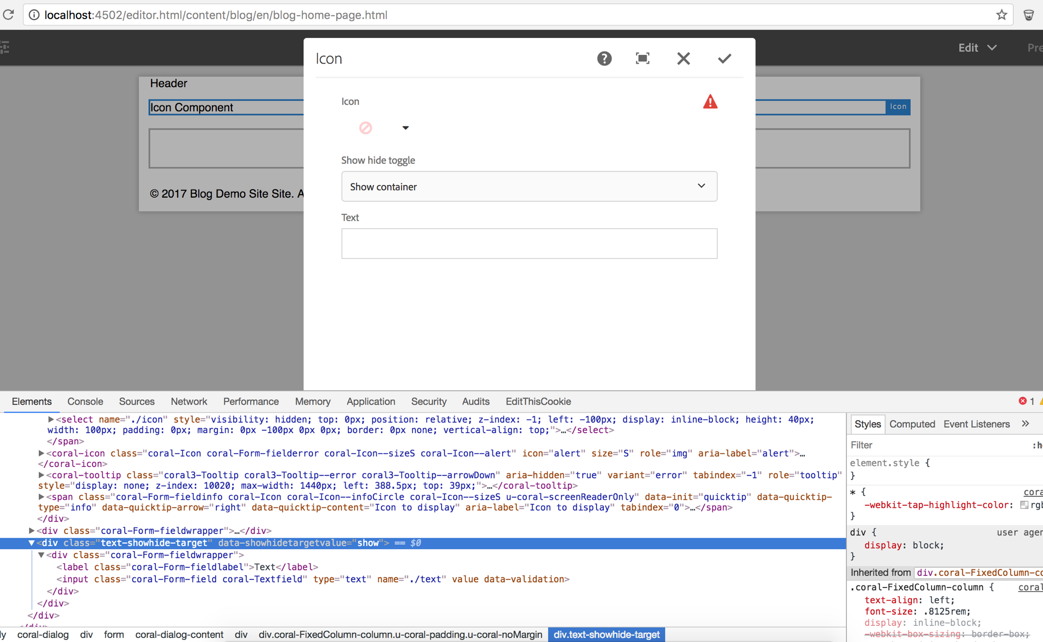
I have created two examples to demonstrate different use cases of granite:data attribute. They are both in the Icon component in my blog project.
One example of granite:data attribute is that I can use it to pass error message for field validation, continued with the dialog validator from my last blog. In my icon-picker-validation.js, I can simply call the data-error-message attribute that’s populated to the dialog field markup (see below section) and display the message when validator doesn’t pass. This way the error message can be extracted from the logic and set in the field, in case you want to reuse the validator with a different error message for another field.
The second example of granite:data attribute is that I can use it to show and hide dialog fields based on dropdown selection. And this comes OOTB (/libs/cq/gui/components/authoring/dialog/dropdownshowhide/clientlibs/dropdownshowhide/js/dropdownshowhide.js). You can implement this like the example fields below (no more event listeners or long inline extjs widgets api code like what you did in Classic UI).
<showhidedropdown
    granite:class="cq-dialog-dropdown-showhide"
    jcr:primaryType="nt:unstructured"
    sling:resourceType="granite/ui/components/coral/foundation/form/select"
    fieldLabel="Show hide toggle"
    name="./showhidedropdown">
    <granite:data
        jcr:primaryType="nt:unstructured"
        cq-dialog-dropdown-showhide-target=".text-showhide-target"/>
    <items jcr:primaryType="nt:unstructured">
        <hide
            jcr:primaryType="nt:unstructured"
            text="Hide container"
            value="hide"/>
        <show
            jcr:primaryType="nt:unstructured"
            text="Show container"
            value="show"/>
    </items>
</showhidedropdown>
<extrafieldcontainer
    granite:class="hide text-showhide-target"
    jcr:primaryType="nt:unstructured"
    sling:resourceType="granite/ui/components/coral/foundation/container">
    <granite:data
        jcr:primaryType="nt:unstructured"
        showhidetargetvalue="show"/>
    <items jcr:primaryType="nt:unstructured">
        <text
            jcr:primaryType="nt:unstructured"
            sling:resourceType="granite/ui/components/foundation/form/textfield"
            fieldLabel="Text"
            name="./text"/>
    </items>
</extrafieldcontainer>
As the snippet shown above, the data-cq-dialog-dropdown-showhide-target is the hook, with value set to the class of the container, “.text-showhide-target”. The container also has “.hide” initially. This is working on the container level, however, it doesn’t work on individual field.
There’s more advanced things you can do to show and hide resource dynamically with FilteringResourceWrapper or render condition. FilteringResourceWrapper leverages granite:hide attribute with the wrapper class, while render condition uses granite:rendercondition node with script to define the render condition logic.
Use component helper api to populate Granite UI common attributes at the back end
Most of the time you will not develop a Granite UI component since it’s not an open source project to the public. But in case you are doing custom dialog field or extending the OOTB Granite UI component, like the example I have above, icon picker component, it’s good to know that you can use the component helper api to populate Granite UI common attributes in the jsp and render those attributes.
Tag tag = cmp.consumeTag();
AttrBuilder attrs = tag.getAttrs();
cmp.populateCommonAttrs(attrs);
Conclusion
Granite UI common attributes help define component global attributes and provide the capability to apply and encapsulate Granite specific implementations. It’s recommended by Adobe to use these shared intentions in developing new server components. And more common attributes may be added for future releases of Granite UI. You should be aware of these attributes and start incorporating them into your Touch UI development.
I constantly end up here when I need to find the Granite UI XML namespace.
So I thank you for that, but it would help in my copy and paste if you added the ” “‘s around the namespace value. 🙂
xmlns:granite=”http://www.adobe.com/jcr/granite/1.0”
Thank you. Just added that, good catch.