Oftentimes, AEM developers will be asked to develop a validator for the component dialog. Back in the Classic UI dialog days, you would probably write a JavaScript function for dialog before submitting an event. In Touch UI dialog, if you’ve Googled around, you probably found a lot articles/codes to use jQuery based validator, i.e. $.validator.register({}). Recently, I found out that this jQuery-based validator is deprecated starting in AEM 6.2 (see screenshot below), where the new best practice is to use foundation-validation. In this blog, I am going to walk you through foundation-validation, and the things you can do with it, using a sample icon component. You can find all the source codes in my GitHub project.
The sample icon picker validator mentioned in this blog is tested in AEM 6.3.
When Do You Need to Write a Validator?
A lot of the validation business requirements for dialog I’ve seen are for mandatory fields. If you are using Granite UI components, this, for the most part, is already resolved by setting required="{Boolean}true". But, for instance, if you have a multi-field, or RTE (resourceType of cq/gui/components/authoring/dialog/richtext), or an icon picker from ACS commons, or even your custom-developed dialog field, you may need to write a validator for a mandatory field and/or any other custom validation requirements.
If you are looking for an RTE validator that is easy to customize and scalable, we have a good blog post about it, which also uses foundation-validation.
How to Hook Validator to Dialog Field?
There are two ways you can call the validator for your dialog field:
1. Validation/custom data attribute
Most Granite UI components have a validation attribute that you can use to trigger a custom validator. It adds a data-validation attribute to the component markup; then, in your custom validator, you can use the data-validation attribute and value as a selector to trigger the validation.
If you are not using Granite UI components, you can add any custom data attribute to your dialog field node and use that as a selector for your validator. Of course, you can also use the same “validation” attribute, but just to make sure the component is adding that data – or data-validation attribute to a -foundation-submittable element (refer to “What is –foundation-submittable?” section). If not, you can’t use it directly as a selector; instead, you will need to register a new selector to the foundation registry.
These validations will be triggered when the dialog submit button is clicked. It will stop the dialog submit event first, scan through the dialog to look for fields with a validator, validate those fields and show errors, if any. If all fields are valid, it will proceed with the dialog submit event.
<icon
    jcr:primaryType="nt:unstructured"
    sling:resourceType="acs-commons/components/authoring/graphiciconselect"
    fieldDescription="Icon to display"
    fieldLabel="Icon"
    name="./icon"
    class="icon-picker-base"
    validation="icon-picker">
    <datasource
        jcr:primaryType="nt:unstructured"
        sling:resourceType="acs-commons/components/utilities/genericlist/datasource"
        path="/etc/acs-commons/lists/font-awesome-icons"/>
</icon>
2. Foundation validation API
You can also trigger the dialog validation from foundation validation API. This can be tied to any event on the dialog field, and you can toggle the error UI based on the validity of the field. See example in “Even Better” section.
What is –foundation-submittable?

Basically it’s similar to the applicable elements in the jQuery validator, plus some coral and foundation elements (see the OOTB list screenshot below). Only these submittable elements can be used as a selector and trigger the foundation validation. You can still register a new selector if the data attribute is not in a –foundation-submittable field. For example, the data-validation attribute is added to a <span> element in icon picker.
Register Selector
You can register a custom selector if the dialog component is a composite field or is not adding the data-validation attribute to a –foundation-submittable element, i.e. input, select, button, textarea…
The best practice for validation selector is to use fast flat selector, i.e. “[data-validation=icon-picker]”. Below is the code snippet of how you can register a selector:
registry.register("foundation.validation.selector", {
    submittable: "[data-validation=icon-picker]",
    candidate: "[data-validation=icon-picker]:not([disabled]):not([readonly])",
    exclusion: "[data-validation=icon-picker] *"
});
Where is the Source Code of Foundation Validation?
This is based on AEM 6.2 and 6.3:
/libs/granite/ui/components/foundation/clientlibs/foundation/js/coral/validations.js
/libs/granite/ui/components/coral/foundation/clientlibs/foundation/js/validation/validation.js
Register Adapter
Foundation validation uses .adaptTo() for adapting elements; it’s the same idea as Sling adapter. You can register an adapter for your element and return custom properties/functions. For example, this is useful when I need to set my icon picker field valid/invalid. I can create an adapter for my icon picker and encapsulate my logic there, so I can reuse it in other places.
function createGenericIsInvalid(el) {
    return function() {
        return el.attr("aria-invalid") === "true";
    };
}
function createGenericSetInvalid(el) {
    return function(value) {
        el.attr("aria-invalid", "" + value).toggleClass("is-invalid", value);
    };
}
registry.register("foundation.adapters", {
    type: "foundation-field",
    selector: "[data-validation=icon-picker]",
    adapter: function(el) {
        var field = $(el);
        var button = field.children(".icons-selector");
        var select = field.children("select");
        return {
            isDisabled: function() {
                return select.prop("disabled");
            },
            setDisabled: function(disabled) {
                select.prop("disabled", disabled);
                input.prop("disabled", disabled);
            },
            isInvalid: createGenericIsInvalid(field),
            setInvalid: createGenericSetInvalid(field)
        };
    }
});
Register Validator
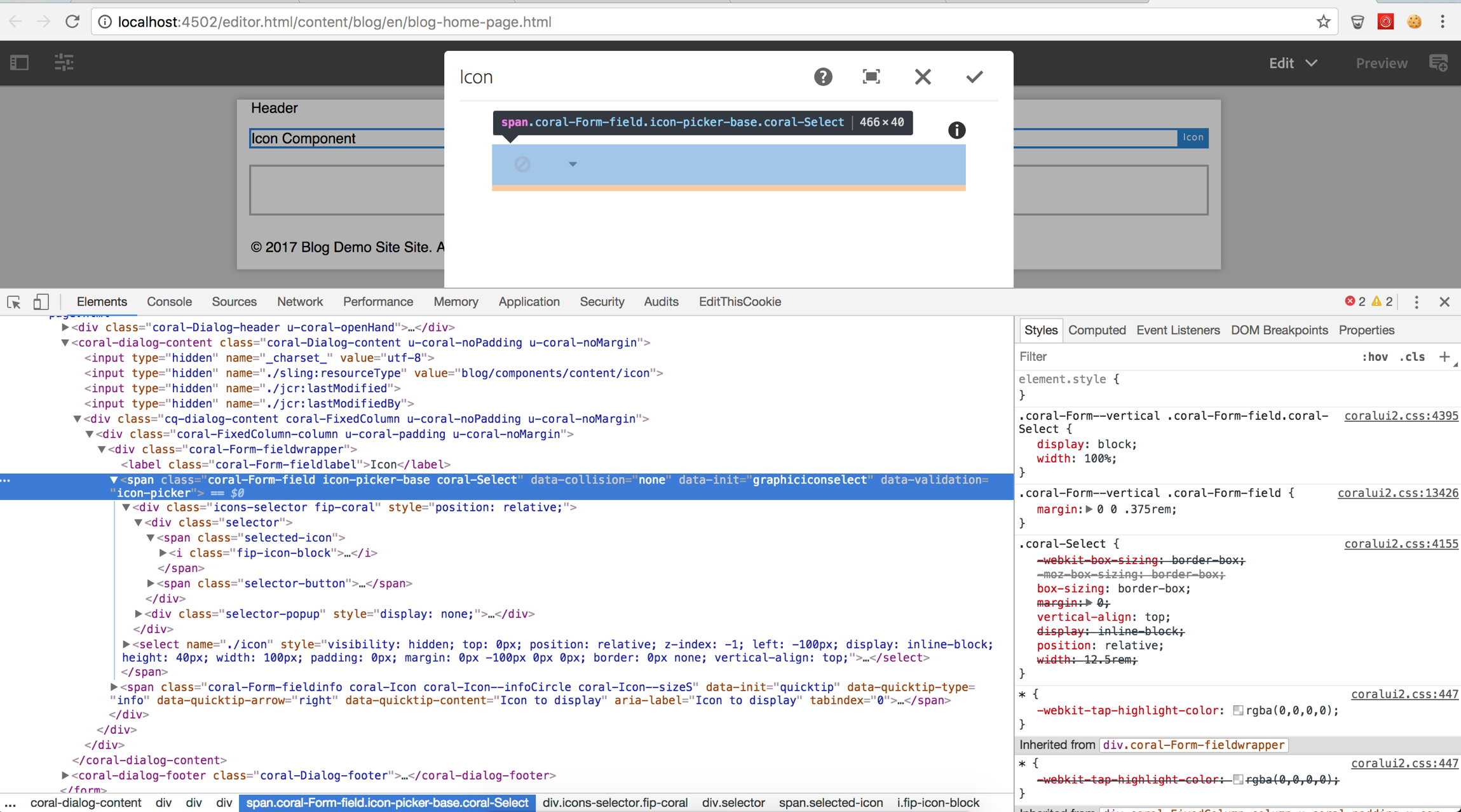
Besides selector, there are validate, show, and clear properties. They are all pretty self explanatory. For validate, if it returns any string value, it means it’s invalid; otherwise it’s valid. Below is the snippet of my icon picker validator. I am validating if any icon other than the empty icon is selected from the icon picker, meaning this is a mandatory field.
registry.register("foundation.validation.validator", {
    selector: "[data-validation=icon-picker]",
    validate: function (element) {
        var field,
            value;
        field = $(element);
        value = $(field).find(".selected-icon>i").attr("class");
        if (value == "fip-icon-block") {
            return "Please select the icon";
        } else {
            return;
        }
    },
    show: function(element, message, ctx) {
        $(element).closest(".icon-picker-base").adaptTo("foundation-field").setInvalid(true);
        ctx.next();
    },
    clear: function(element, ctx) {
        $(element).closest(".icon-picker-base").adaptTo("foundation-field").setInvalid(false);
        ctx.next();
    }
});
Even Better
You can use foundation validation API to check validity and/or update U accordingly. For example, I want to check validity whenever someone selects a new icon from icon picker (instead of when they click dialog submit) and I want to toggle the red error triangle and message based on the validity of the select. I can bind the click event from icon selector, trigger a function to call the foundation validation API. I will find the icon picker element and adapt that to “foundation-validation,” and then I can call the foundation validation API.
var validateHandler = function(e) {
    var iconpicker = $(document).find("[data-validation=icon-picker]");
    var api = $(iconpicker).adaptTo("foundation-validation");
    if (api) {
        api.checkValidity();
        api.updateUI();
    }
};
$(document).on("dialog-ready", function () {
    var container = $(this).find("div.fip-icons-container");
    if (container.length > 0) {
        $('.fip-icons-container').on('click', function(){
            setTimeout(validateHandler, 200);
        });
    }
});
Feel free to comment on your specific questions for foundation-validation. I understand that when you have to go through all the documentations and source codes without any working reference can be very challenging, so I hope this blog gives you pointers and examples to lighten up your Touch UI dialog validation implementation.
I am not really sure how to hook the data-validation attribute to the field when using the foundation validation api under ‘How to Hook Validator to Dialog Field?’. I can just add it to the field in my .content.xml but that isn’t the correct way I guess?
Do you also have a link to a github repo where I can view the full code, would be really helpful.
Hi, this is link to the github repo https://github.com/guangweiyao/blog.
When you use the foundation api, you can add a custom attribute to your content.xml, then in your js, you will find that attribute and then adaptTo(“foundation-validation”) in order to hook the validator to that field, reference to “Even Better” section.
I’m trying to work with the code that you have in your repo but I cannot get it working. I created a new blog page but I can’t add components because it’s giving me a 403 error. Also when trying to create my own validator I’m getting stuck at the beginning. The code is not recognizing the adaptTo method…. Do you have any suggestions?
Hi, I want to add validations for nested multifield to limit both inner and outer multifield also I’m using image and text for my multifield. There I need to create thumbnail after I drag and dorp in the cq:dialog. The values are rendering properly. But when I close and again open the dialog only text fields appearing image is not appearning. Can you please help me for this ???
In a multifield I have a dropdown based on which certain fields are shown/hidden. One of the fields is another multifield having another validation for minimum no. of items. Now of that field is part of the hidden fields, still I get an error and I’m not able to complete & close the dialog. How can we remove these custom foundation validation when field is hidden?
If author change any style or update any text to as anchor by rich text tool bar (which is top on the rich text when content author open rich text box) then “keyup” event is not triggering so do you have any suggestion which event I need to use or how I can listing that update/change ?