
While the tips in my previous blog posts about forms (part 1 and part 2) are still relevant, there is finally new data to support using a multi-step process on mobile devices.
This is related to the design pattern known as “One Thing Per Page.” (Essentially, it means splitting up a complex process into smaller pieces.) There is a veritable laundry list of reasons why users benefit from baby-stepping. My favorites: progress, error handling and clarity.
3 Benefits of Multi-Step Forms
1. Progress
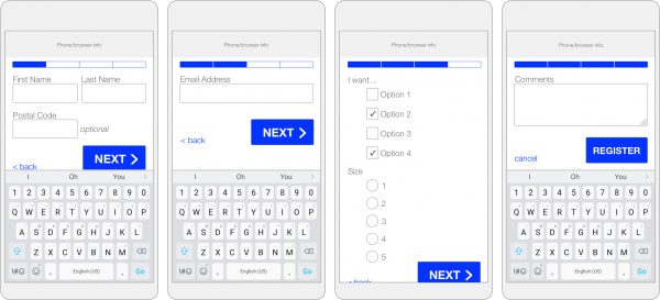
Each new screen shows the user that they have done something right.
TIP: Don’t forget to show an indicator of completed and remaining steps.
2. Error Handling

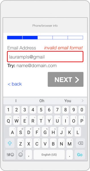
Because data entered is validated at each step, users know right away if there is a problem and where to find it.
TIP: Clearly highlight the mistake, suggest a correction and disable the button allowing the next step until this is fixed.
3. Clarity
With a single page form, the user can get easily overwhelmed by everything on the screen. Not knowing how long the form is, especially when the keyboard is enabled, can be daunting.
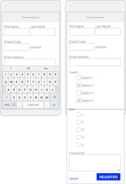
TIP: Break it down into sections. With fewer items on each screen, filling out forms is much more palatable.
More Tips & Takeaways for Mobile Forms
And when it comes to forms for both mobile and desktop, always keep these tips in mind:
- Only ask for information that you will actually use in the next 30 days.
- Use a single-column form whenever possible.
- Allow users to enter information they already have on their device by attaching a photo, using voice inputs, pasting copied information, etc.
- Use location information you can get from the device to pre-populate some geographical information. This may not always be correct, but when it is, it can save a lot of time.
- White space matters! Group labels with their associated fields, and group like items together.
Remember, the use of mobile devices for everything is not going to decrease anytime soon. So, unless you want to lose a lot of your visitors, make everything work as smoothly as possible on mobile.