
Umbraco has several input options built to allow a variety of content on a page. Images, numbers, text and bool variables all used to implement your content on a website. Most of this content is entered and altered in some way to fit the design, text added as an overlay or an image to a carousel.
Umbraco also includes a Rich Text Editor (RTE) which allows the content editor to add content in whatever form is needed without it being altered. Most of the time this section is used to enter blocks of text with the occasional link or image. But what if you could add something more interesting, even something responsive, and be able to understand it.
If this sounds like I’m going to make you write code and learn things – I am, and you’re going to like it! This gives you the control you need to make a well-structured page that will flow with the rest of your site.
These pictures show how foundation is used to portion out the width of content. Each row has 12 columns, each section inside the row spans any number of these columns. You can also change the number of columns each section has based on the width of the screen.
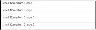
For example here we have four boxes in one row, each spanning three columns. For a tablet sized screen we don’t want the boxes to get smaller but to move down to the next line so we give them six columns each, and on small screens we can do the same and give each section 12 columns. This is done with classes, which are reference points used to talk with the style document, which will tell the section what size to be.
<div class="row">
    <div class="large-12 columns">
        <div class="row">
            <div class="large-3 medium-6 small-12 columns">
                <p>small 12 medium 6 large 3</p>
            </div>
            <div class="large-3 medium-6 small-12 columns">
                <p>small 12 medium 6 large 3</p>
            </div>
            <div class="large-3 medium-6 small-12 columns">
                <p>small 12 medium 6 large 3</p>
            </div>
            <div class="large-3 medium-6 small-12 columns">
                <p>small 12 medium 6 large 3</p>
            </div>
        </div>
    </div>
</div>
Each section spans 3 of the 12 columns
Each section has 6 of the 12 columns, since this results in more than 12 columns we wrap to the next line.

Each section has 12 of the 12 columns, meaning each section is now a full row.
If there is code surrounding your RTE you might not get a row that spans the full width of your webpage. This depends on the layout that has been setup for the page. Even if your code is entered into another code block, the row and columns will follow the same rules.
Now how do I add other elements like image and link, since this doesn’t tell me how to code a link or image? You can take this code and place it into the code editor of any RTE.
After you save and close the editor the text will appear in your text editor, now you can replace the placeholder text with images and links using the helper tools. This part can be problematic because the code you added can be deleted in the text editor by deleting empty space. This is why is it suggested to add your content in the middle of the placeholder content rather than deleting it and adding your own. After you have tested the content in a browser you can carefully delete the placeholder text.
You can open the code editor after you have added content to be sure that all of the original code elements are still there.
Grid Editor
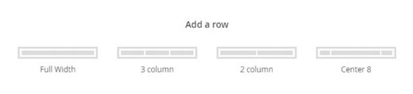
Umbraco has added a Grid Editor for the newest version of Umbraco, allowing you to visualize the columns you want to use.
Each page that allows the Grid Editor will have a tab where you will select a layout. These are created under Data Types, each page will have a layout option and each layout as many configurations as you need. When you want to add a new row you click the plus sign to see all of the configuration options available.
By using these layout, you avoid any potential code problems since each is rendered by Umbraco, but you also loose the option to control the change in number of columns. Large and small screen sizes are automatically determined. Each of the columns in these layouts will be set to ‘small-12’, which works for most cases so it isn’t a problem. You can add a medium class if you want to change the tablet layout. Click on the gear for the column you want to change and add a medium class into ‘Class’.

If you want to have more control you still have the option to select the ‘Full Width’ configuration and use the RTE to create the sections and row you need.