
The Future is Digital
Becoming digital is the surest way for you to understand your customers' needs and meet their expectations. Learn how Perficient can help anticipate what's ahead for you and your customer with a digital strategy centered around empathy, alignment, and agility.
As stated previously, I’m a big fan of focusing on the persuasive aspects of your presentations and reports. After all, the power of data is to trigger an improvement or optimization to the benefit of a client or business. A significant portion of a persuasive argument is backing up your recommendations with solid insights drawn from the relevant data for the specific project or client to whom you are presenting.
The world is awash in information, data in particular, and it’s a hugely valuable skill to be able distill down all the relevant client data into concise, digestible and actionable insights. Part of that skill is presenting that data in a way that clients across multiple departments can understand quickly, and ideally, in the age of social, share those insights across an organization or department.
As my colleague Abbey recently pointed out, storytelling in presentations is a very effective way to get your point across. Data can also tell a story, if presented clearly and with some visual flair and style.
Two great examples I’ve come across recently were produced by startups MailChimp and Shopify. Both brands are fairly new to the world, and both want to show significant market share and year-over-year growth, both to their investors, and to their users. So they both present data on the volume of activity flowing through their services, demonstrate their significant growth, while also showcasing their brand through arresting visuals.

MailChimp, an affordable bulk email service, developed an HTML5 microsite that scrolls through the various elements of their services, and highlights the most significant areas of growth. You’ll quickly notice the use of huge numbers to call out the most relevant data in each chapter – not the whole table of data, but just the choice few data point that tell the most impressive story. They couple that information with bright colors that change in each chapter, and each section has visual elements so step you through their 2012 storyline, keeps your attention on the overall experience, and draws you down the site from chapter to chapter.
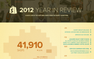
Shopify takes a similar approach, but presents their information in a single infographic posted to their website (and shared through visual.ly). They divide the image into a primary column with large numbers and supporting images of the most compelling data, and a thinner right hand column with the timeline of activity over the course of the year. Scrolling down the page they highlight even more significant data with basic visuals to contrast the previous year’s data, with the significantly larger current year data, to great effect.