Eric Overfield (@ericoverfield) and Rita Zhang gave an informative session. It was chock full of examples and example code. I couldn’t grab the code examples but a lot of the best practices and screenshots from live sites I was able to grab. They started with the three pillars of Responsive Design:

Fluid Grid
Must use a fluid grid. By keeping the grid approach, users come to expect a common pattern. The grid must be able to resize itself, hence the fluid grid
- Large would be three columns
- Tablet would use two
- Smart phone would use one.
Flexible Media
Be flexible with what images and images sizes you use. You would also use proportional text
Media Query
Query your media based on the size. You might use the same image but cropped.
How to Implement
- Build and code a mobile interface first
- helps you control some resources. You start by optimizing the resources for lowest bandwidth, etc.
- It also forces you to concentrate on the content. Smaller interface forces the prioritization of that content
- She gave an example of doing the smart phone viewport wireframe first. It did help to see it there first because you prioritized what you wanted to appear and where.
- Note: IE 8 is not mobile first friendly

Demo
He showed a demo of CSS with a setting with the following logic
- for anything greater than 992 px then
- display a background image in this location with this width, height, and margin
Navigation in Mobile First
 Notice that your navigation will most likely change as you move from full site to smart phone optimized site. You must first think through the user experience.
- How will your navigation adapt to different viewport
- Responsive navigation may require thought
- Consider real estate require for navigation
SharePoint 2013 does give you common mobile navigation. These options include:
- First build a media query for navigation
- Choose from
- Floating navigation: Most common because navigation just pushes as far left as it can
- Can’t use dynamic navigation, not supported
- It also uses a lot of real estate
- Drop down: This is a select form field from any library like JQuery.
- You can get a pretty large select box
- It’s not the prettiest
- Collapsing: collapse navigation with a mobile tool
- Off Canvas: Look at your facebook iphone app where navigation appears when clicking a button on the left of the right of the screen.
- Floating navigation: Most common because navigation just pushes as far left as it can
Site Planning
It’s the same regardless of tools
- Begin with site planning
- Start with content and site purpose
- Use a sitemap
- Define Information Architect
- What’s different
- Use wireframes
- Do high fidelity mockups at all viewports
- Design for the extremes
- Assume a huge tablet
- Assume a really small screen
- Be prepared to go wide or go small
- Design to the side first then you can fill in the middle
SharePoint Specific
- What will be a part of the Master Page. Operate in the paradigm of the Master Page. Don’t go too crazy
- How will page layout content be defined
- How will you handle navigation
- Will you include the quick launch on all pages?
Getting to Code / Best Practices
There’s a lot of ways you can do this but consider the following
- Use an existing framework
- Pre-built responsive and fluid grids
- Save time and resource
- Many include extras
- for example, collapsing navigation
- There are pros and cons
- Make take time to learn framework
- Not always SharePoint ready oob
- But once learned, you can save a bunch of time with an existing framework
- Common framework – no particular order
- Twitter bootstrap
- Zurb foundation
- Skeleton
- Less framework
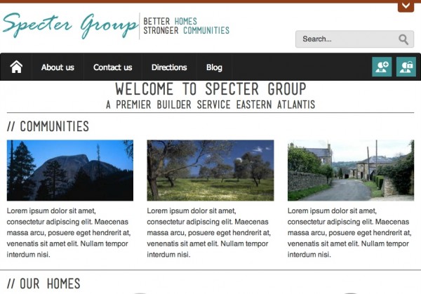
- Showed a demo using Twitter bootstrap framework
- Was built on SharePoint 2013
- Built the prototype first though to get approval before pushing into SharePoint
Converting It To SharePoint
- Distill the page into master page and page layouts
- Fix framework to work with SharePoint
- Add SharePoint controls, snippets, and navigation
Rita showed us a demo of the framework converted to SharePoint. Most of here demo was in actually showing the conversion to the nav controls, snippets, etc. using SharePoint designer It was too hard to capture that info in the blog post though. That said, Rita took the HTML/CSS and converted it to a responsive design in SharePoint and did it in about 10 minutes.
Wrap-up and what’s important
- Use a pre-built framework that’s SharePoint ready
- Set project budget, deliverables, and expectations
- Develop for the real world (will mobile users need to edit pages)
- Don’t break SharePoint!
- Mobile first is your design approach
- Be sure you and your developers are very comfortable with CSS/HTML
- Test, and test, and test some more
- Train content authors. RWD relies on groomed content.